Welcome to STA/GLHLTH 198!
Introduction to Global Health Data Science
Amy Herring
Duke University
STA/GLHLTH 198 Fall 2026
2026-08-24
Data science
Data science is an exciting discipline that allows you to turn raw data into understanding, insight, and knowledge.
This is a course on health data science, with an emphasis on statistical thinking and global health challenges
-
Our process involves
- forming a question of interest,
- (collecting) and summarizing data,
- and interpreting and communicating results.
Global health data science
STA/GLHLTH 198 will
provide a tour of basic statistical methods useful in public health and biomedical research
emphasize intuition and understanding of the methods, with a focus on critical assessment of evidence, data-driven decision-making, and effective communication of insights from data
make use of timely, relevant examples from global health science, with opportunities to think about what makes us human
utilize free, modern software and reproducible research methods for transparency and data sharing
Frequently Asked Questions
Q: What data science background does this course assume?
A: None. No prior experience with data science or programming is expected.Q: Is this an intro statistics course?
A: Statistics and data science are closely related, with substantial overlap. This course is an excellent way to begin learning statistics, but it is not a traditional high school statistics course.Q: Will we be doing computing?
A: Yes—extensively. Computing is a core part of the course and an essential tool for learning data science and statistics.
Software
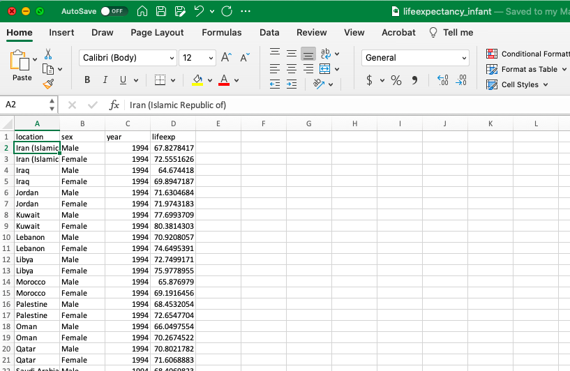
We’ll combine the ease of viewing in Excel with …
Software
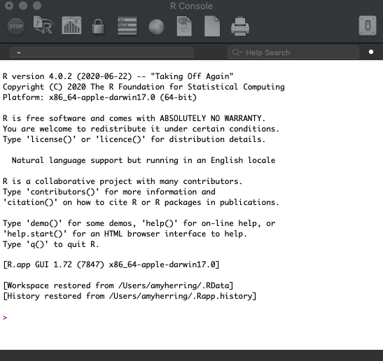
the rigor of the R programming language …
Software
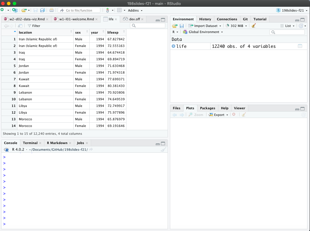
in an integrated environment. To learn more, check out the introductory video for our computing toolkit.
The data science life cycle
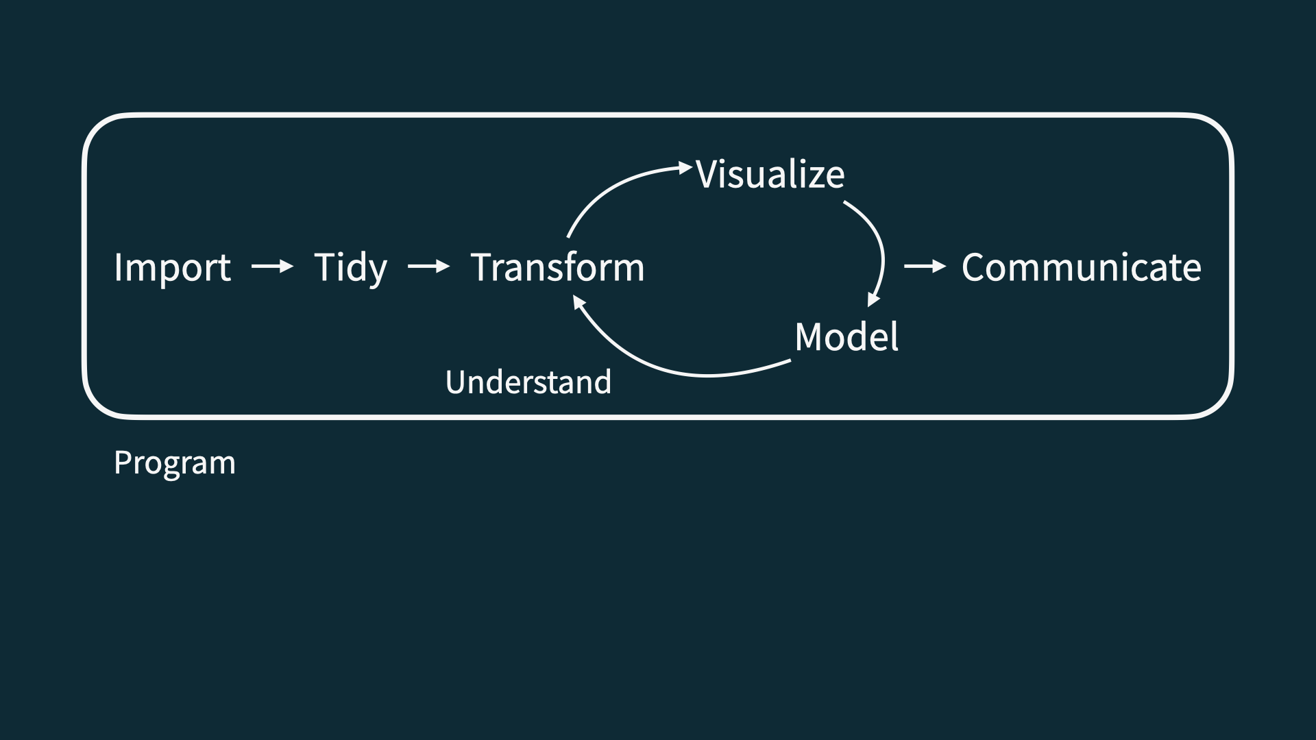
The statistical process
Statistical process
Convert data into useful information, whereby practitioners
form a question of interest,
collect, summarize, and analyze the data,
and interpret the results
Identifying the question of interest
The population is the group we would like to learn about.
- What is the prevalence of diabetes among U.S. adults, and has it changed over time?
- Is there a relationship between tumor type and five-year mortality in breast cancer patients?
- Does the average amount of caffeine vary by vendor in 12 oz. cups of coffee at Duke coffee shops?
If we had data from every unit in the population, we could just calculate what we wanted and be done!
Sampling from the population
Unfortunately, we (usually) have to settle with a sample from the population.
Ideally, the sample is representative, allowing us to use probability and statistical inference to make conclusions that are generalizable to the broader population of interest.
Sampling methods
Probability sampling (e.g., simple random sampling, stratified, cluster, or multi-stage sampling)
- All units have a known chance of being selected
- More likely to be generalizable
- Can be more expensive and time-consuming
Non-probability sampling (e.g., quota, convenience, or snowball sampling)
- Some units unable to be selected, with no way of knowing size or effect of sampling errors
- Less generalizable to population of interest
- More convenient and less costly
Study design
Experimental studies (e.g., randomized controlled trials)
- Researchers directly control exposures or treatments
- Ability to make causal statements
- Less real-world applicability and generalizability
Observational studies (e.g., surveys, electronic medical records)
- Researchers do not assign exposures or treatments
- Real-world setting with lower burden on participants
- Inability to prove causality
- Generally more susceptible to bias than experimental studies (learn more about many types of bias at the Catalog of Bias)
Observational Study Challenges
Observational studies are critical in advancing health research. However, we must be more careful interpreting their results than in the experimental setting due to the possibility of bias and confounding.
A confounding variable is one that is associated with both the explanatory and response variables. Because it is associated with both variables, it prevents the study from concluding that the explanatory variable caused the response variable. Consider an example with total ice-cream sales as the explanatory variable and murder rate as the response variable. Outside temperature is associated with both variables, and therefore we cannot conclude that high ice-cream sales are driving an increase in homicides.
Confounding variables may or may not be measured as part of the study. Regardless, drawing cause-and-effect conclusions is difficult in an observational study because of the ever-present possibility of confounding variables.
A fun rabbit hole to explore is Tyler Vigen’s Spurious Correlations Website.
Let’s dive in!
Life Expectancy
The Institute for Health Metrics and Evaluation (IHME) is a resource for data on a variety of important health outcomes worldwide.
IHME maintains the Global Burden of Disease (GBD), a valuable resource for policymakers and others that quantifies health loss due to a variety of risk factors, diseases, and injuries.
Life Expectancy
We consider data from IHME on (estimated) infant life expectancy from the years 1990–2023 as a function of location (primarily country) and binary gender.
Here life expectancy is the # of years an infant can expect to live if mortality rates in the current year remain unchanged for the rest of their life. Life expectancy usually underestimates how long the baby will actually live because mortality rates have been declining over time.
What is in a dataset?
Dataset terminology
- Each row is an observation
- Each column is a variable. A variable in statistics is a characteristic or measurement that can take different values across observations in a data set.
# A tibble: 13,872 × 4
   location    sex     year lifeexp
   <chr>       <chr>  <dbl>   <dbl>
 1 Afghanistan Female  1990    59.8
 2 Afghanistan Female  1991    59.8
 3 Afghanistan Female  1992    60.2
 4 Afghanistan Female  1993    60.5
 5 Afghanistan Female  1994    60.7
 6 Afghanistan Female  1995    61.1
 7 Afghanistan Female  1996    61.6
 8 Afghanistan Female  1997    61.6
 9 Afghanistan Female  1998    60.7
10 Afghanistan Female  1999    62.0
# ℹ 13,862 more rows
What’s in the life expectancy data?
Take a glimpse at the data:
Rows: 13,872
Columns: 4
$ location <chr> "Afghanistan", "Afghanistan", "Afghanistan", "Afghanistan", "…
$ sex      <chr> "Female", "Female", "Female", "Female", "Female", "Female", "…
$ year     <dbl> 1990, 1991, 1992, 1993, 1994, 1995, 1996, 1997, 1998, 1999, 2…
$ lifeexp  <dbl> 59.77891, 59.75369, 60.19466, 60.47221, 60.69472, 61.14557, 6…
How many rows and columns does this dataset have?
What does each row represent?
What does each column represent?
How many rows and columns does this dataset have?
Exploratory data analysis
What is EDA?
- Exploratory data analysis (EDA) is an approach to analysing data sets to summarize its main characteristics
- Often, this is visual – this is what we’ll focus on first
- But we might also calculate summary statistics and perform data wrangling/manipulation/transformation at (or before) this stage of the analysis – this is what we’ll focus on next
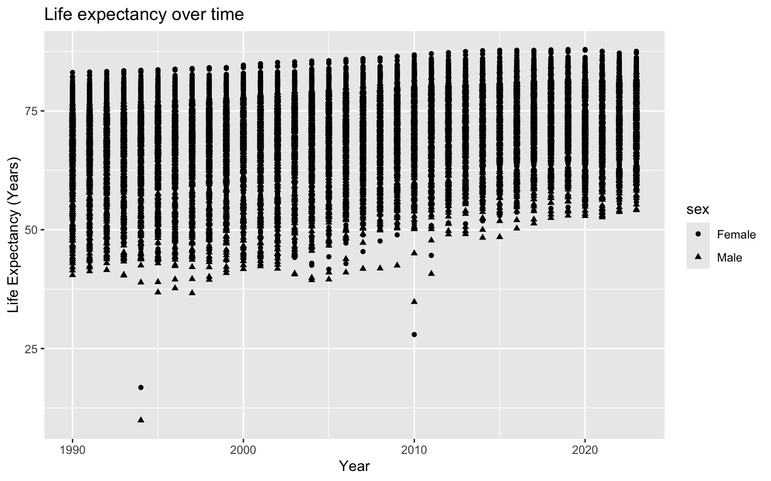
Life expectancy over time
How would you describe the relationship between year and life expectancy?
What other variables would help us understand data points that don’t follow the overall trend?
What is causing the outliers at the bottom?
Outliers
We’ll learn how to make a more useful plot later, but first let’s look into the outliers.
# We want to look at the bottom 5 values of life expectancy
# (5 just in case some points are exactly the same)
life %>%
  top_n(-5, lifeexp)
# A tibble: 5 × 4
location sex year lifeexp
<chr> <chr> <dbl> <dbl>
1 Haiti Female 2010 27.9
2 Haiti Male 2010 34.8
3 Rwanda Female 1994 16.8
4 Rwanda Male 1994 9.88
5 Rwanda Male 1997 36.7 Are these data errors, realistic estimates, or neither?
(Hint: Recall how life expectancy is calculated.)
Data visualization
Data visualization
“The simple graph has brought more information to the data analyst’s mind than any other device.”
— John Tukey
- Data visualization is the creation and study of the visual representation of data.
- There are many tools for visualizing data—R is one of them.
- There are many approaches and systems within R for making data visualizations. ggplot2 is one of them, and it’s what we’ll use in this course.
ggplot2 \(\in\) tidyverse
- ggplot2 is the tidyverse’s data visualization package.
-
ggin “ggplot2” stands for Grammar of Graphics. - Inspired by the book Grammar of Graphics by Leland Wilkinson.
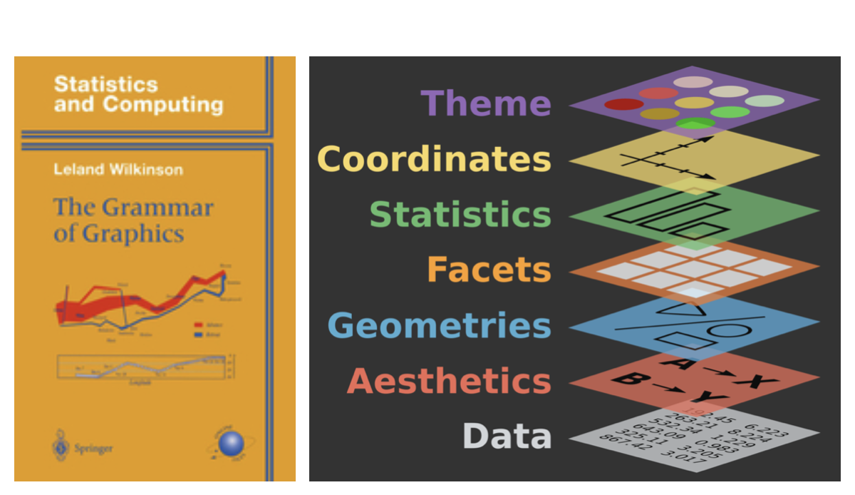
Grammar of Graphics
A grammar of graphics is a tool that enables us to concisely describe the components of a graphic.
Source: BloggoType
Men’s gap in life expectancy by year
Let’s subset to a few countries to de-clutter the plot.
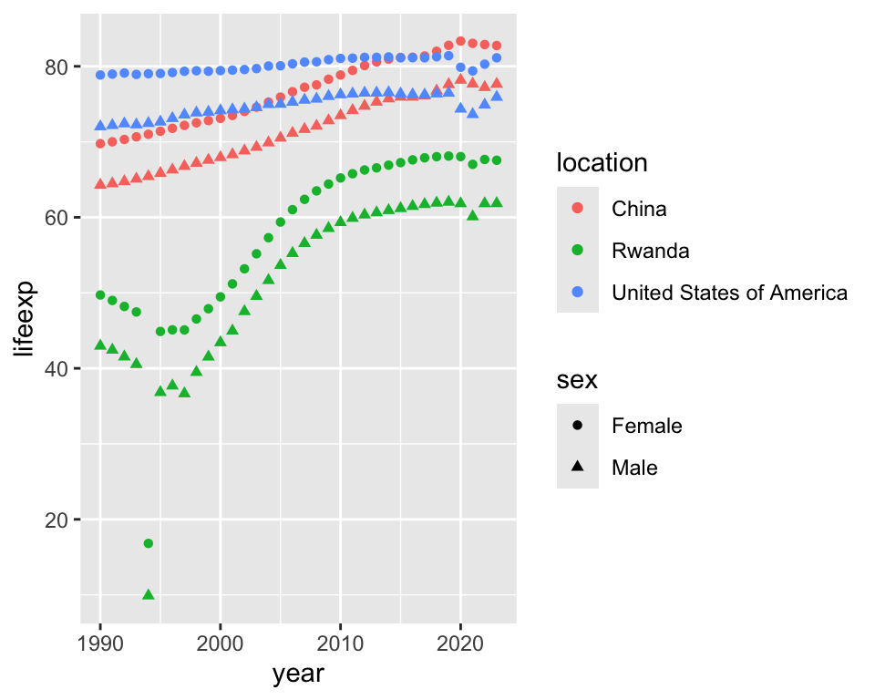
We’ll learn to make this a lot better later!
- What are the functions doing the plotting?
- What is the dataset being plotted?
- Which variables map to which features (aesthetics) of the plot?
Hello ggplot2!
-
ggplot()is the main function in ggplot2. - Plots are constructed in layers.
- The structure of the code for plots can be summarized as:
- The ggplot2 package comes with the tidyverse.
- For help with ggplot2, see https://ggplot2.tidyverse.org/. We will learn more this week and next about its use.
Syllabus highlights
Homepage
https://sta198-fa26-2.github.io
- All course materials
- Links to Canvas, GitHub, RStudio containers, etc.
Course toolkit
All linked from the course website:
- GitHub organization: github.com/sta198-fa26-2
- RStudio containers: cmgr.oit.duke.edu/containers
- Communication: Ed Discussion
- Assignment submission and feedback: Gradescope
Activities
Introduce new content and prepare for lectures by completing the readings (videos are sometimes included if you want extra support!)
Attend and actively participate in lectures, labs, and office hours
Practice applying statistical concepts and computing with application exercises during lecture
-
Put together what you’ve learned to analyze real-world data
- Lab assignments
- Practice problems
- Exams
Grading
| Category | Percentage |
|---|---|
| Lectures (attendance + participation) | 5% |
| Labs | 20% |
| Midterm 1 | 25% |
| Midterm 2 | 25% |
| Midterm 3 | 25% |
| Final | Replace lowest midterm |
See course syllabus for how the final letter grade will be determined.
Labs
Hands-on practice with data analysis
A single exercise per lab, graded based on being there and turning in something reasonable + correctness
Completed in-person, in lab, or in teams
Teams randomized for roughly first half of course
Team lab solutions developed collaboratively, but turned in individually by the end of the lab session
Weekly throughout semester, two lowest scores dropped
No late work accepted
Exams
Three in-class midterm exams during semester
Final (optional to replace lowest grade on midterm)
No extensions or make-ups.
Caution
Exam dates cannot be changed, and no make-up exams will be given. If you can’t take the exams on these dates, you should drop this class or be comfortable with relying on the make-up exam. (If you know of an issue well in advance, let’s talk.)
If you need testing accomodations
Make sure I get a letter, and make your appointments in the Testing Center now, as slots fill out!
Teams
Randomized at first for weekly labs (some labs will be individual)
-
Expectations and roles
- Everyone is expected to contribute equal effort
- Everyone is expected to understand all code turned in
- Individual contribution evaluated by peer evaluation, commits, etc.
Questions?
This week’s tasks
- Attend lectures and lab:
- Computational setup;
- Getting to know you survey;
- Read the syllabus and ask questions on Ed;
- Complete readings for next class;
- Send me SDAO letters and schedule testing center appointments.
- Check out practice problems (homework!)
Homework (Practice)
- Problem 3
- Problem 10
- Problem 12
Note: answers to odd-numbered problems are in the Appendix. Feel free to use Ed Discussion to raise questions with the class.