Visualising data with ggplot2
Introduction to Global Health Data Science
2026-08-24
Data: Life expectancy from infancy
IHME data on location (mostly countries), World Bank region, binary sex, and estimated life expectancy and population in 2023 will be used to explore the men’s health gap (later we will add more years).

Dr. Abernathy of The Simpsons (aged 40)
Rows: 204
Columns: 6
$ location        <chr> "Afghanistan", "Albania", "Algeria", "A…
$ year            <dbl> 2023, 2023, 2023, 2023, 2023, 2023, 202…
$ worldbankregion <chr> "South Asia", "Europe and Central Asia"…
$ pop             <dbl> 38041757, 2854191, 43053054, 55312, 771…
$ Female          <dbl> 68.98985, 82.05155, 77.60938, 74.38214,…
$ Male            <dbl> 68.13812, 77.27016, 74.54654, 67.96911,…
Grampa Simpson (Matt Groening)

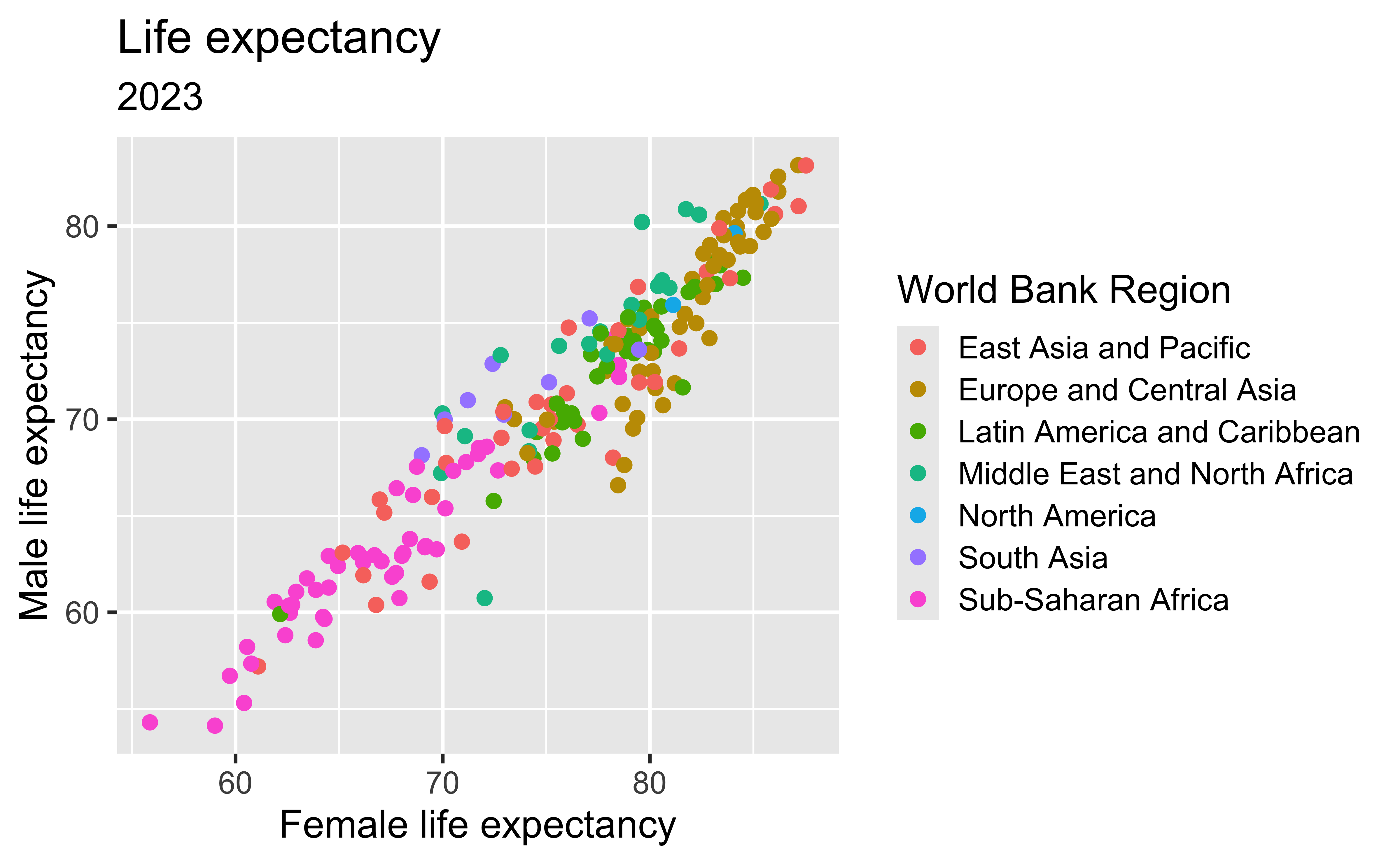
Life expectancy
Discuss
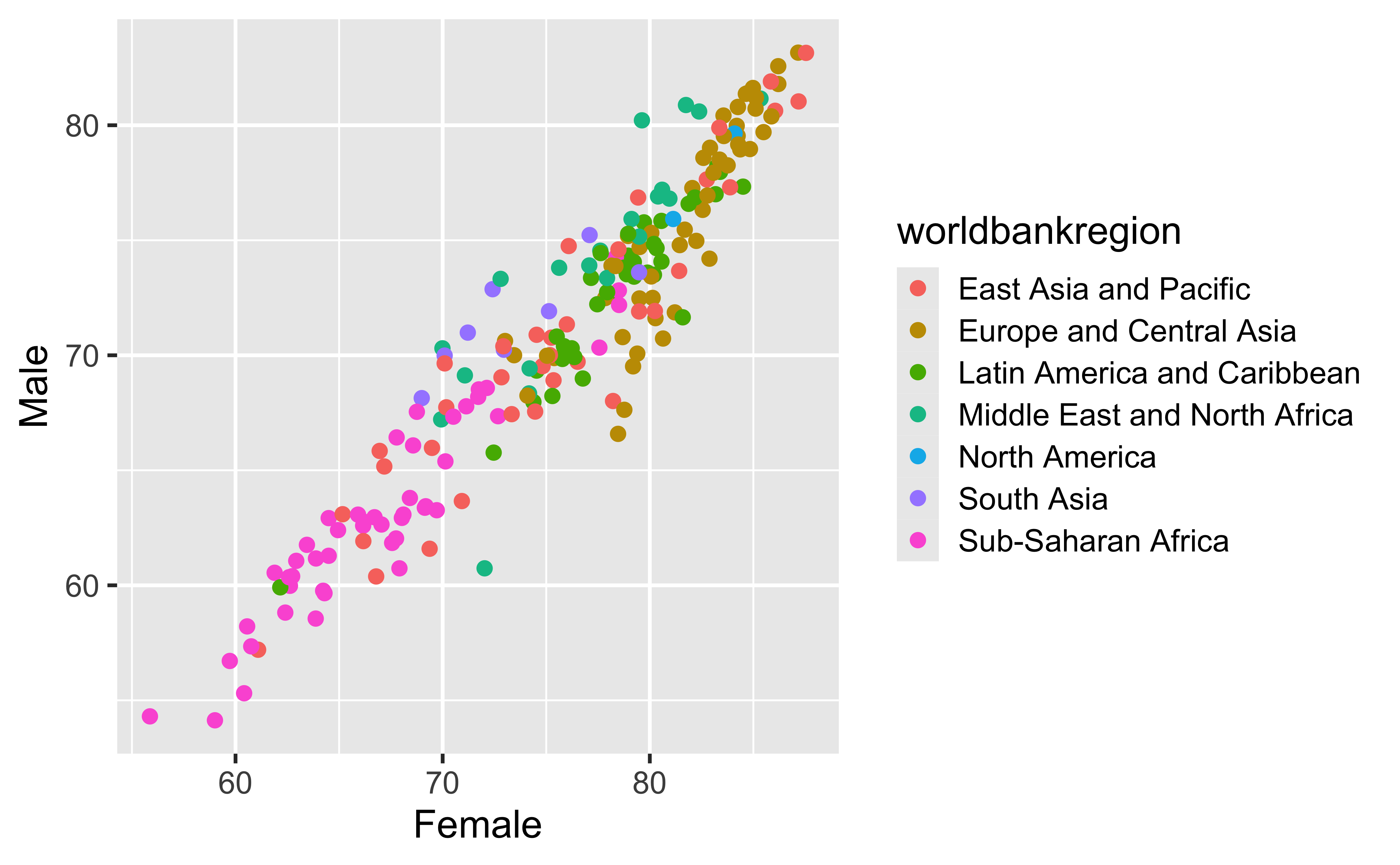
- What does the color represent?
- What overall pattern do you notice?
- What additional information would help explain the scatter?

Coding out loud
Coding out loud
Coding out loud
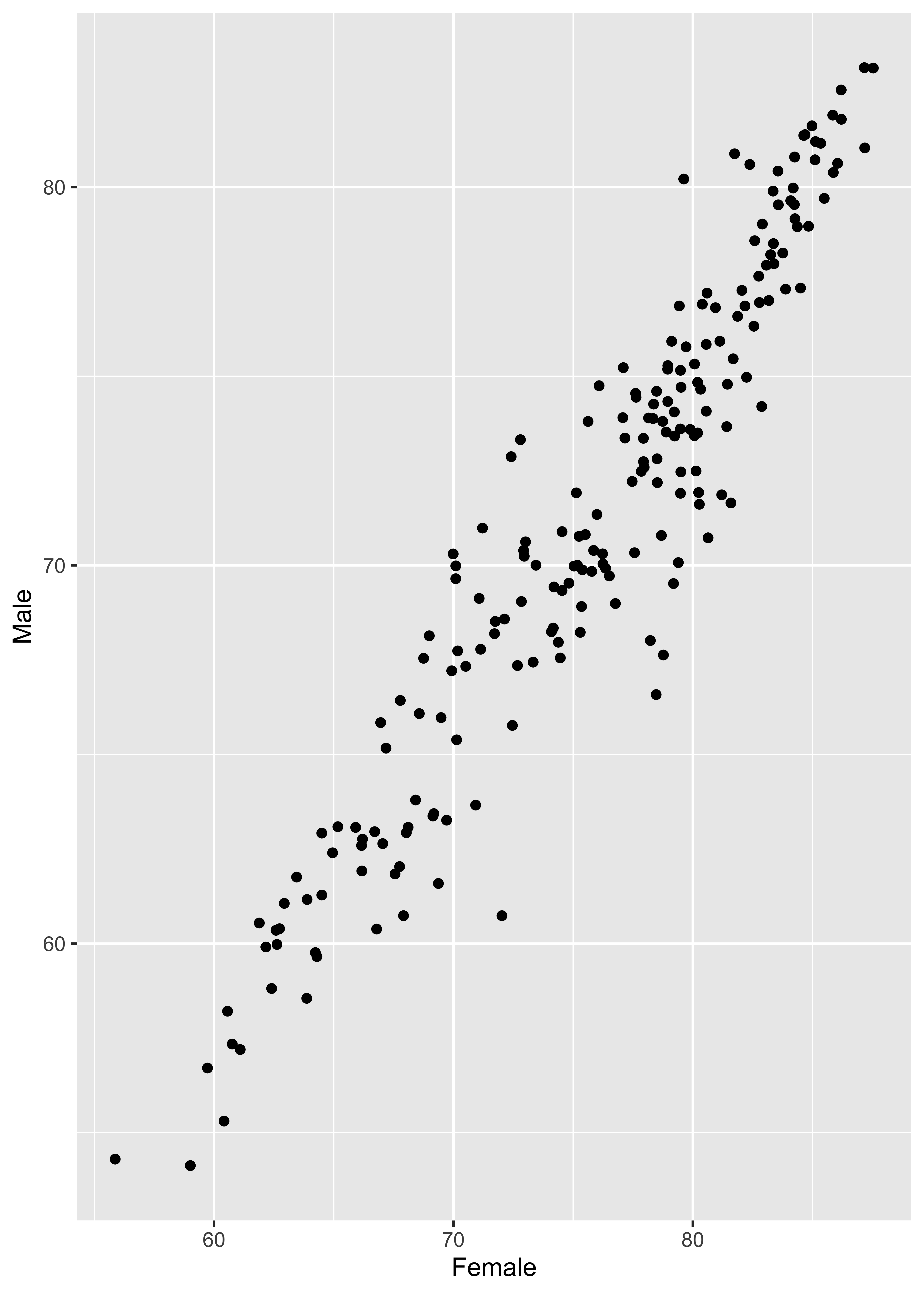
Coding out loud
Start with the
lifeexpwide2023data,
map female life expectancy to the x-axis,
map male life expectancy to the y-axis,
represent each observation with a point,
and map region to the color of each point
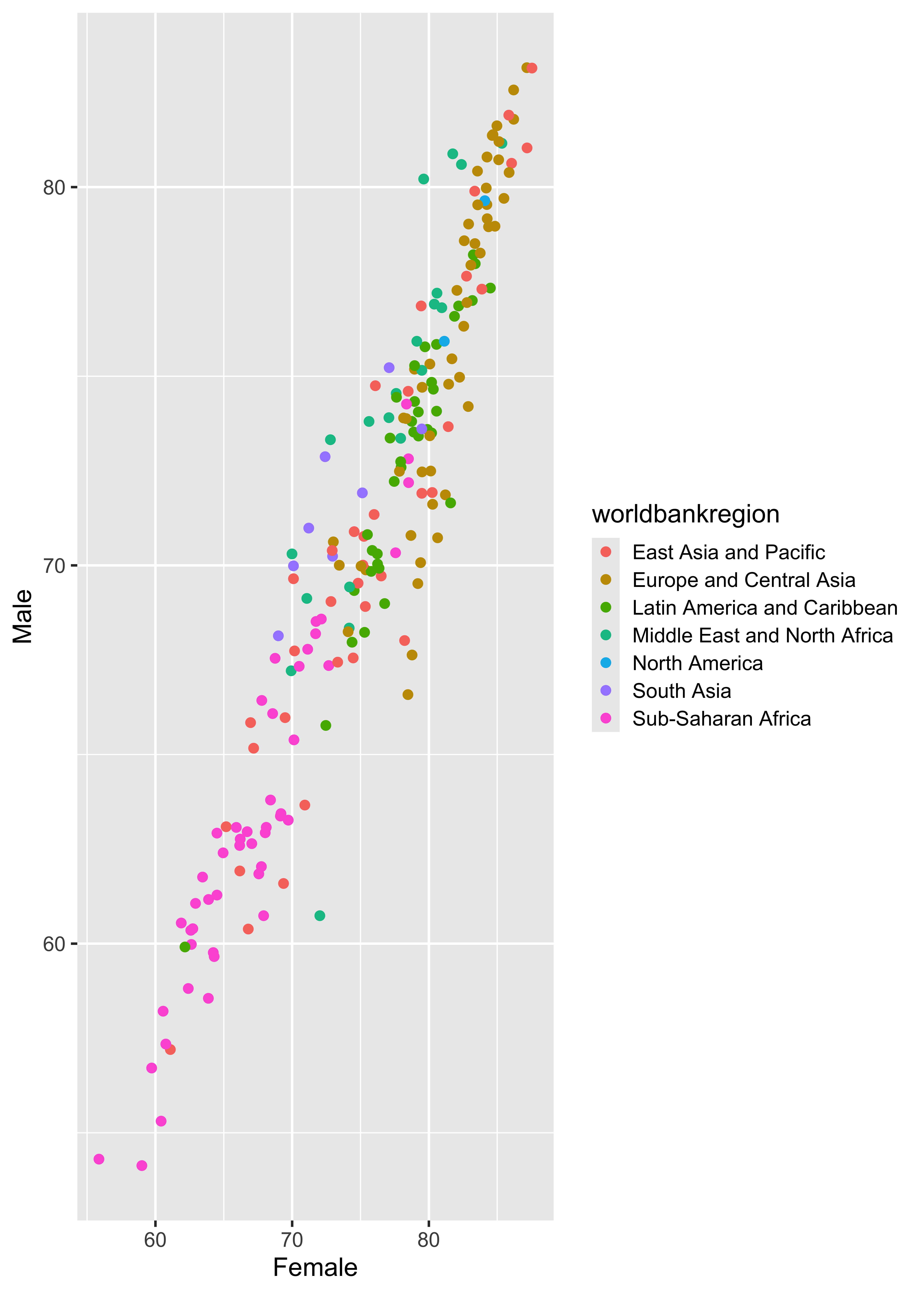
Coding out loud
Start with the
lifeexpwide2023data,
map female life expectancy to the x-axis,
map male life expectancy to the y-axis,
represent each observation with a point,
map region to the color of each point,
and title the plot “Life expectancy.”
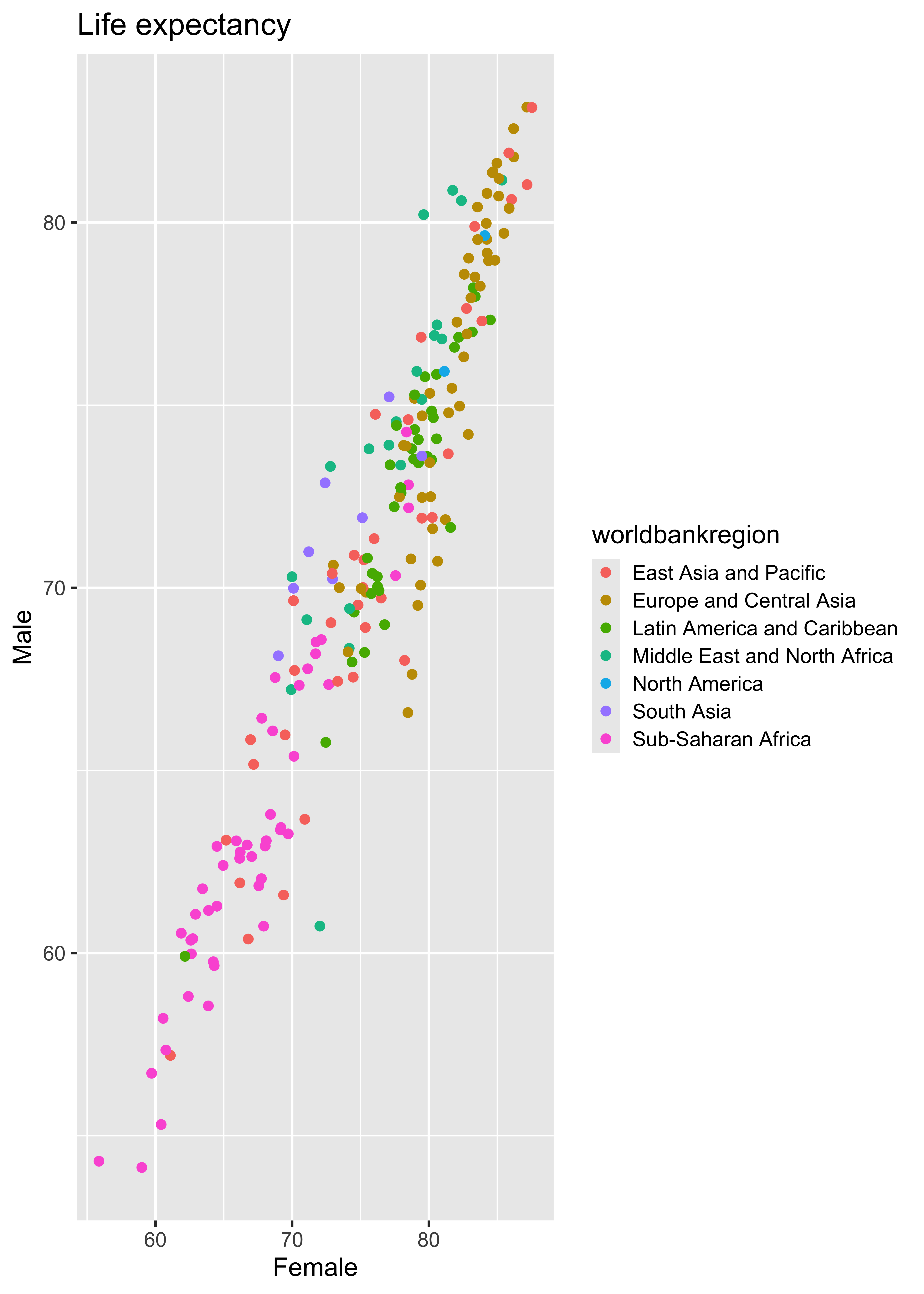
Coding out loud
Start with the
lifeexpwide2023data,
map female life expectancy to the x-axis,
map male life expectancy to the y-axis,
represent each observation with a point,
map region to the color of each point,
title the plot “Life expectancy,” and add the subtitle “2023.”
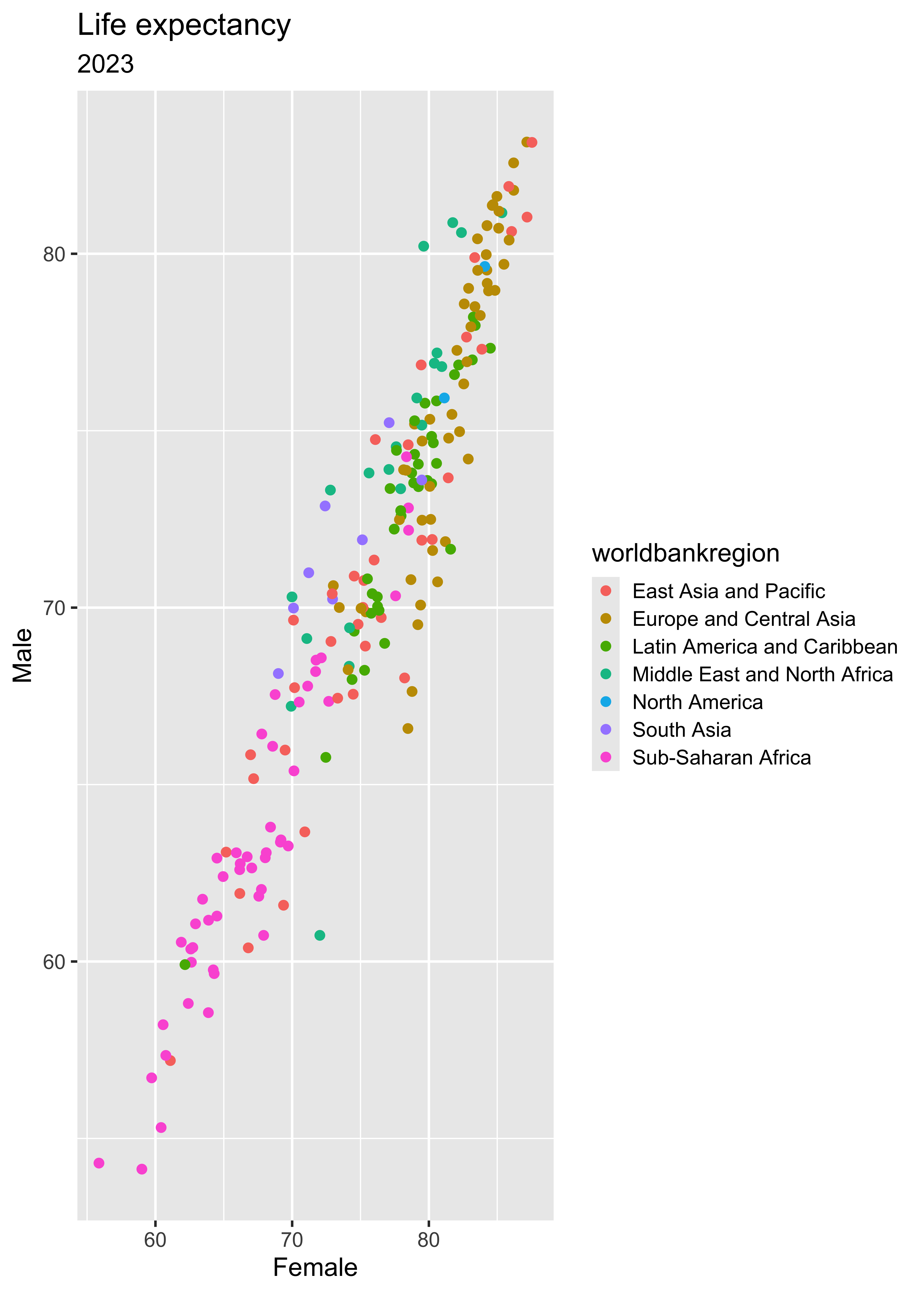
Coding out loud
Start with the
lifeexpwide2023data, map female life expectancy to the x-axis, map male life expectancy to the y-axis, represent each observation with a point, map region to the color of each point, title the plot “Life expectancy,” add the subtitle “2023,” and refine x and y axis labels.
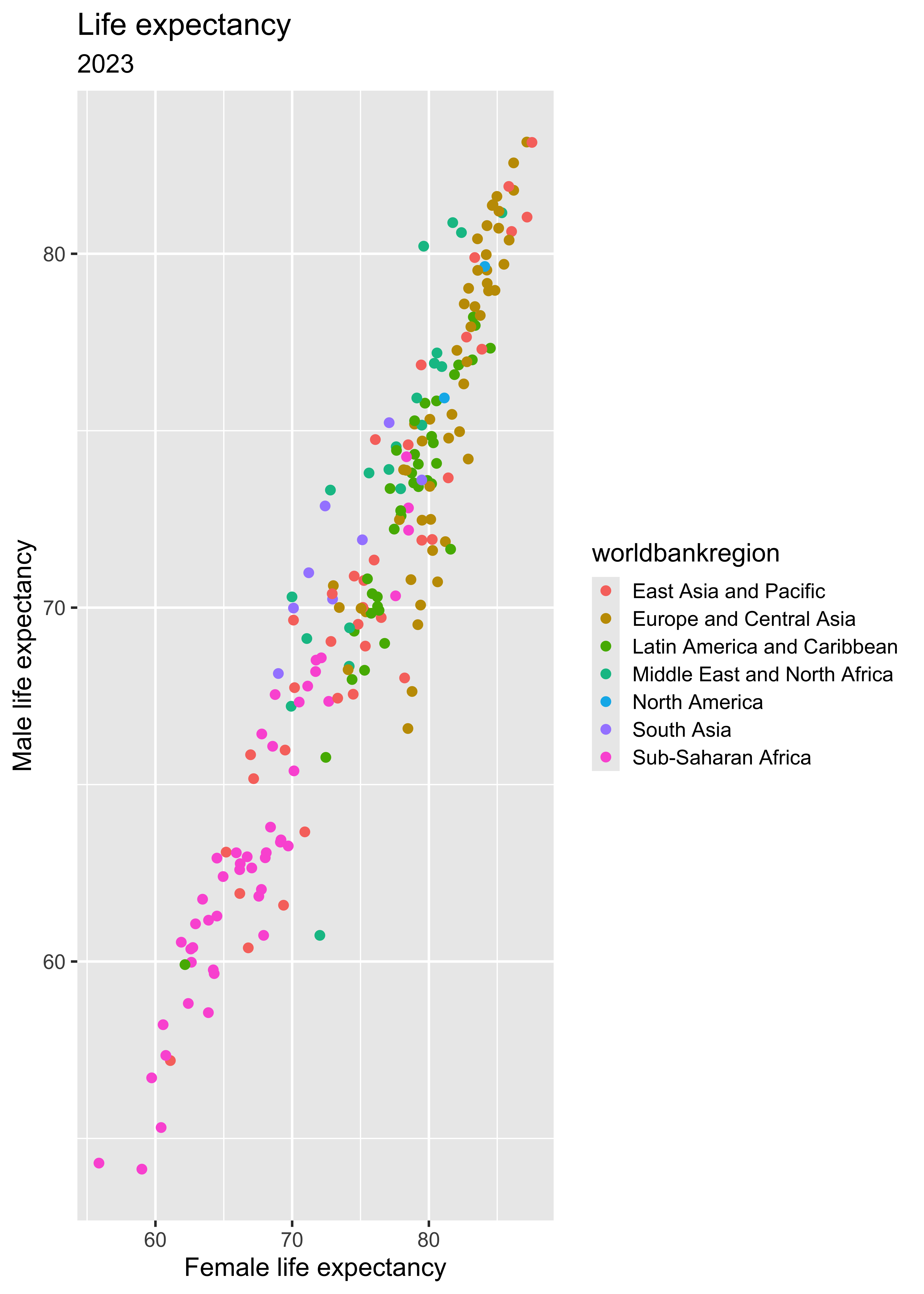
Coding out loud
Start with the
lifeexpwide2023data, map female life expectancy to the x-axis, map male life expectancy to the y-axis, represent each observation with a point, map region to the color of each point, title the plot “Life expectancy,” add the subtitle “2023,” refine the axis labels, and fix the legend label.
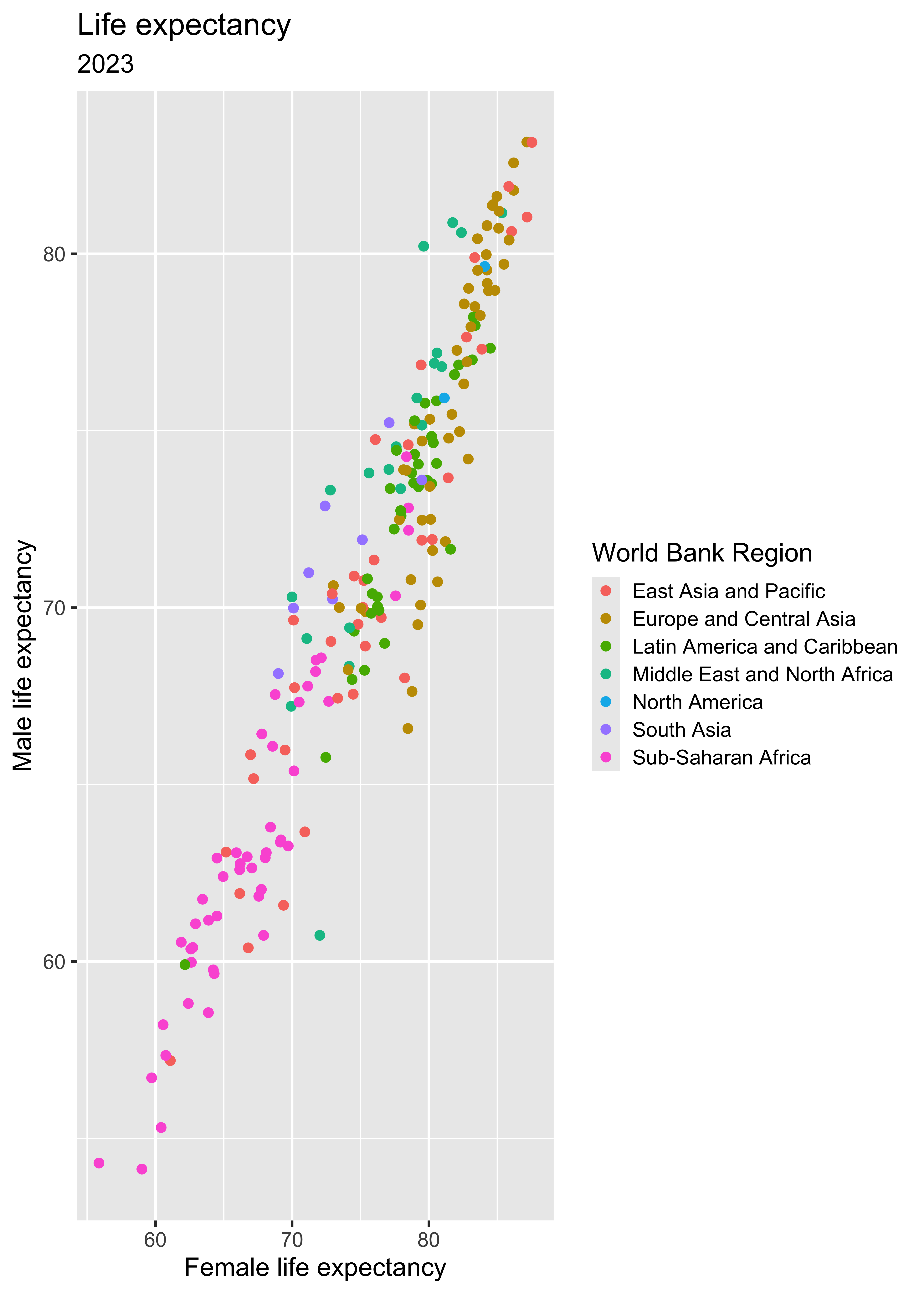
Coding out loud
Start with the
lifeexpwide2023data, map female life expectancy to the x-axis, map male life expectancy to the y-axis, represent each observation with a point, map region to the color of each point, title the plot “Life expectancy,” add the subtitle “2023,” refine the axis labels, fix the legend label, and add a caption for data source.
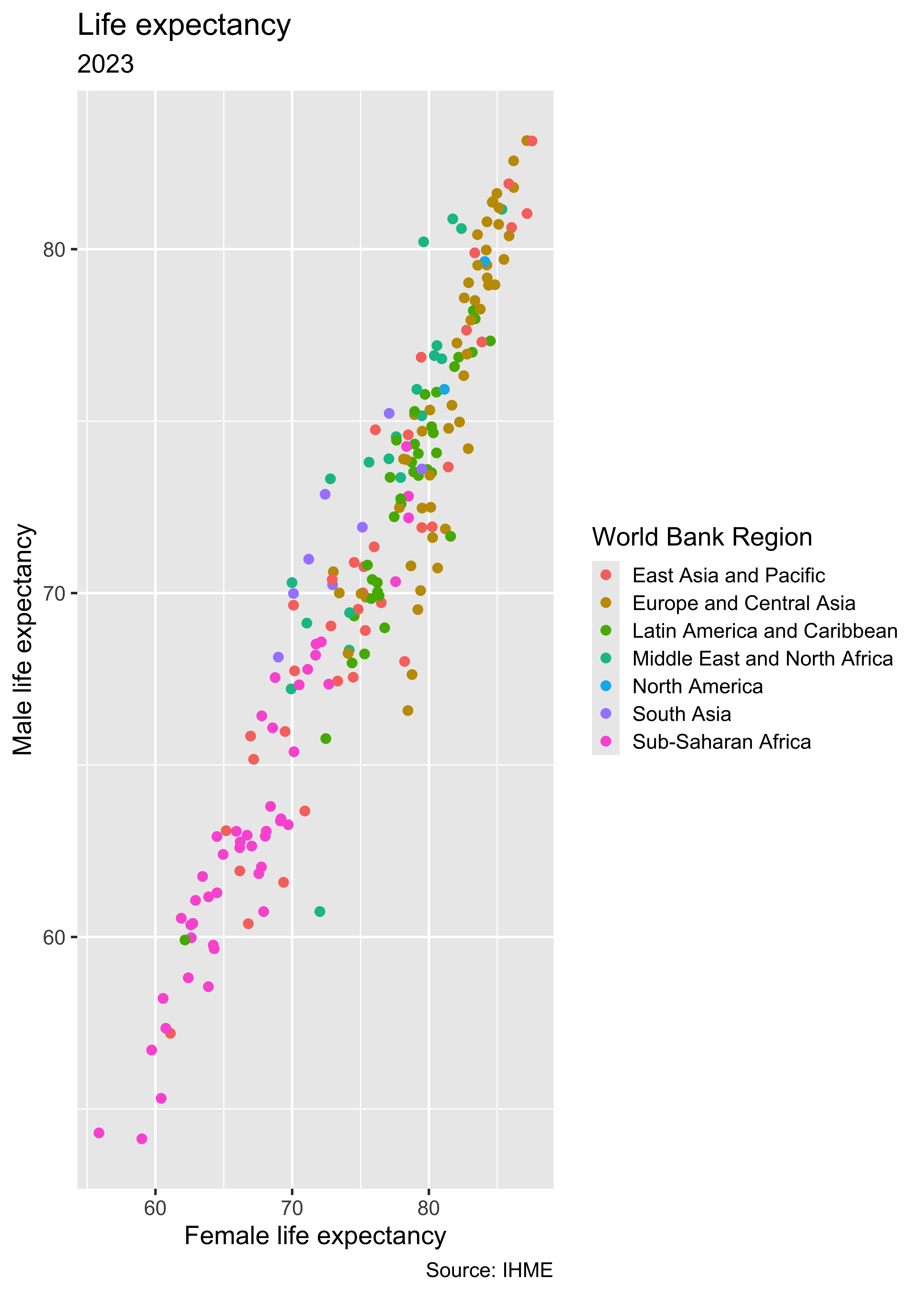
Color
Shape
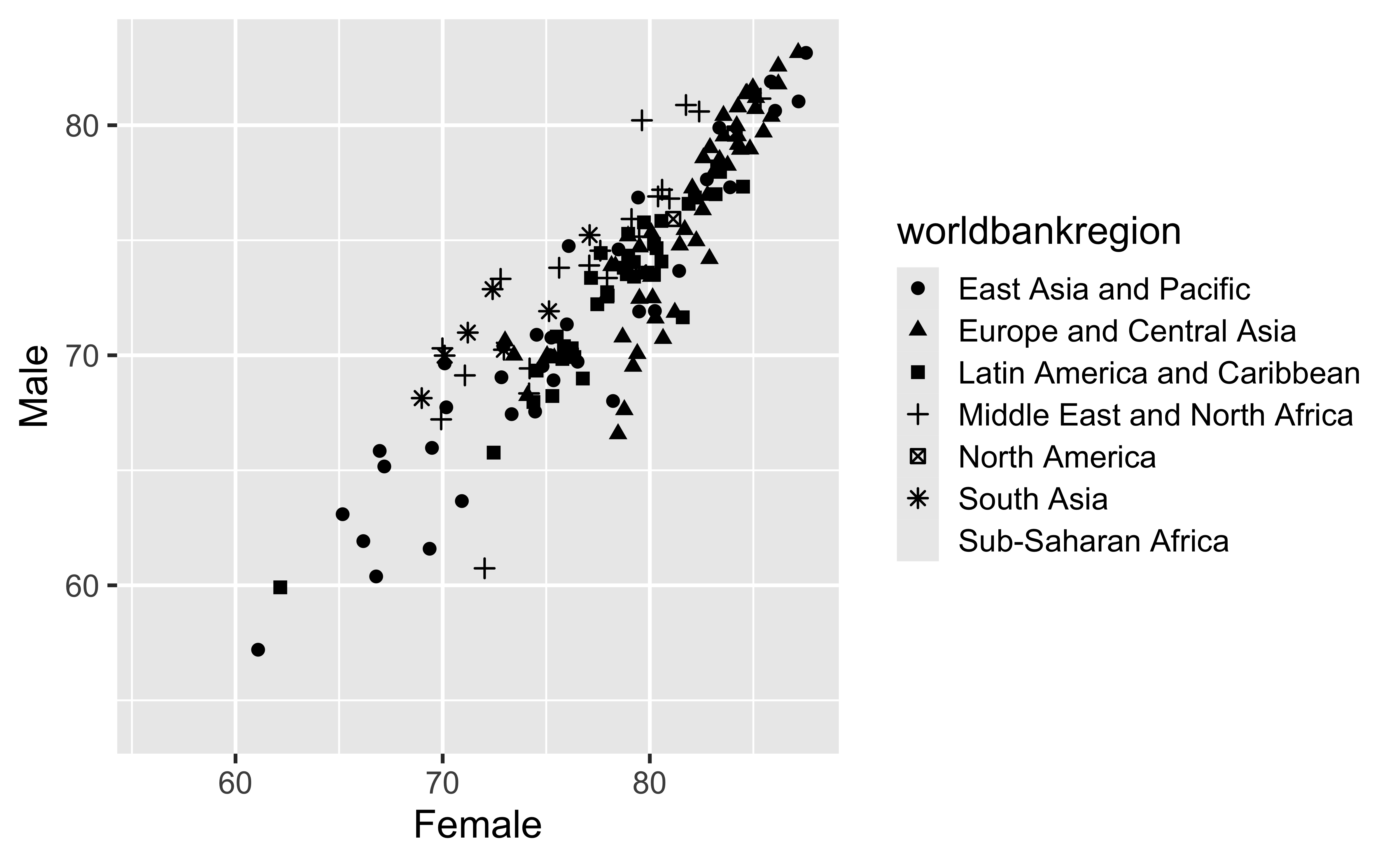
Oops! Only 6 shapes are available, so this isn’t a good option for our more than 6 regions! Let’s fix that.
Shape, take 2
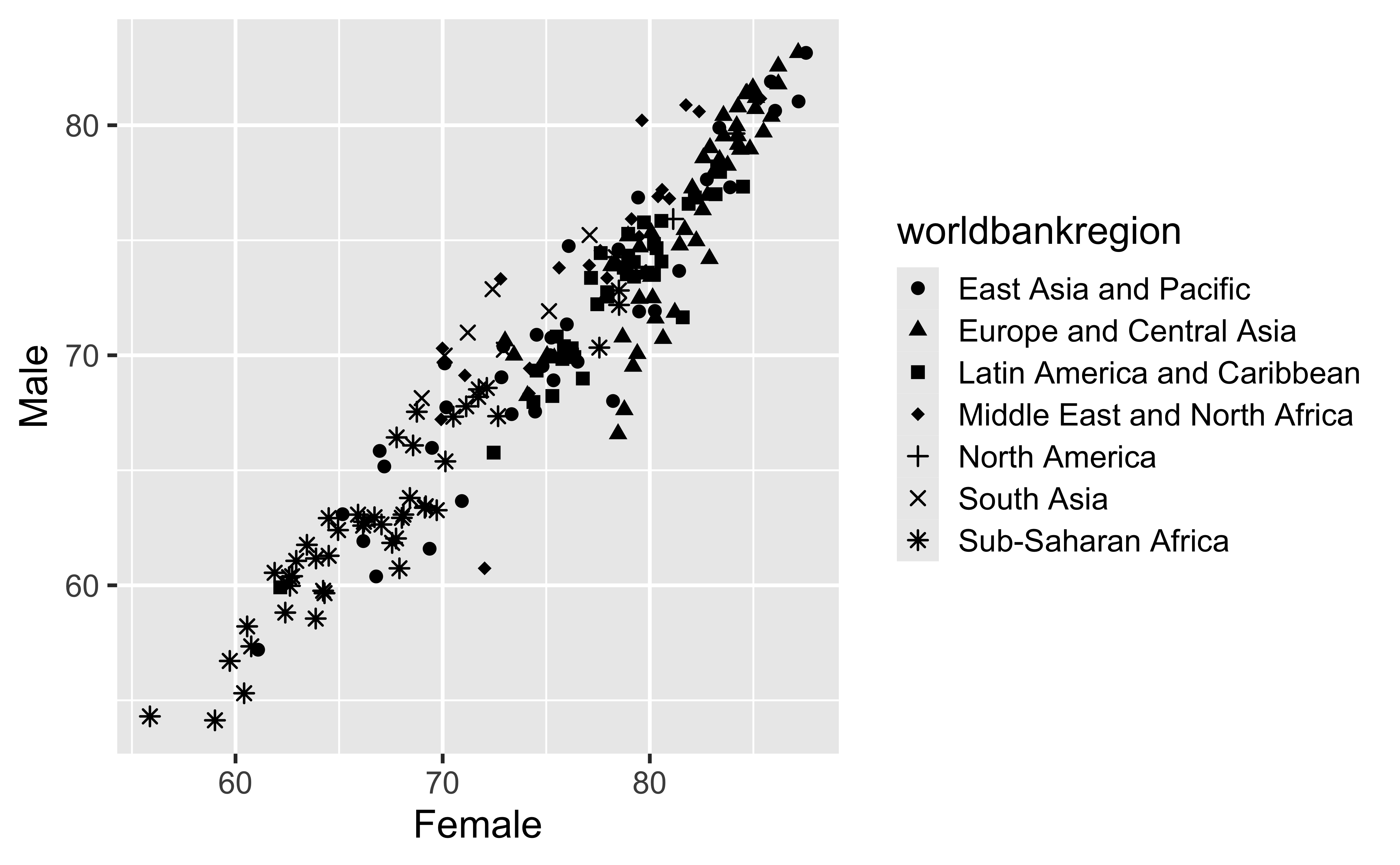
Oops! Only 6 shapes are available, so this isn’t a good option for our more than 6 regions! Let’s fix that.
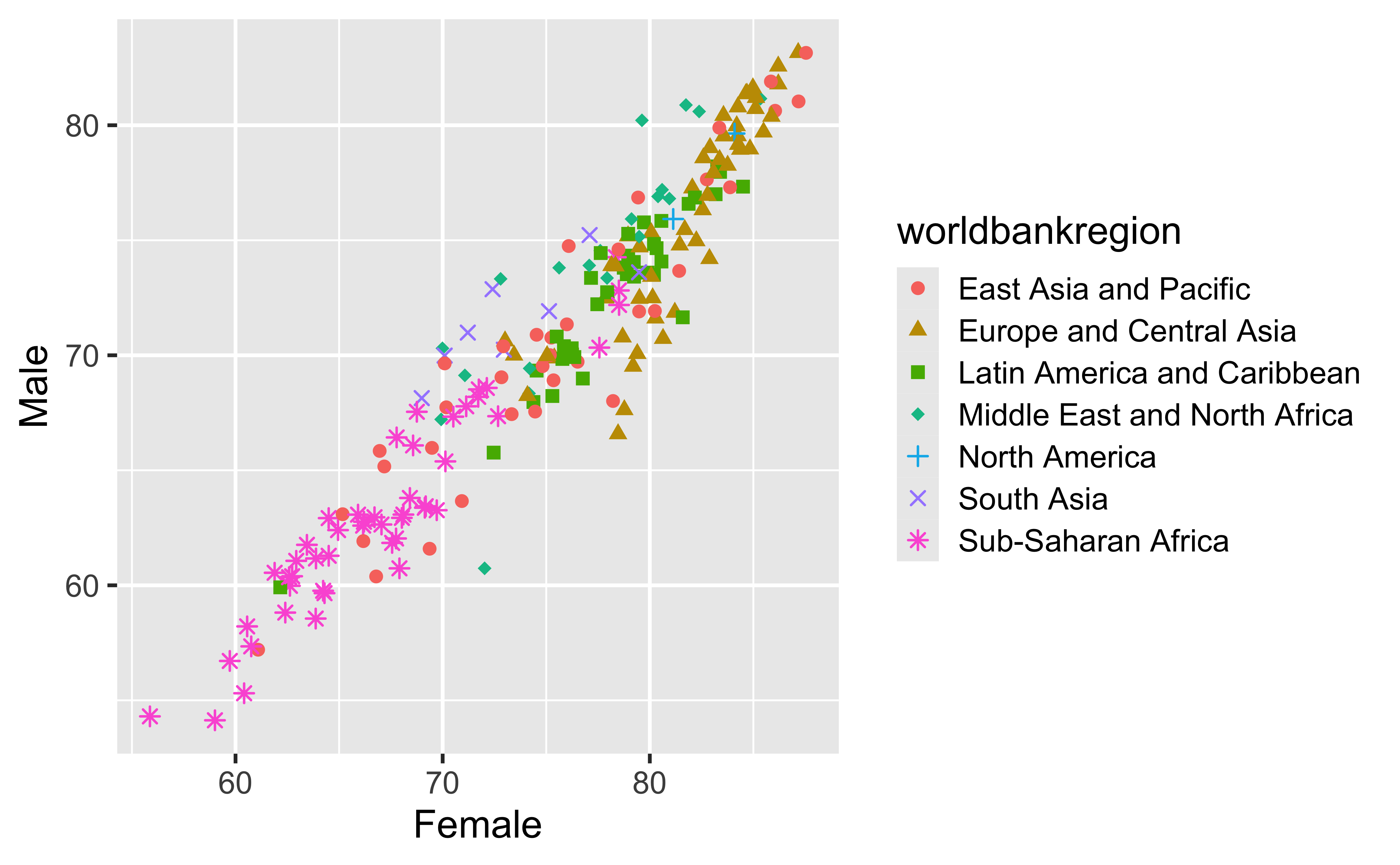
Shape
Can also map to the same variable as color (helps for color vision deficiency)
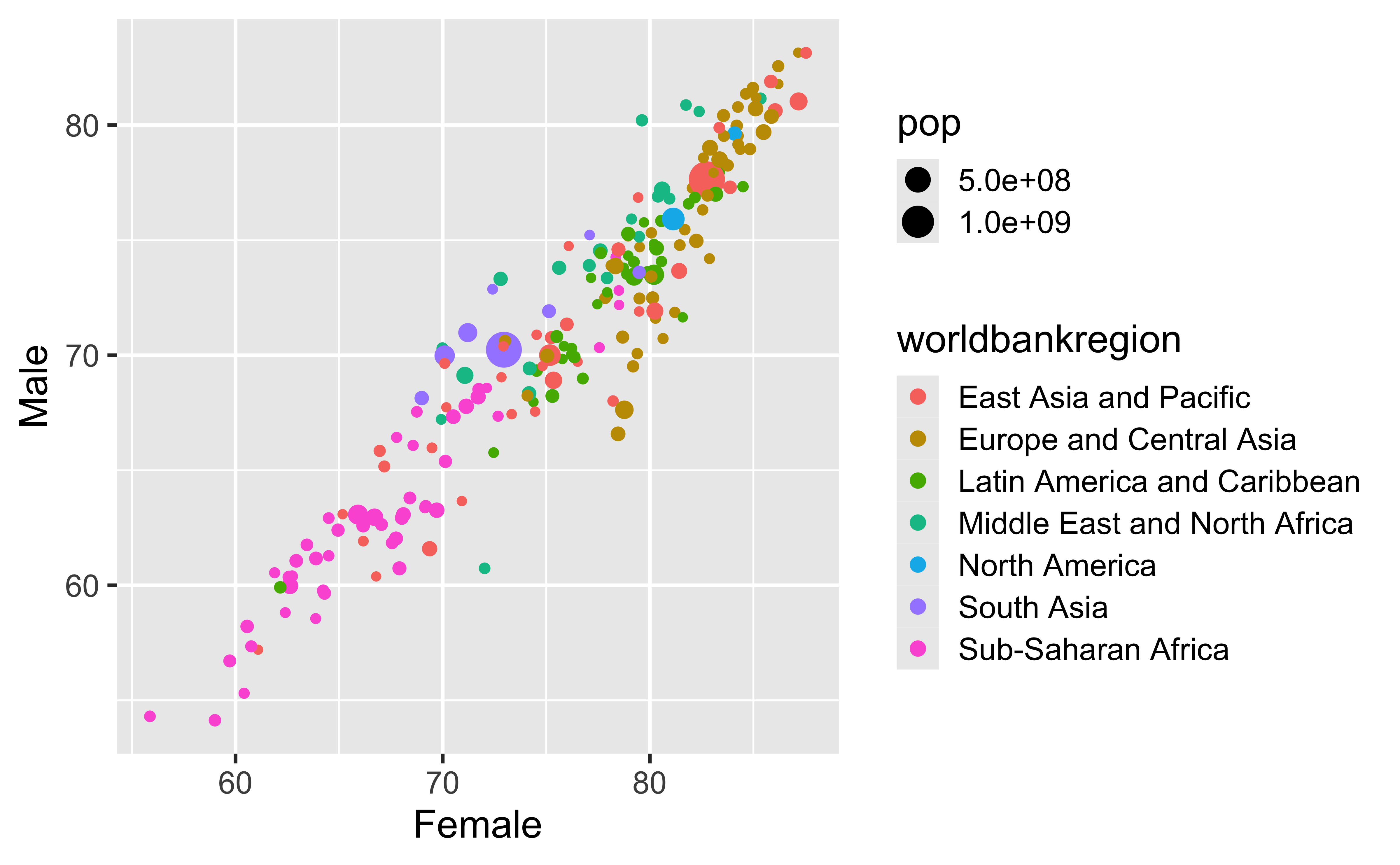
Size
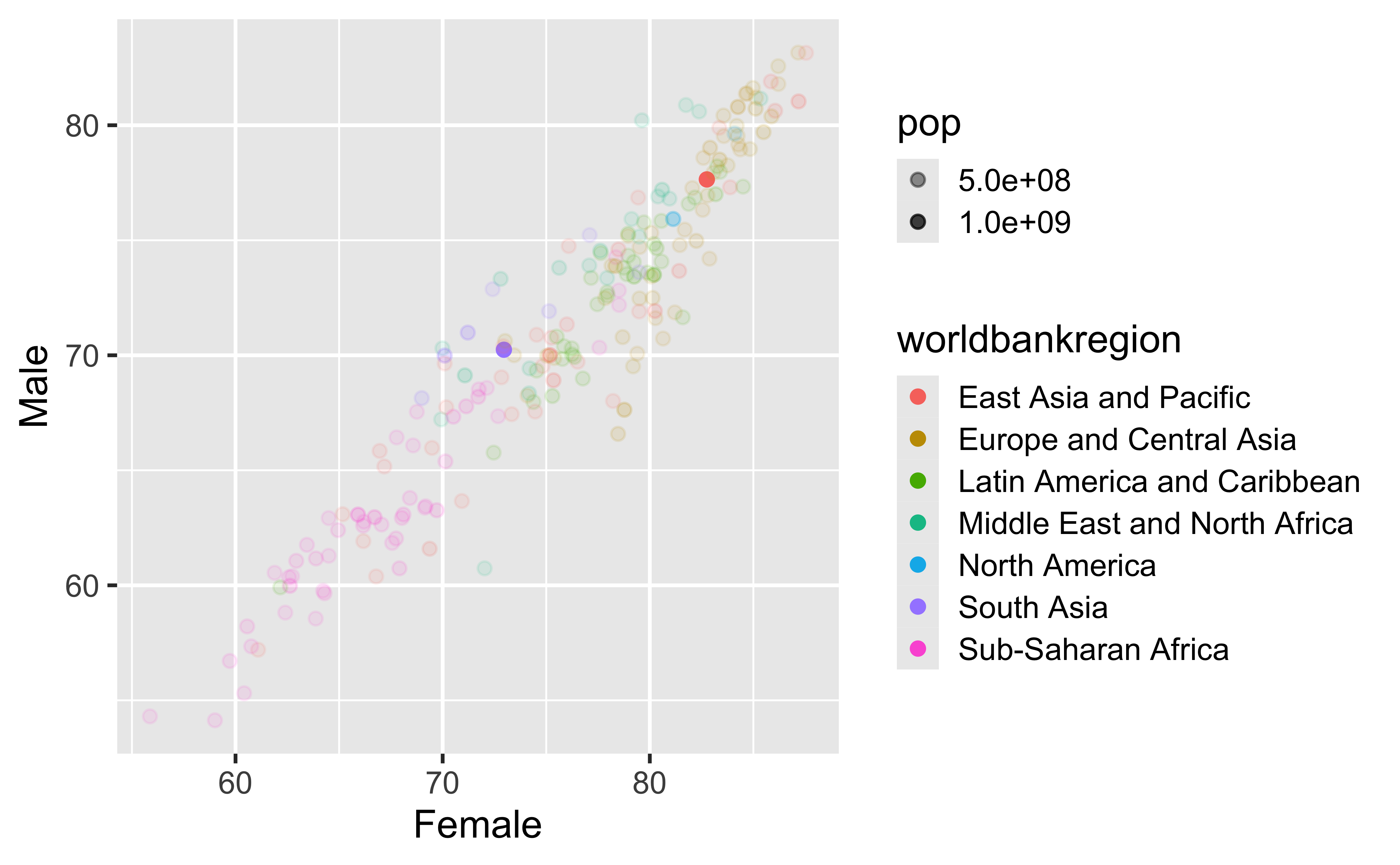
Alpha (Transparency)
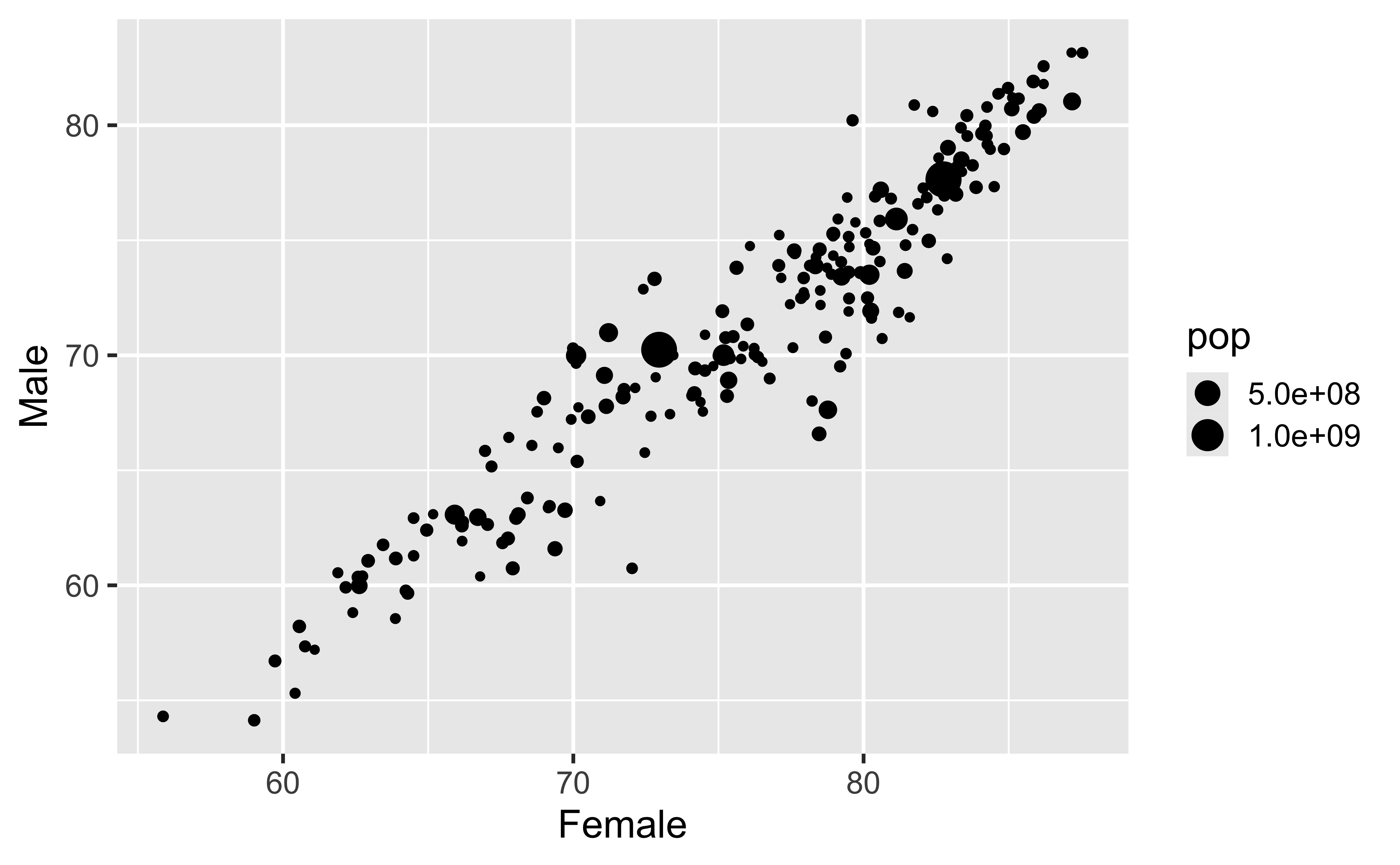
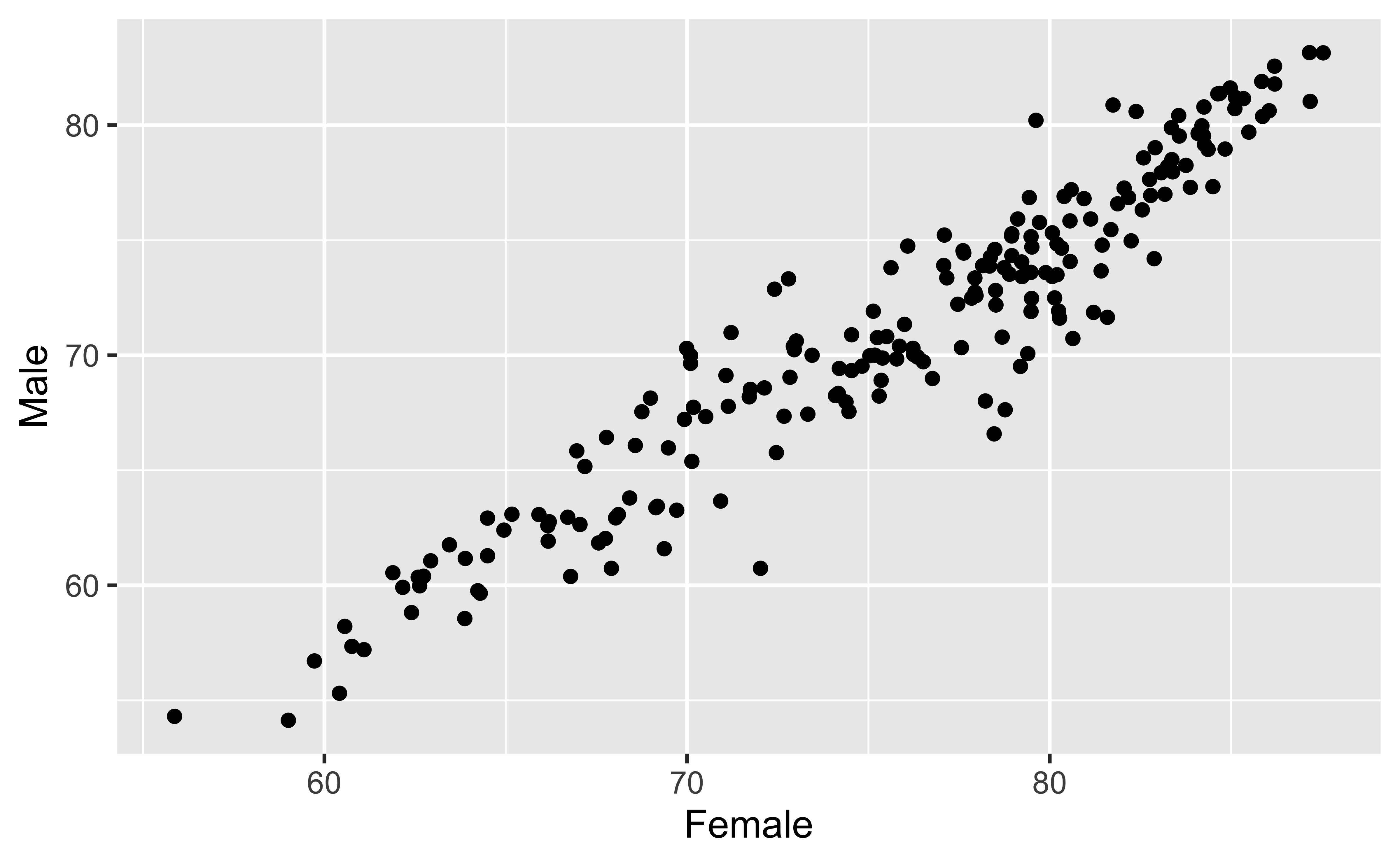
Mapping vs. setting aesthetics
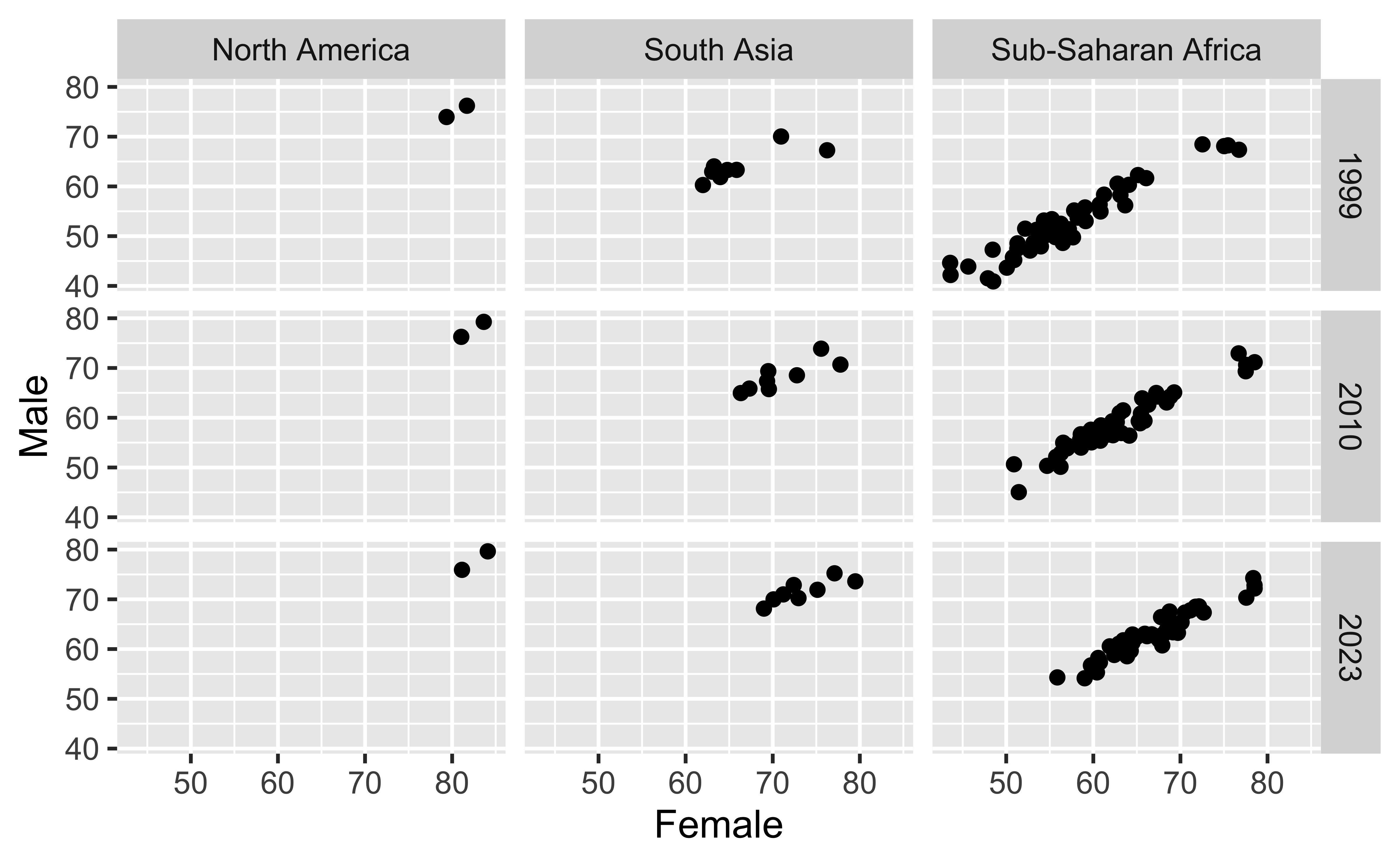
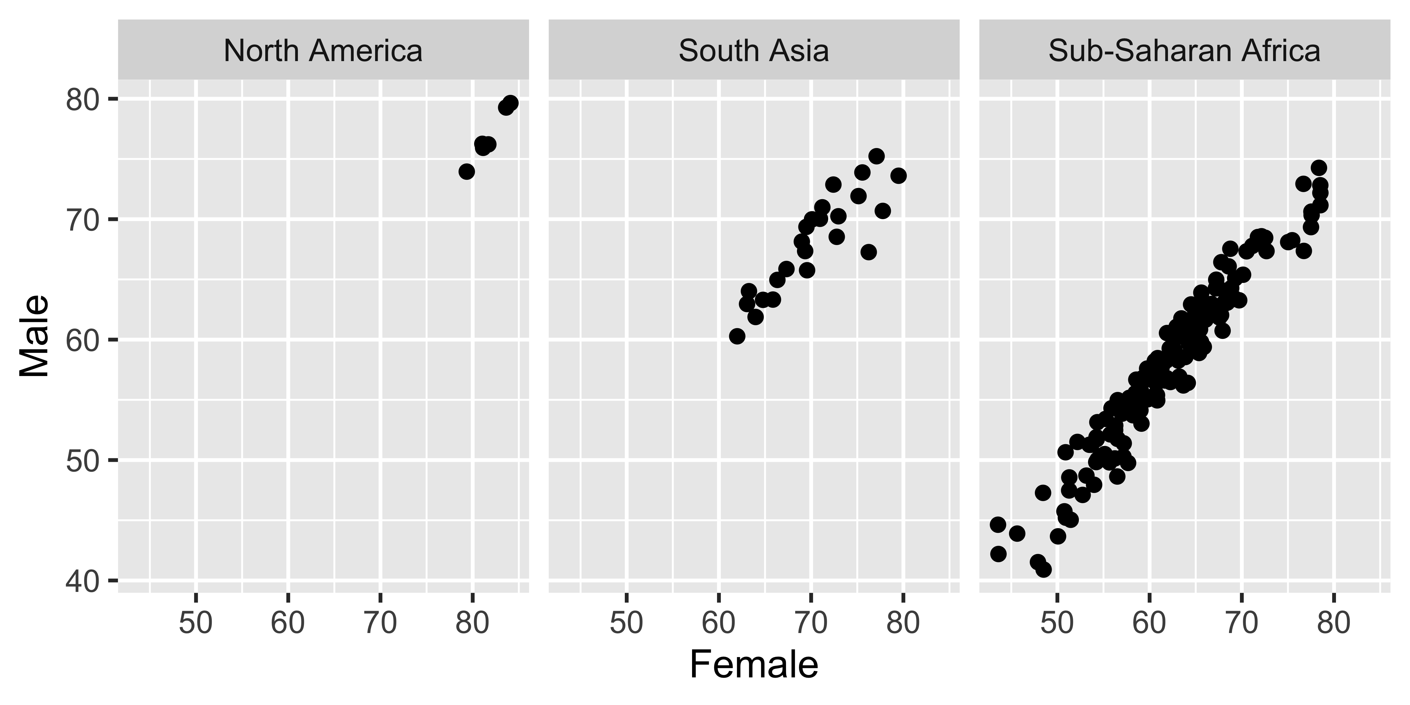
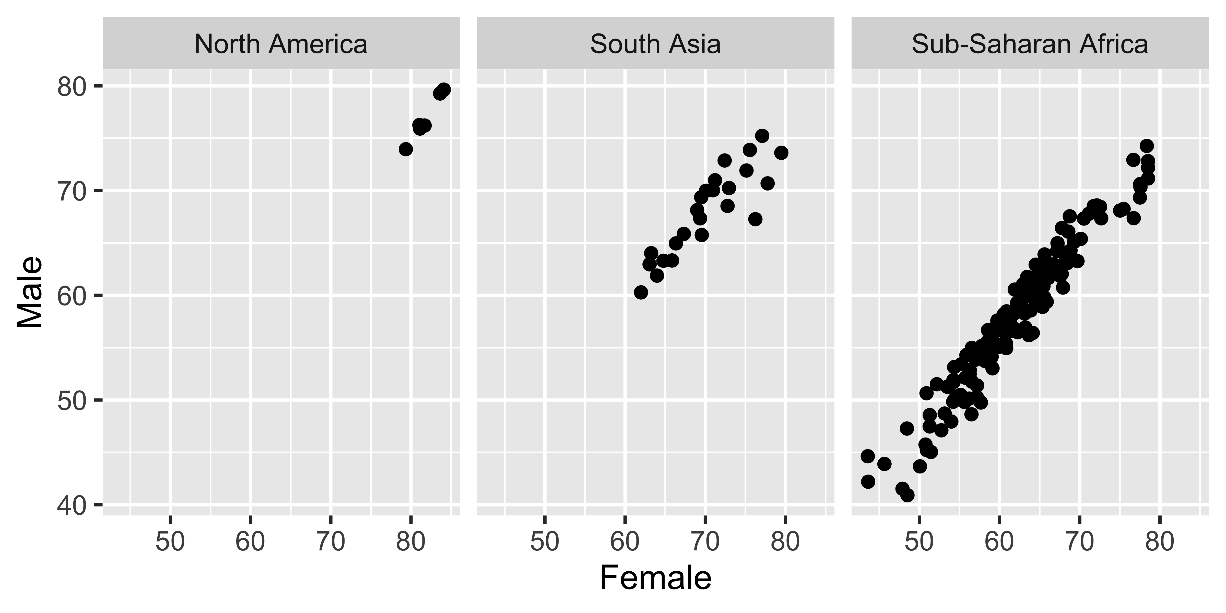
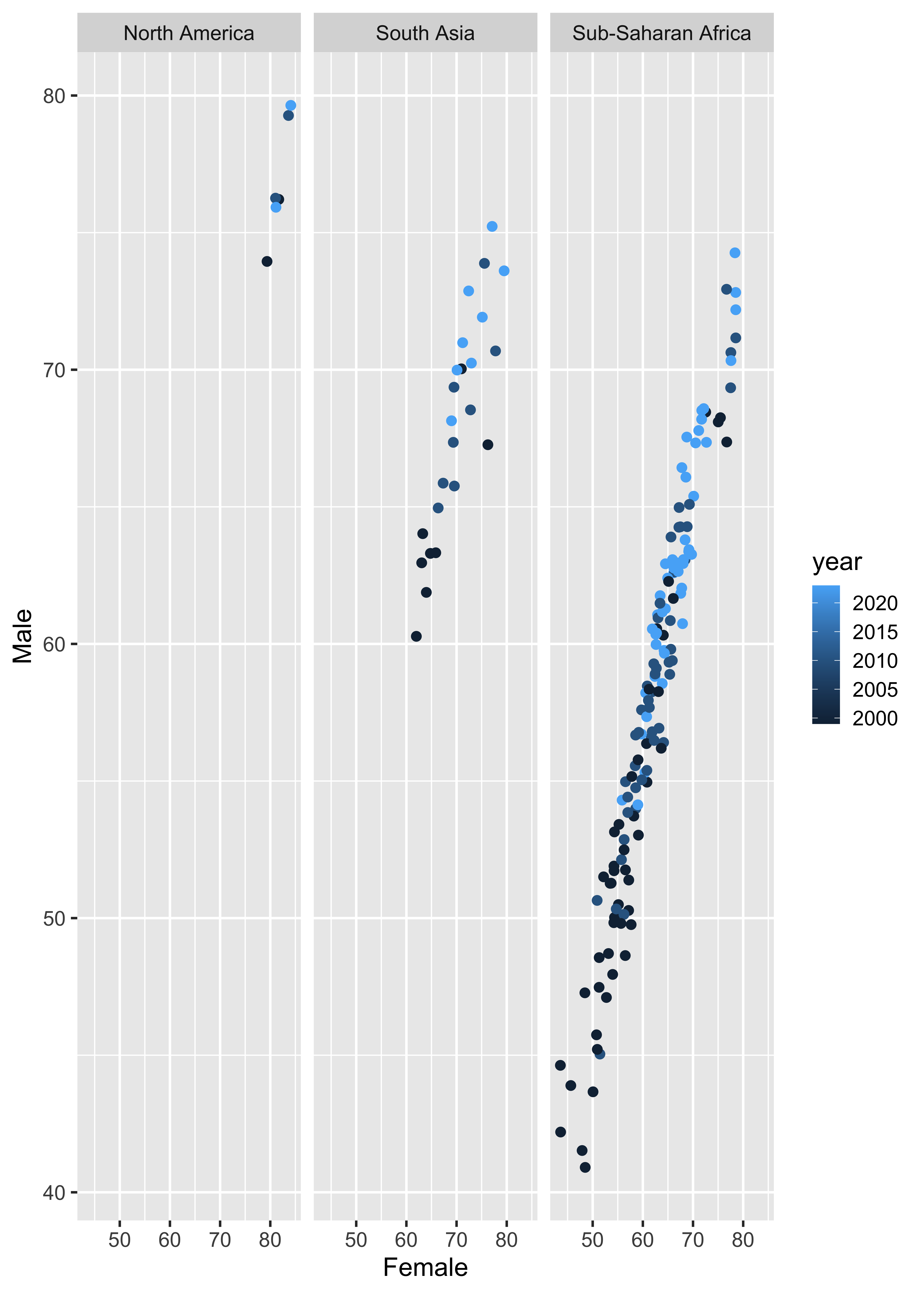
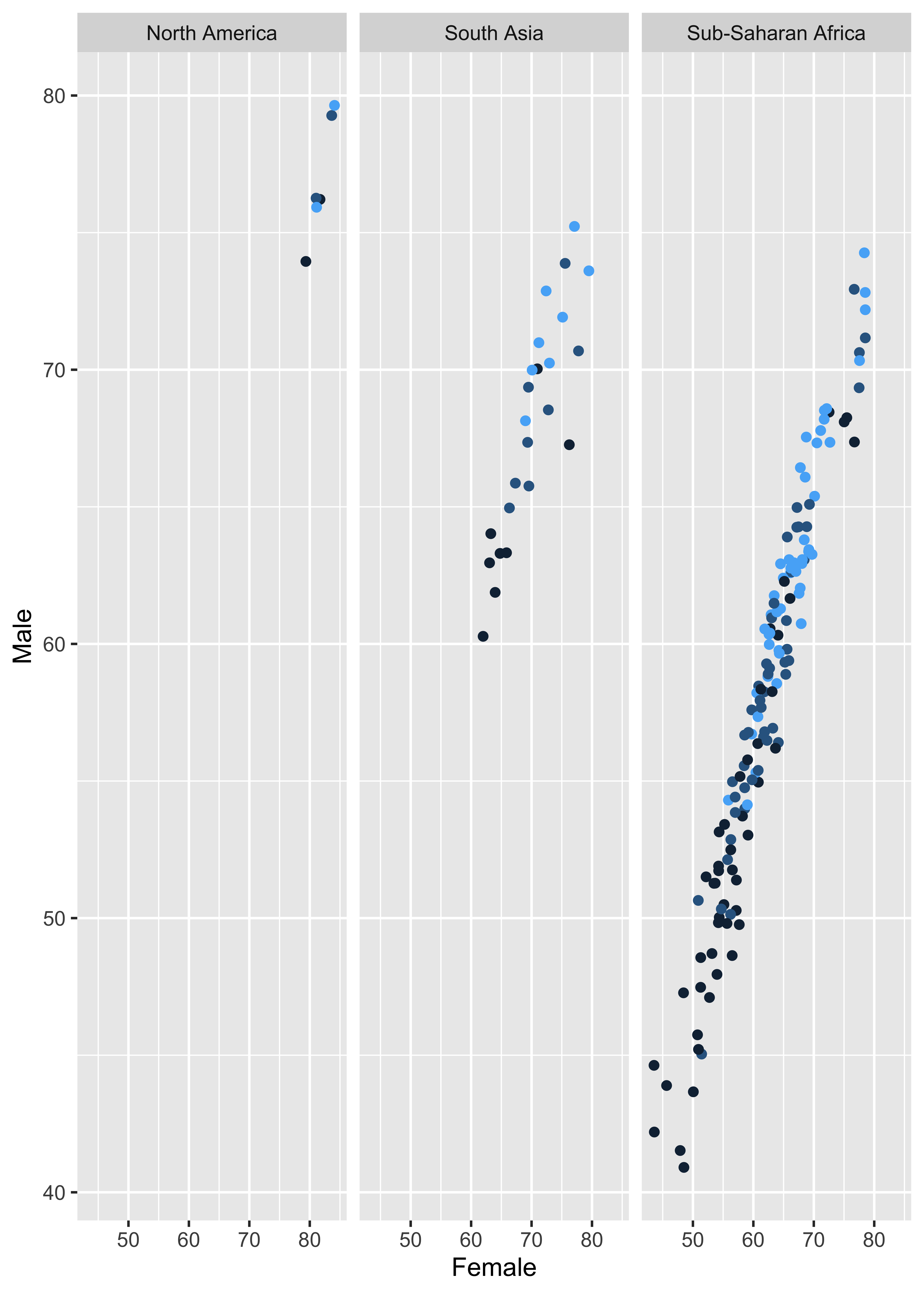
Faceting