Introduction to Modelling

Introduction to Global Health Data Science

Amy Herring

Duke University
STA/GLHLTH 198 Fall 2026

2026-10-14

Packages

library(tidyverse)
library(tidymodels)
library(readr)

Modelling

  • Use models to explain the relationship between variables and to make predictions
  • For now we will focus on linear models (but remember there are many many other types of models too!)
Recall: Sample Standard Deviation

The sample standard deviation, \(s\), measures the typical distance of observations from the sample mean.

\[ s = \sqrt{\frac{\sum_{i=1}^{n}(y_i-\bar{y})^2}{n-1}} \]

where:

  • \(y_i\) = each observed value
  • \(\bar{y}\) = sample mean
  • \(n\) = sample size

Note

The standard deviation is expressed in the same units as the original variable.

Larger \(s\) → more variability
Smaller \(s\) → less variability

Correlation coefficient, \(r\)

The correlation coefficient, \(r\), measures the direction and strength of the linear relationship between two quantitative variables.

\[ r = \frac{1}{n-1} \sum_{i=1}^{n} \left(\frac{x_i-\bar{x}}{s_x}\right) \left(\frac{y_i-\bar{y}}{s_y}\right) \]

where:

  • \(\bar{x}\) and \(\bar{y}\) are the sample means
  • \(s_x\) and \(s_y\) are the sample standard deviations
  • \(n\) is the number of observations

\[ -1 \leq r \leq 1 \]

\[ r = \frac{1}{n-1} \sum_{i=1}^{n} \left(\frac{x_i-\bar{x}}{s_x}\right) \left(\frac{y_i-\bar{y}}{s_y}\right) \]

Interpretation:

  • \(r > 0\): positive linear relationship
  • \(r < 0\): negative linear relationship
  • \(r \approx 0\): little or no linear relationship
  • \(|r|\) closer to 1: stronger linear relationship

Data: Artisanal and Small-Scale Gold Mining in the Peruvian Amazon

Study

A growing body of scientific work has shown that a wide variety of species are threatened by mercury pollution. We will explore data from Duke researcher Prof. Bill Pan, collected in the Peruvian Amazon. He gives a thorough introduction to artisanal and small-scale gold mining in this environment here.

Mercury and Assets

Are wealthier individuals less likely to have high mercury exposures?

Today we will explore the relationship between levels of mercury in hair and an index measuring socio-economic position as a function of household assets. Note that asset-based indices are not at all a perfect proxy and may perform poorly, particularly in low income countries (the World Bank classifies Peru as an upper-middle income country).

Because the scale of this variable is not easily interpreted, we will convert it to standard deviation units by subtracting the means and dividing by the standard deviation (like getting a z-score). Then a one-unit increase in the variable is a one standard deviation increase.

Data Manipulation

mercury <- readr::read_csv("../data/mercury_reg.csv")
mercury <-
  mercury %>%
  # scale() subtracts the mean and divides by the SD to make the units "standard deviations" like a z-score
  mutate(assets_sc=scale(SESassets)) %>%
  #another variable we may use later
  mutate(form_min_sc=scale(FM_buffer)) %>%
  #so I don't have to remember coding
  mutate(sex,sex_cat=ifelse(sex==1,"Male","Female")) %>%
  mutate(native,native_cat=ifelse(native==1,"Native","Non-native")) 

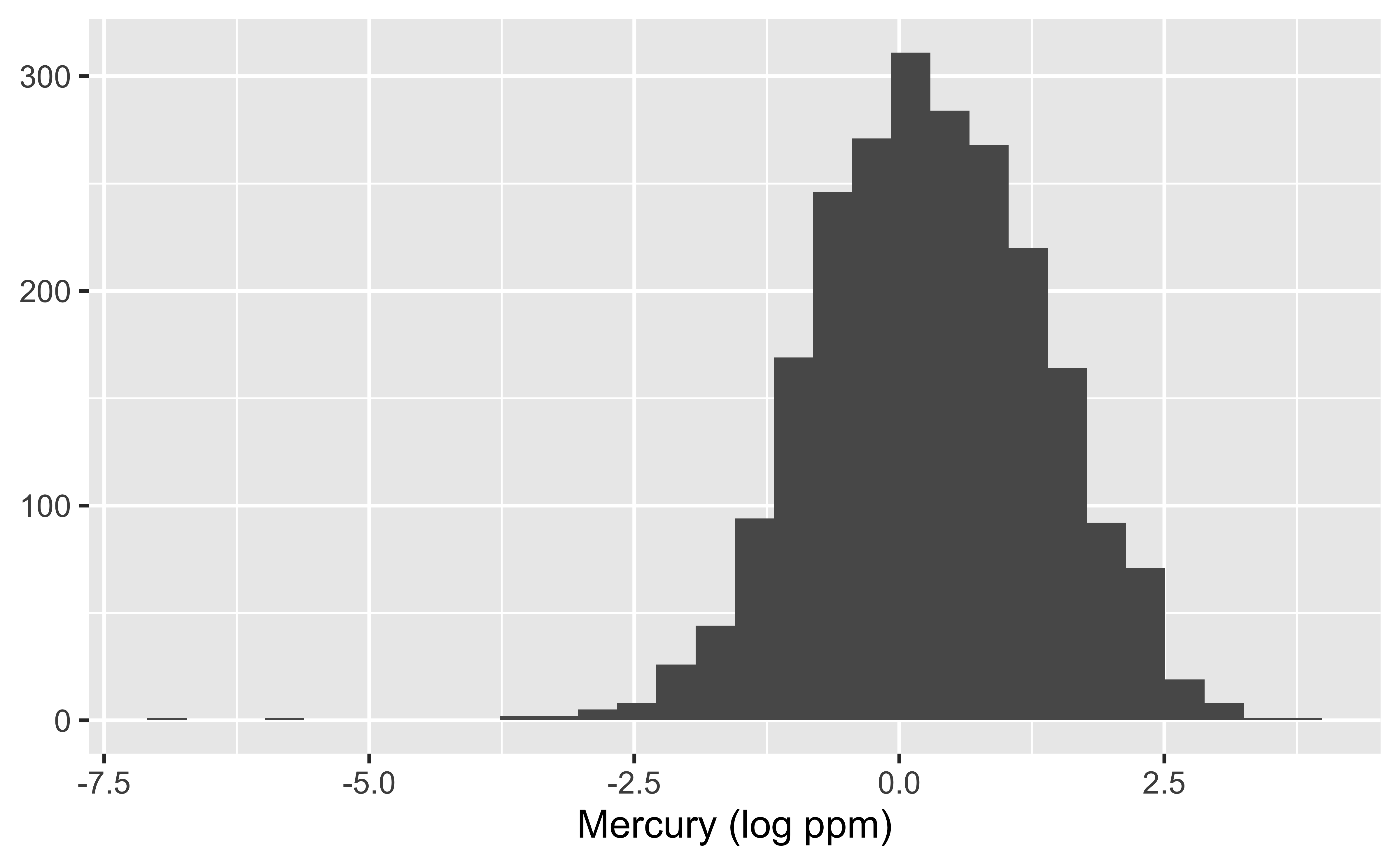
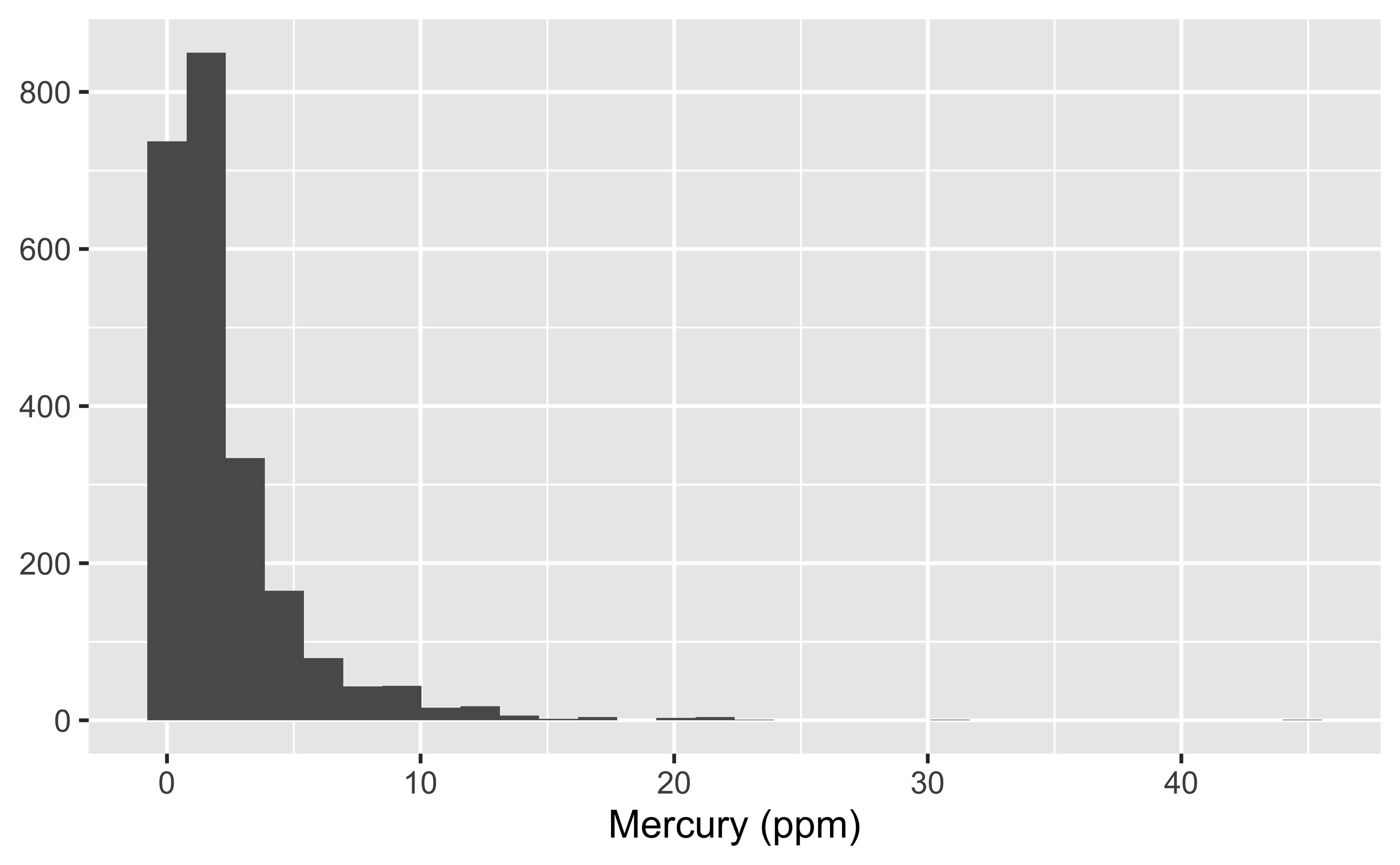
The distribution of hair mercury in ppm is skewed.
# lhairHg is the natural log of mercury in hair
# this code puts it back on the ppm scale
ggplot(data = mercury, aes(x = exp(lhairHg))) +
  geom_histogram() +
  labs(x = "Mercury (ppm)", y = NULL)

ggplot(data = mercury, aes(x = lhairHg)) +
  geom_histogram() +
  labs(x = "Mercury (log ppm)", y = NULL)

Because the models we will discuss to start prefer data that are approximately normally distributed, we will work with the log of hair mercury concentrations.

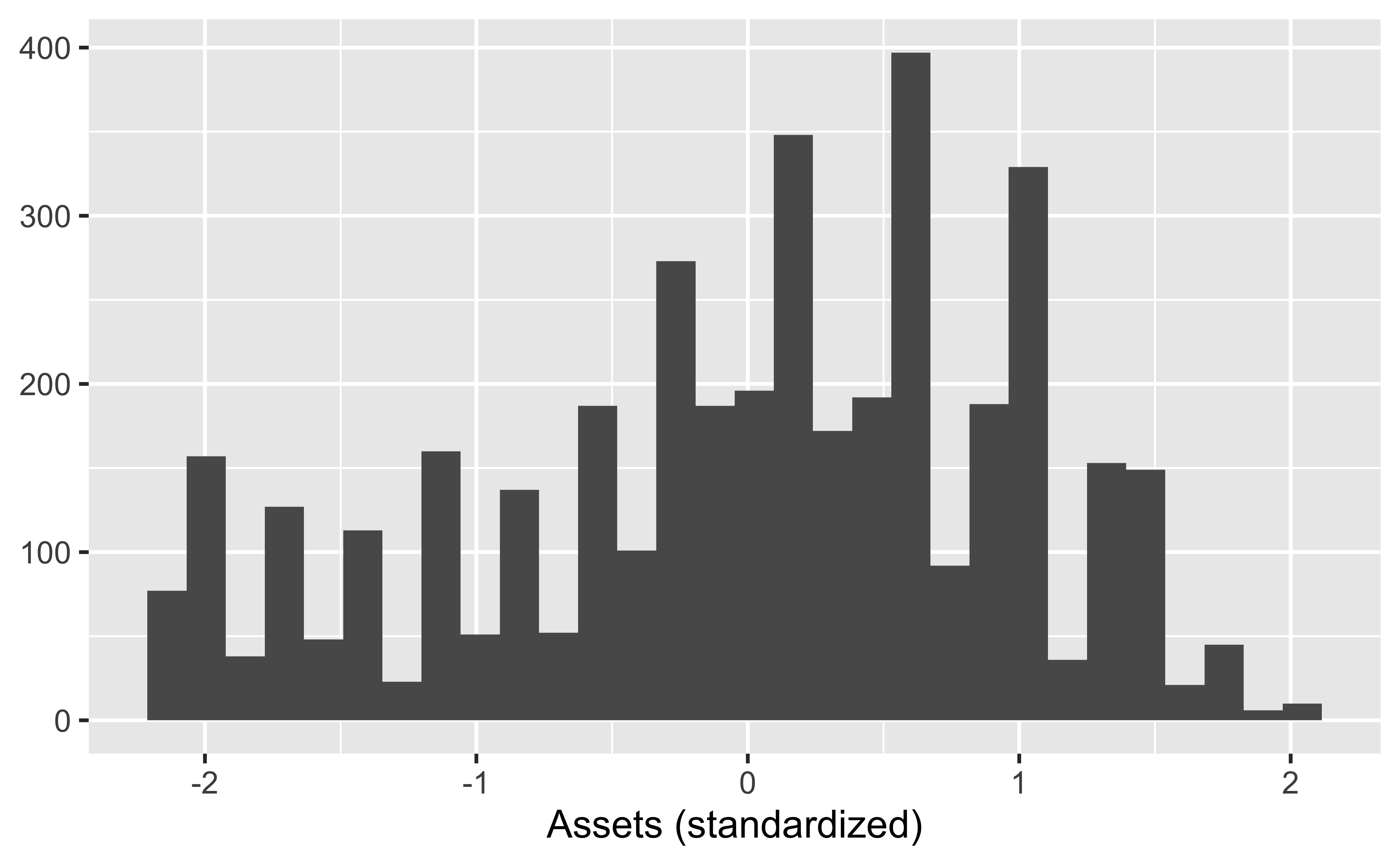
In our model, we will use assets to predict our response variable, the log of hair mercury concentrations. The regression model does not require predictors to follow any specific distributions, which is a good thing here!
ggplot(data = mercury, aes(x = assets_sc)) +
  geom_histogram() +
  labs(x = "Assets (standardized)", y = NULL)

Models as functions

  • We can represent relationships between variables using functions
  • A function is a mathematical concept: the relationship between an output and one or more inputs
    • Plug in the inputs and receive back the output
    • Example: The formula \(y = 3x + 7\) is a function with input \(x\) and output \(y\). If \(x\) is \(5\), \(y\) is \(22\), \(y = 3 \times 5 + 7 = 22\)

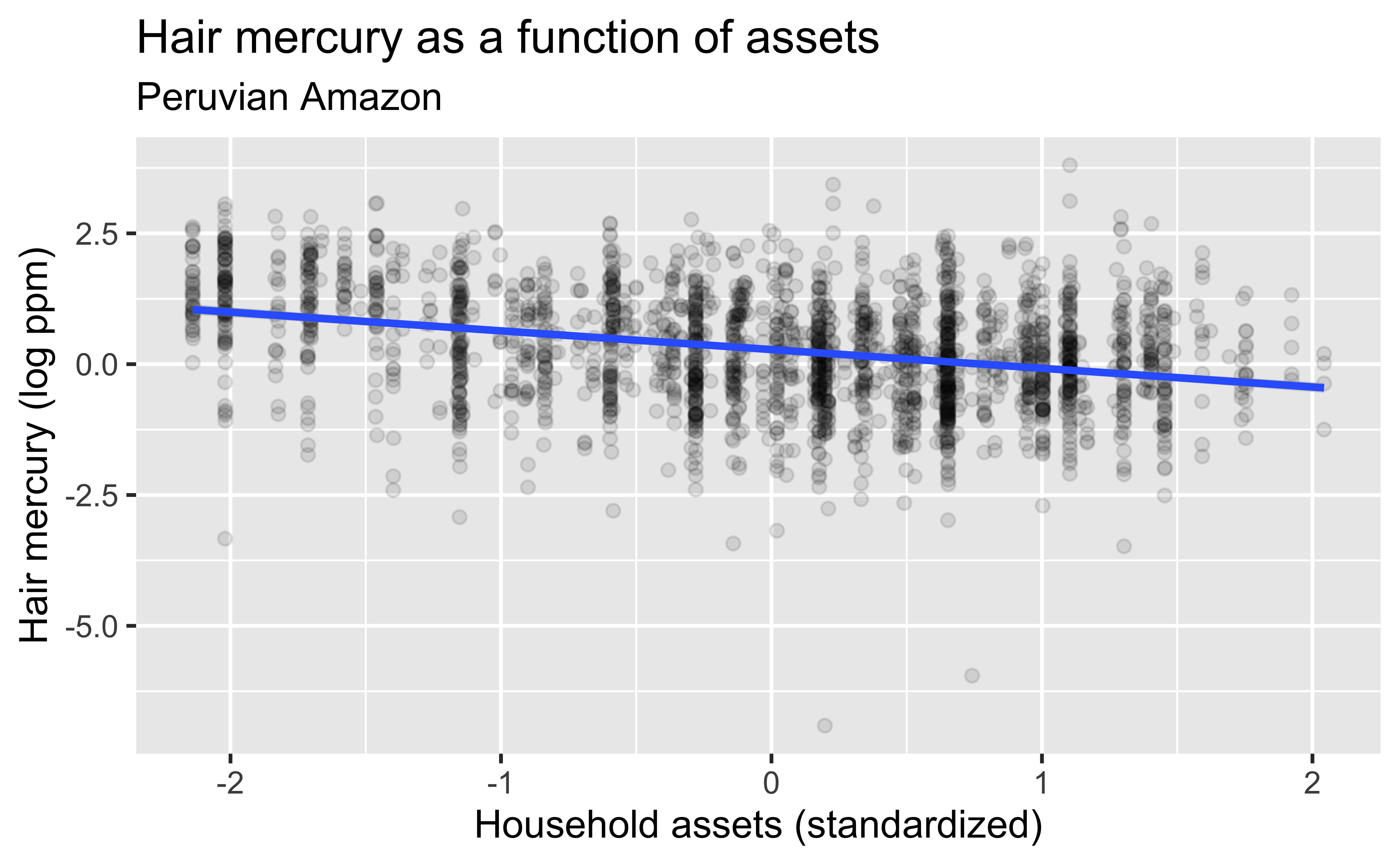
Hair mercury as a function of assets

ggplot(data = mercury, aes(x = assets_sc, y = lhairHg)) +
  geom_point(alpha=.1) +
  geom_smooth(method = "lm") +
  labs(
    title = "Hair mercury as a function of assets",
    subtitle = "Peruvian Amazon",
    x = "Household assets (standardized)",
    y = "Hair mercury (log ppm)"
  )

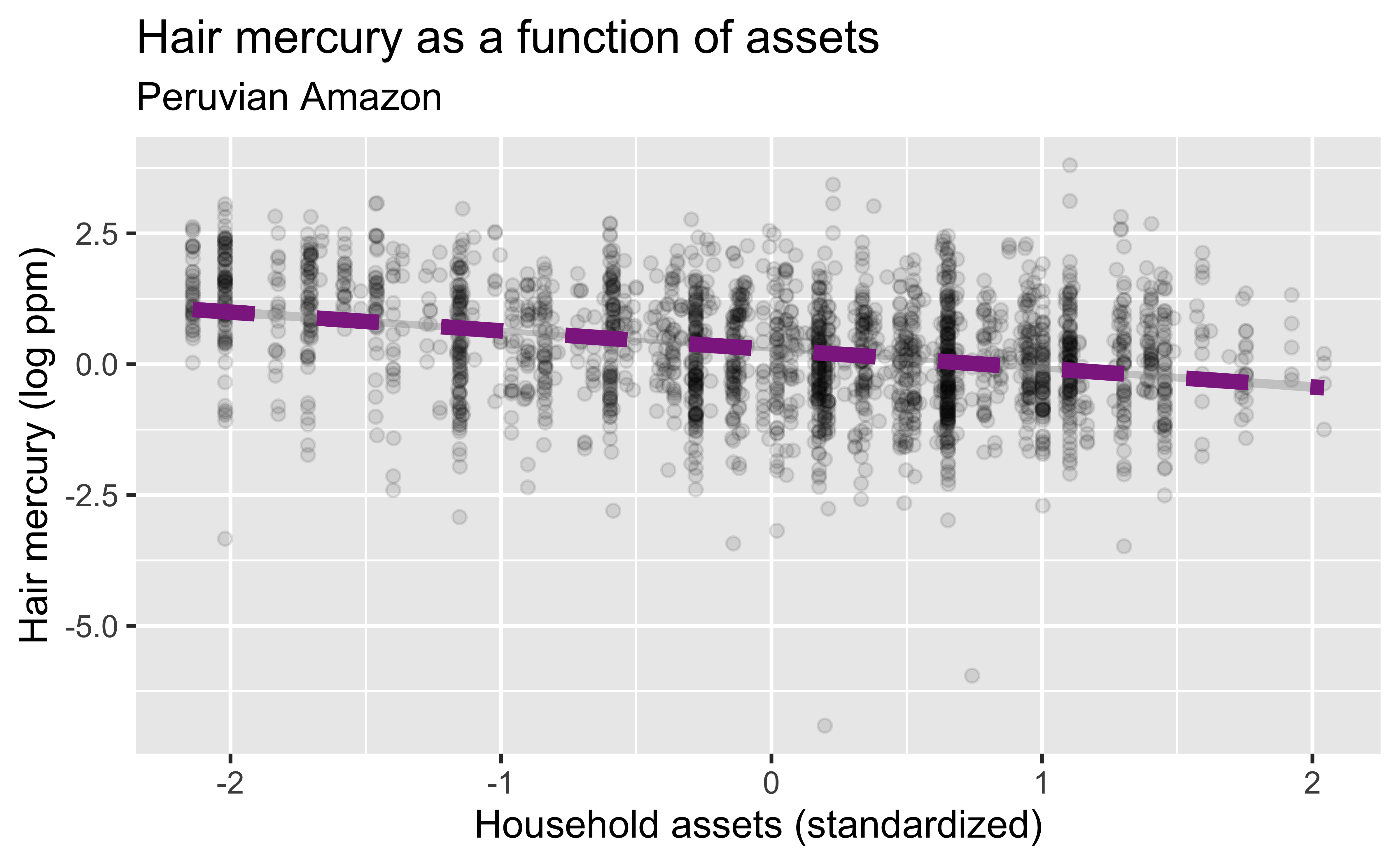
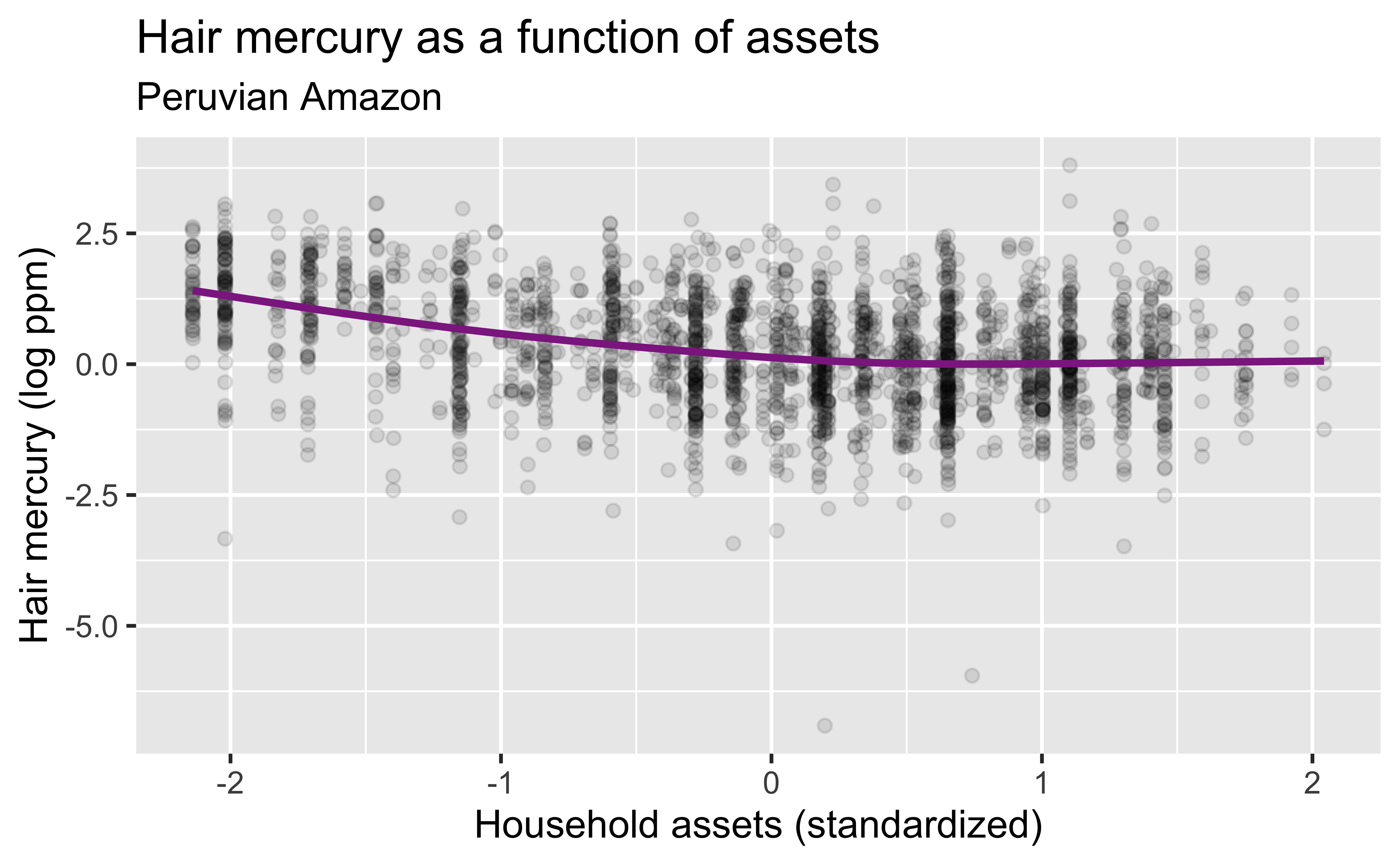
The correlation coefficient between assets and the log of hair Hg is -0.33.

With different cosmetic choices…
ggplot(data = mercury, aes(x = assets_sc, y = lhairHg)) +
  geom_point(alpha=.1) +
  geom_smooth(method = "lm", se = TRUE,
              color = "#8E2C90", linetype = "dashed", size = 3) +
  labs(
    title = "Hair mercury as a function of assets",
    subtitle = "Peruvian Amazon",
    x = "Household assets (standardized)",
    y = "Hair mercury (log ppm)"
  )

Using a different smoother: GAM
ggplot(data = mercury, aes(x = assets_sc, y = lhairHg)) +
  geom_point(alpha=.1) +
  geom_smooth(method = "gam",
              se = FALSE, color = "#8E2C90") +
  labs(
    title = "Hair mercury as a function of assets",
    subtitle = "Peruvian Amazon",
    x = "Household assets (standardized)",
    y = "Hair mercury (log ppm)"
  )

Vocabulary

  • Response variable: Variable whose behavior or variation you are trying to understand, on the y-axis, denoted \(y\)

  • Explanatory variables: Other variables that you want to use to explain the variation in the response, on the x-axis, denoted \(x\)

  • Predicted value: Output of the model function

    • The model function gives the typical (expected) value of the response variable conditioning on the explanatory variables, denoted \(\hat{y}\)
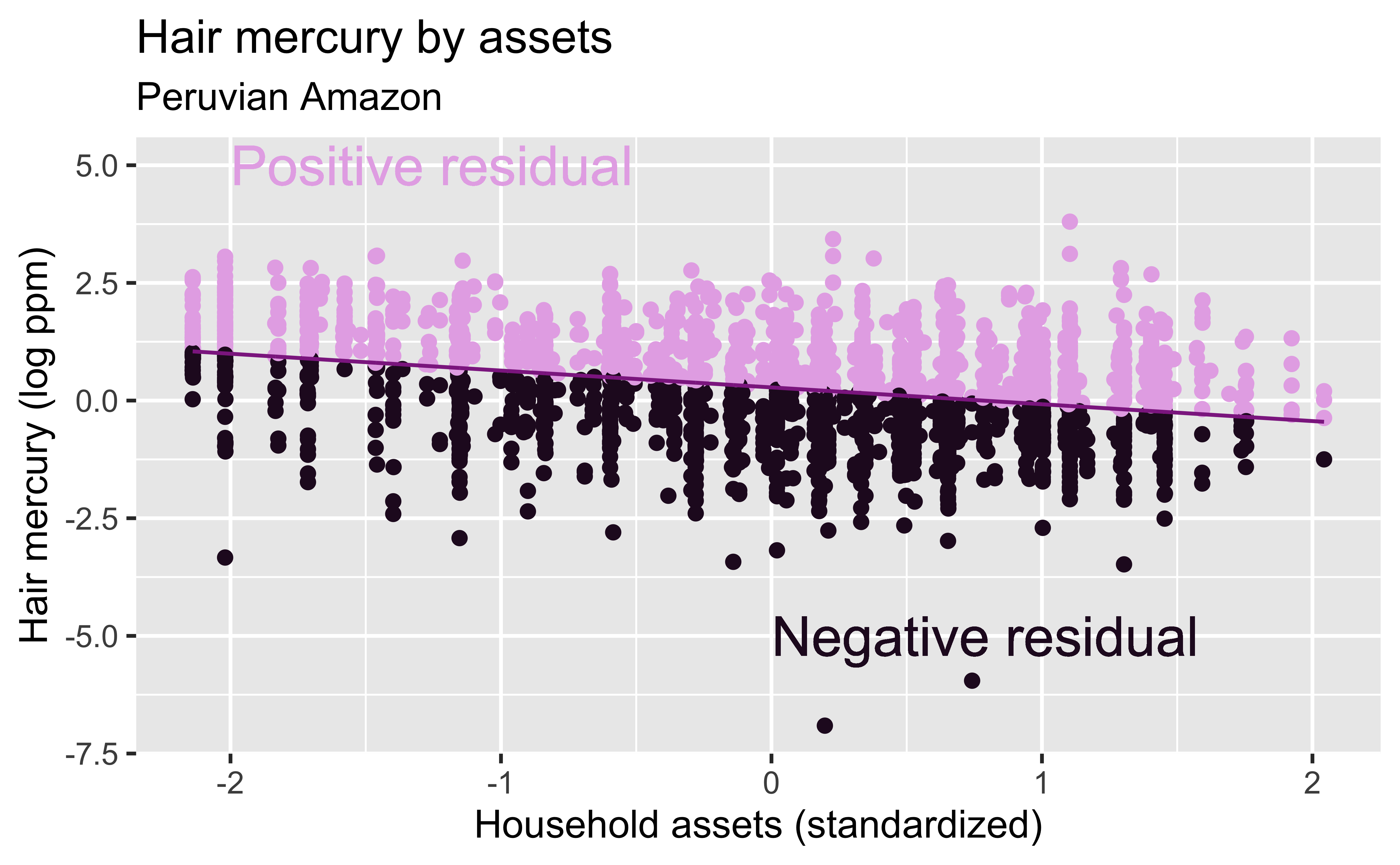
  • Residuals: A measure of how far each case is from its predicted value (based on a particular model), \(y-\hat{y}\)

    • Residual = Observed value - Predicted value

    • Tells how far above/below the expected value each case is

Residuals \(y-\hat{y}\)

hg_asset_fit <- linear_reg() %>%
  set_engine("lm") %>%
  fit(lhairHg ~ assets_sc, data = mercury)
hg_asset_fit_tidy <- tidy(hg_asset_fit$fit) 
hg_asset_fit_aug  <- augment(hg_asset_fit$fit) %>%
  mutate(res_cat = ifelse(.resid > 0, TRUE, FALSE))
ggplot(data = hg_asset_fit_aug) +
  geom_point(aes(x = assets_sc, y = lhairHg, color = res_cat)) +
  geom_line(aes(x = assets_sc, y = .fitted), size = 0.75, color = "#8E2C90") + 
  labs(
    title = "Hair mercury by assets",
    subtitle = "Peruvian Amazon",
    x = "Household assets (standardized)",
    y = "Hair mercury (log ppm)"
  ) +
  guides(color = FALSE) +
  scale_color_manual(values = c("#260b27", "#e6b0e7")) +
  geom_text(aes(x = -2, y = 5), label = "Positive residual", color = "#e6b0e7", hjust = 0, size = 8) +
  geom_text(aes(x = 0, y = -5), label = "Negative residual", color = "#260b27", hjust = 0, size = 8)

If \(y-\hat{y}\) is positive, the observed value \(y\) is higher than what the model predicted, and if \(y-\hat{y}\) is negative, the observed data was lower than what was predicted.

Multiple explanatory variables

How, if at all, does the relationship between hair mercury and household assets of individuals vary by whether or not they live in a town classified as native?
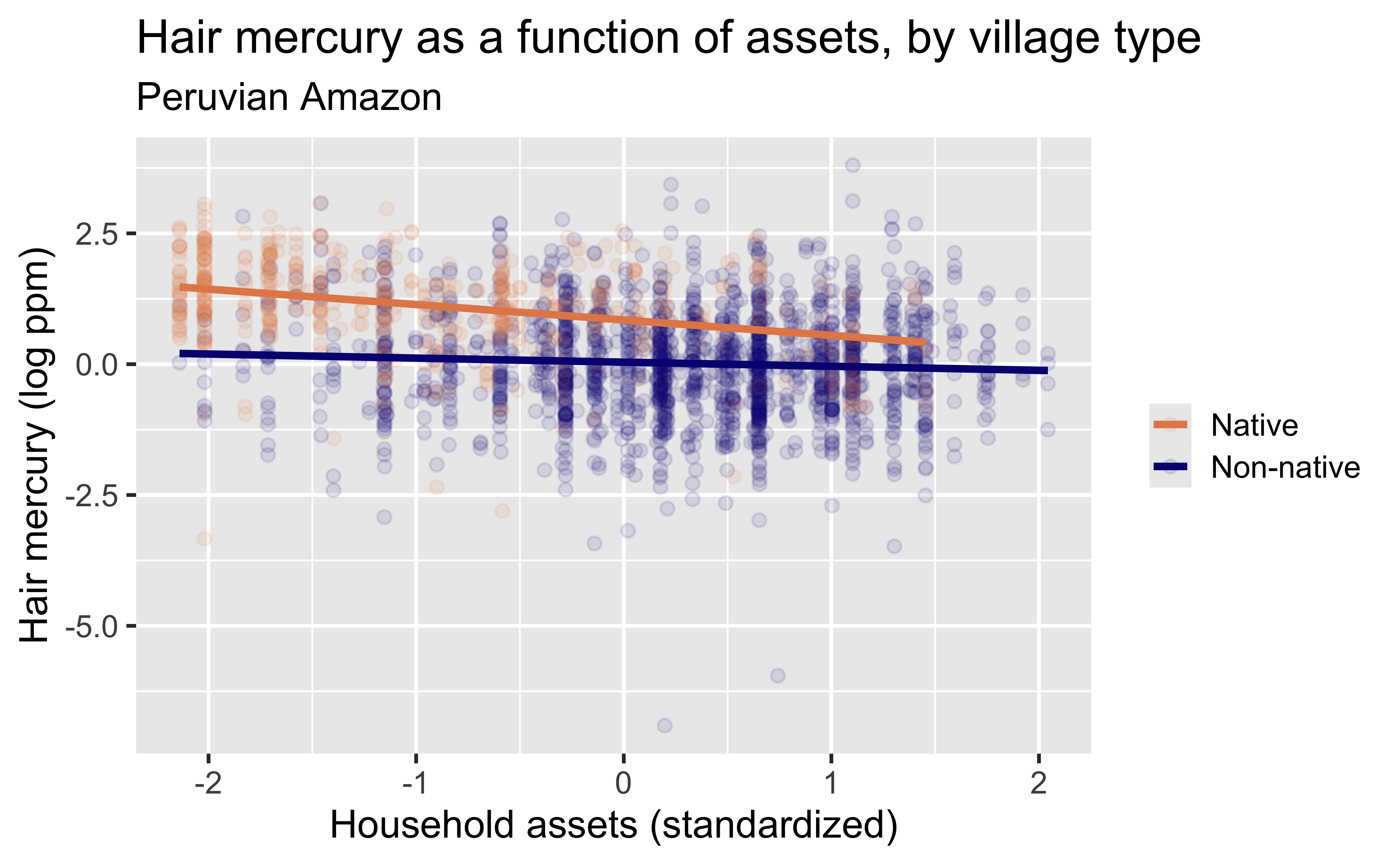
This is an example of an interaction effect – the relationship between assets and mercury depends on the value of a third variable, community type. We will discuss multiple regression in more depth later in the course.

ggplot(data = mercury, aes(x = assets_sc, y = lhairHg, color = native_cat)) +
  geom_point(alpha = 0.1) +
  geom_smooth(method = "lm", se = FALSE) +
  labs(
    title = "Hair mercury as a function of assets, by village type",
    subtitle = "Peruvian Amazon",
    x = "Household assets (standardized)",
    y = "Hair mercury (log ppm)",
    color = NULL
  ) +
  scale_color_manual(values = c("#E48957", "#071381"))

Range of Plotted Lines
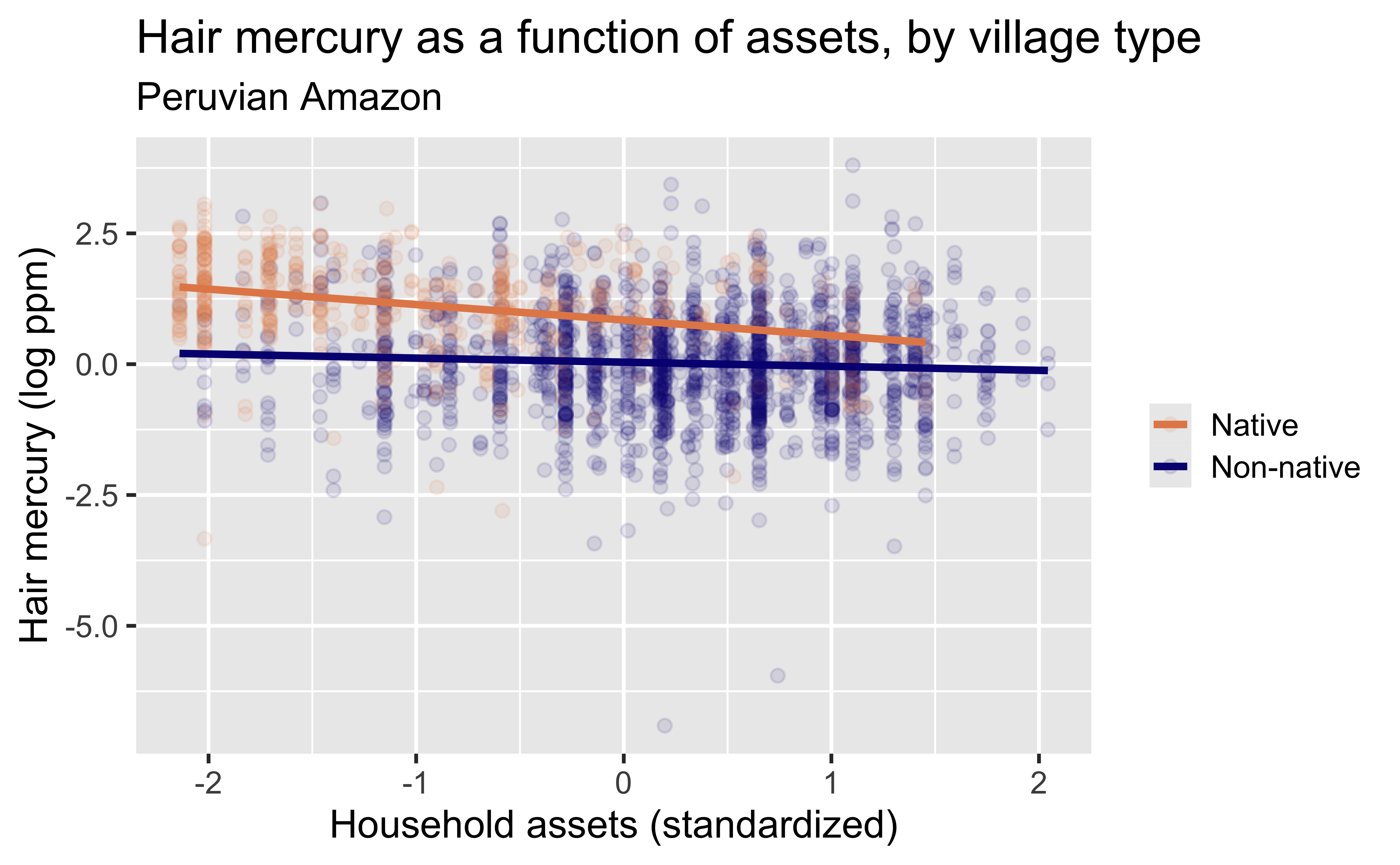
Why does the native village line stop at assets around 1.5 sd?

Extending regression lines

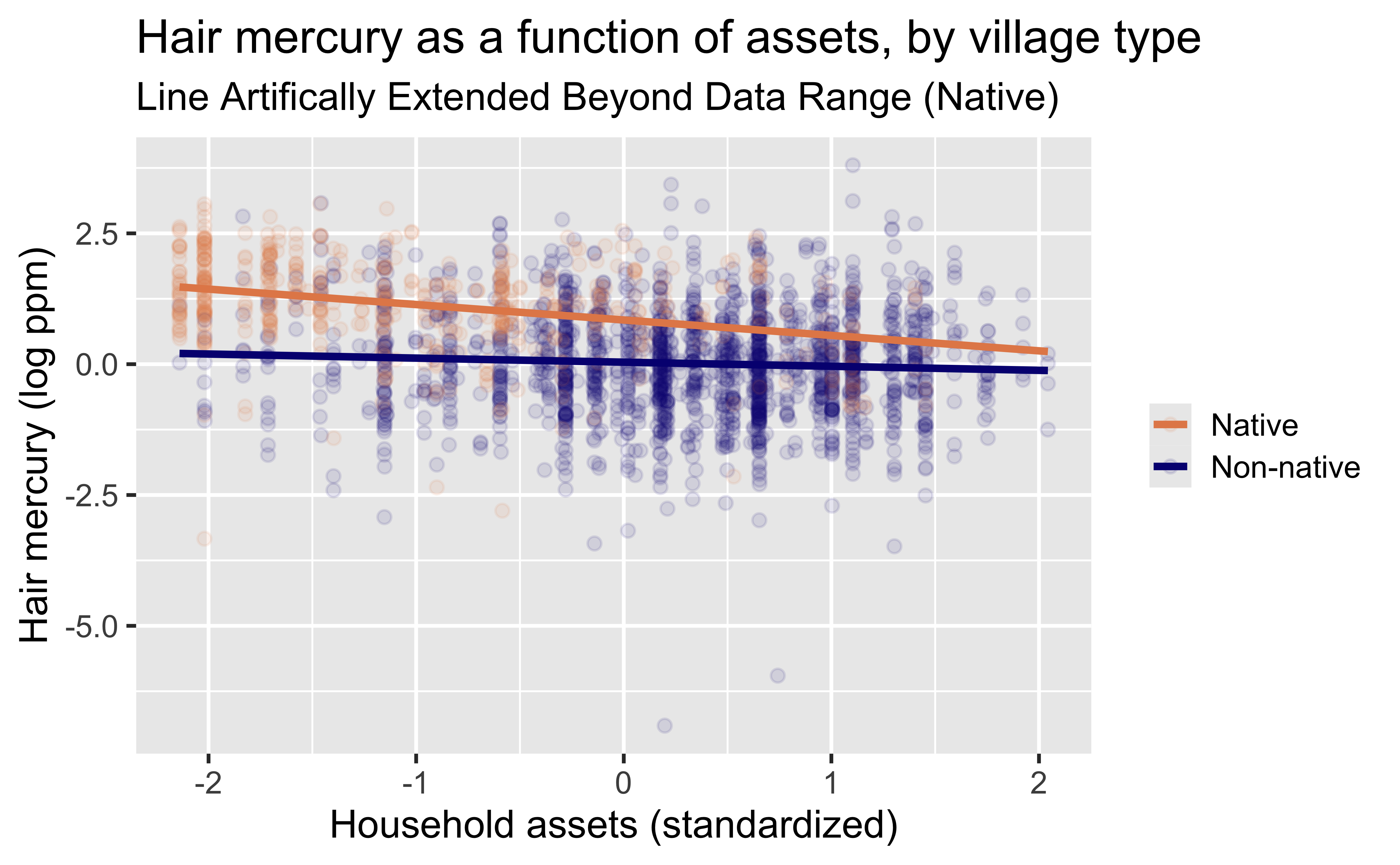
Extrapolation beyond the range of data observed is quite risky and is generally best avoided, though sometimes the goal is to do so (e.g., weather forecasting, election prediction). Here, we have extended the line for native villages beyond the value of 1.5 for assets, but we do not see such wealthy individuals in native villages in our data. If we extend the lines to ultra wealthy individuals (say $>$3 SD above the mean asset level), do we believe the lines actually cross, and those in native villages have lower exposures?
ggplot(data = mercury, aes(x = assets_sc, y = lhairHg, color = native_cat)) +
  geom_point(alpha = 0.1) +
  geom_smooth(method = "lm",
              se = FALSE,
              fullrange = TRUE) +
  labs(
    title = "Hair mercury as a function of assets, by village type",
    subtitle = "Line Artifically Extended Beyond Data Range (Native)",
    x = "Household assets (standardized)",
    y = "Hair mercury (log ppm)",
    color = NULL
  )  +
  scale_color_manual(values = c("#E48957", "#071381"))

Models - upsides and downsides

  • Models can sometimes reveal patterns that are not evident in a graph of the data. This is a great advantage of modeling over simple visual inspection of data.

  • There is a real risk, however, that a model is imposing structure that is not really there on the scatter of data, just as people imagine animal shapes in the stars. A skeptical approach is always warranted.

Variation around the model…

is just as important as the model, if not more!

Statistics is the explanation of variation in the context of what remains unexplained.

  • The scatter suggests that there might be other factors that account for large parts of variability in hair mercury levels, or perhaps just that randomness plays a big role.
  • Adding explanatory variables to a model can sometimes usefully reduce the size of the scatter around the model. (We’ll talk more about this later.)

How do we use models?

  • Explanation: Characterize the relationship between \(y\) and \(x\) via slopes for numerical explanatory variables or differences for categorical explanatory variables
  • Prediction: Plug in \(x\), get the predicted \(y\)