Visualising numeric data

Introduction to Global Health Data Science

Author
Affiliation

Amy Herring

Duke University
STA/GLHLTH 198 Fall 2026

Published

August 26, 2026

Terminology

Number of variables involved

  • Univariate data analysis - distribution of single variable
  • Bivariate data analysis - relationship between two variables
  • Multivariable/multivariate data analysis - relationship between many variables at once, sometimes focusing on the relationship between two while conditioning for others. (Often we reserve multivariate for multiple outcomes, and multivariable for multiple predictors.)

Types of variables

  • Numerical variables can be classified as continuous or discrete based on whether or not the variable can take on an infinite number of values or only a finite number of distinct values (e.g., counts), respectively.
  • If the variable is categorical, we can determine if it is ordinal based on whether or not the levels have a natural ordering.

Data

Data: Life Expectancy

  • We focus again on the IHME data on estimated life expectancy for a variety of countries and locations worldwide in the year 2023.
glimpse(lifespan2023)
Rows: 408
Columns: 5
$ location        <chr> "Afghanistan", "Afghanistan", "Albania"…
$ sex             <chr> "Female", "Male", "Female", "Male", "Fe…
$ lifeexp         <dbl> 68.98985, 68.13812, 82.05155, 77.27016,…
$ worldbankregion <chr> "South Asia", "South Asia", "Europe and…
$ pop             <dbl> 38041757, 38041757, 2854191, 2854191, 4…
Selected variables


Variable Description
location Country or area name
worldbankregion World region, as classified by the World Bank
pop Estimated 2023 population of the location
sex Binary sex as reported by the country
lifeexp Life expectancy from infancy

Variable types


Variable Type
location Categorical, not ordinal
worldbankregion Categorical, not ordinal
pop Numerical, discrete
sex Categorical, not ordinal
lifeexp Numerical, continuous

In the full data (not subset to 2023), year is an additional numerical, discrete variable.

Visualizing numerical data

Describing shapes of numerical distributions

  • Shape
    • Skewness: right-skewed, left-skewed, symmetric (skew is to the side of the longer tail)
    • Modality: unimodal, bimodal, multimodal, uniform
  • Center: mean (mean), median (median), mode
  • Spread: range (range), standard deviation (sd), variance (square of sd), interquartile range (IQR)
  • Unusual observations

Measures of center

Consider a random variable \(x_i\) that is the estimated life expectancy for country \(i\), \(i = 1, \ldots, n\), among \(n\) countries.

  • Mean: estimated as

\[ \bar{x} = \frac{\sum_{i=1}^{n} x_i}{n}\]

Measures of center

  • Median: middle number (50th percentile), \(x_{(n+1)/2}\)
    • For \(n\) odd, the median is the middle number.
    • For \(n\) even, the median is the mean of the two middle numbers.
    • Just remember: it splits the ordered data in half.
  • Mode: most frequent value in the data set

Measures of spread

  • variance: average squared distance from mean

  • standard deviation (sd): square root of variance (on same scale as data). The sample variance \(s^2\) is estimated in a single sample as \[\frac{\sum_{i=1}^n (x_i-\overline{x})^2}{n-1}\]

    • we think of 1 sd as a sizeable difference. For example, height of college students in the US has a sd \(\approx\) 3 in men and \(\approx\) 2.5 in women

Measures of spread

  • range: difference between highest and lowest values, e.g. \(x_{(n)}-x_{(1)}\)

  • interquartile range (IQR): difference between 75th and 25th %iles

    • we think of this as pretty big too
    • 75th %ile of height among male college students in the US is 5’11”, and the 25th %ile is 5’7”, so the IQR is 4”
    • for female students, the 75th %ile is 5’5.6”, 25th %ile is 5’1.6”, and IQR is also 4”

Visualizing relationships among numerical variables

Scatterplot

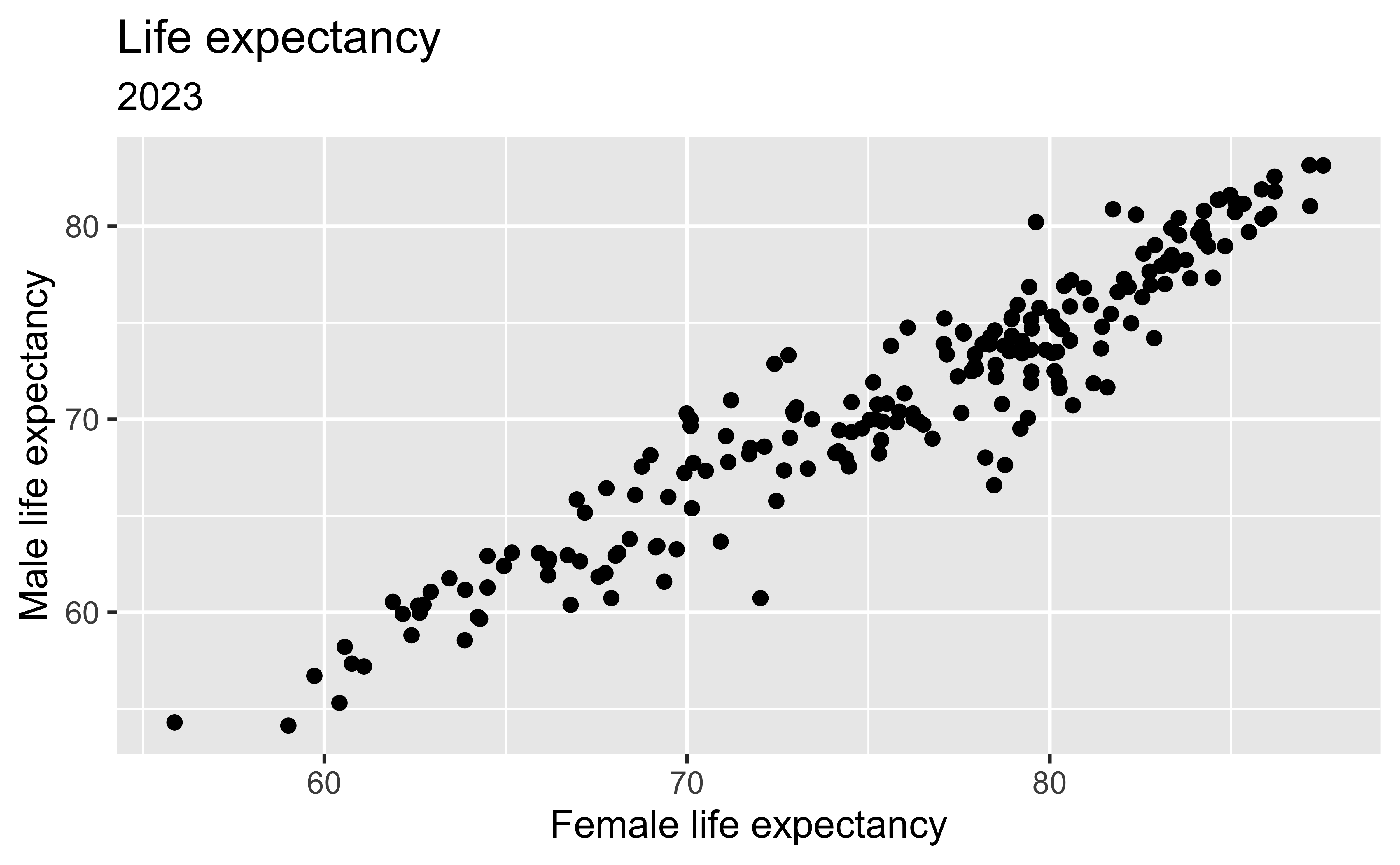
Previously we viewed a scatterplot showing the relationship between life expectancy of females and males in each location.

ggplot(
  lifeexpwide2023,
  aes(
    x = Female,
    y = Male
  )
) +
  geom_point() +
  labs(
    title = "Life expectancy",
    subtitle = "2023",
    x = "Female life expectancy",
    y = "Male life expectancy"
  )

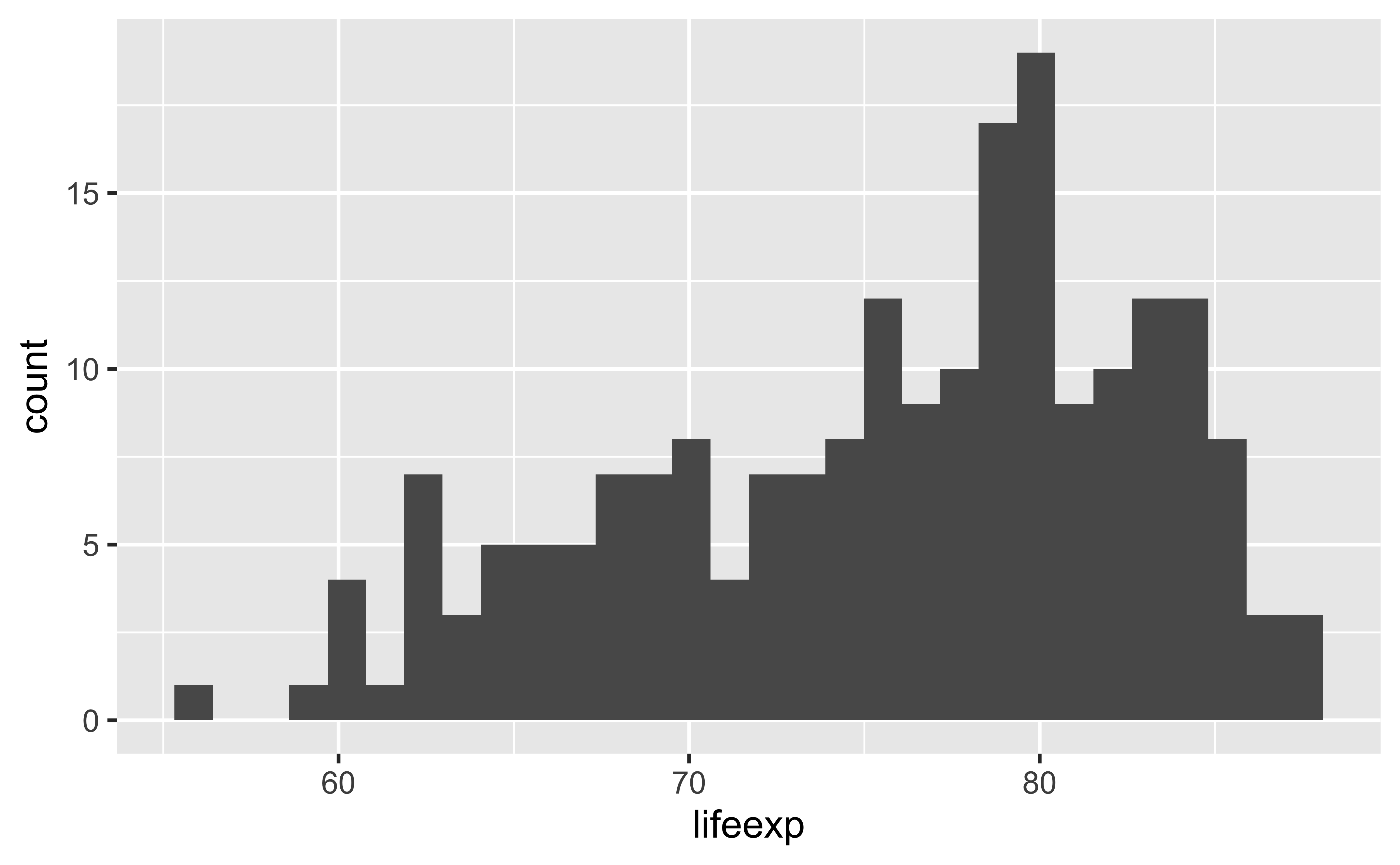
Histogram

Histogram

lifespan2023 %>%
  filter(sex == "Female") %>%
  ggplot(
    aes(x = lifeexp)
  ) +
  geom_histogram()

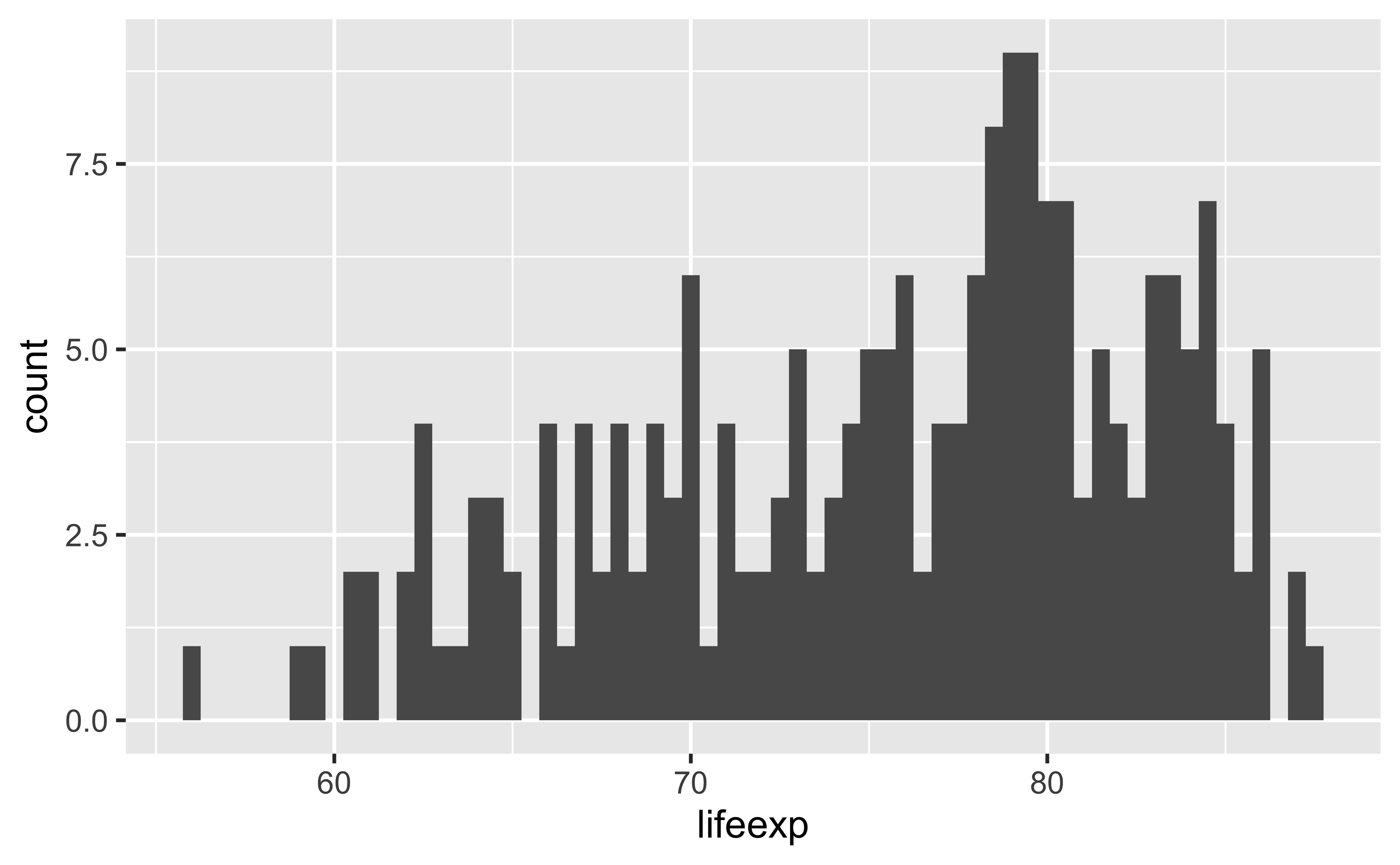
Histograms and binwidth: binwidth = 0.5

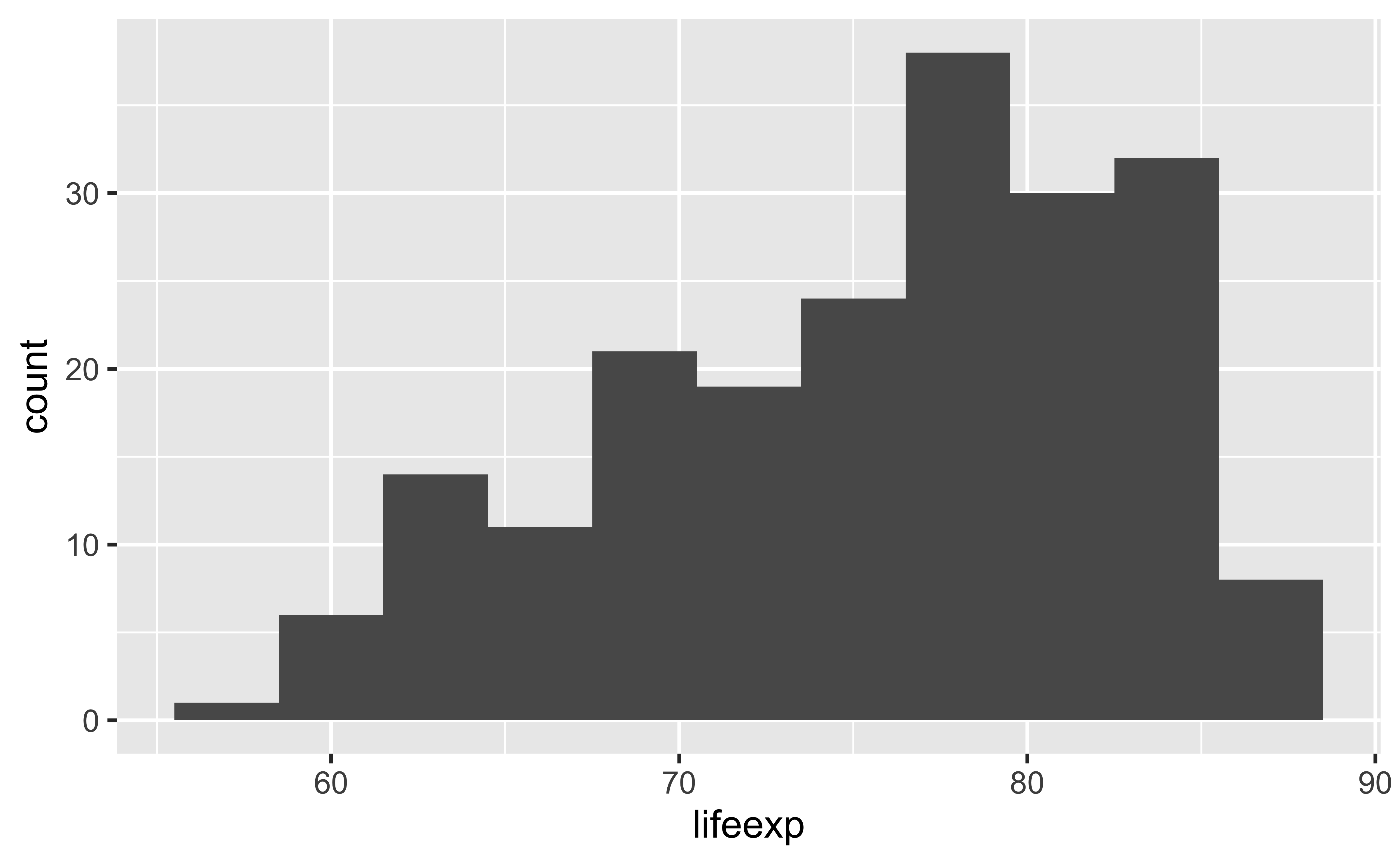
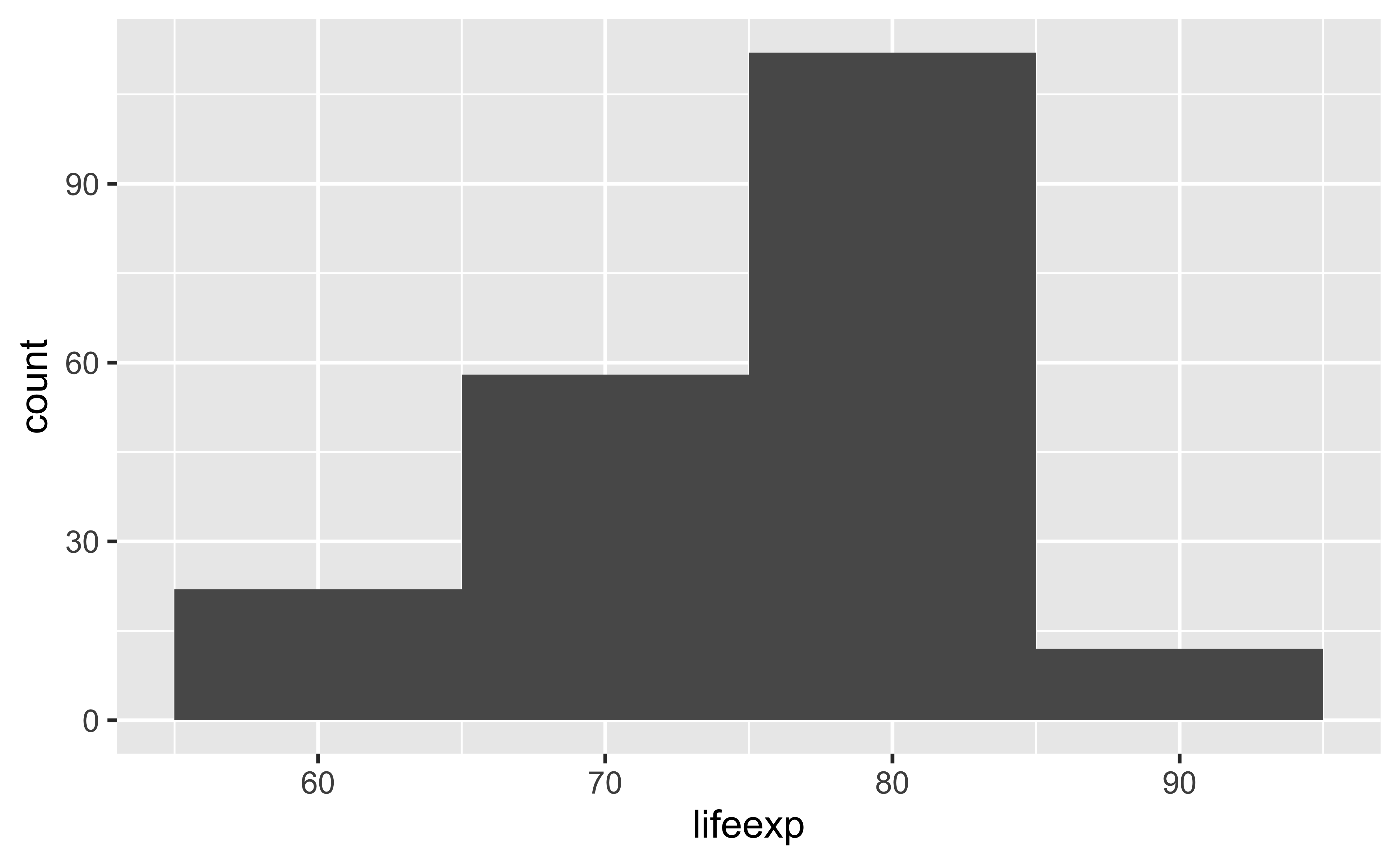
The bin width is the width of the interval used for grouping the data. It is selected automatically by R, but we can alter it. For example, a bin width of \(\frac{1}{2}\) plots a bar for each 6 month life expectancy group, while a bin width of 10 plots a bar for groups of 10 years.

lifespan2023 %>%
  filter(sex == "Female") %>%
  ggplot(
    aes(x = lifeexp)
  ) +
  geom_histogram(binwidth = 0.5)

Histograms and binwidth: binwidth = 3

lifespan2023 %>%
  filter(sex == "Female") %>%
  ggplot(
    aes(x = lifeexp)
  ) +
  geom_histogram(binwidth = 3)

Histograms and binwidth: binwidth = 10

lifespan2023 %>%
  filter(sex == "Female") %>%
  ggplot(
    aes(x = lifeexp)
  ) +
  geom_histogram(binwidth = 10)

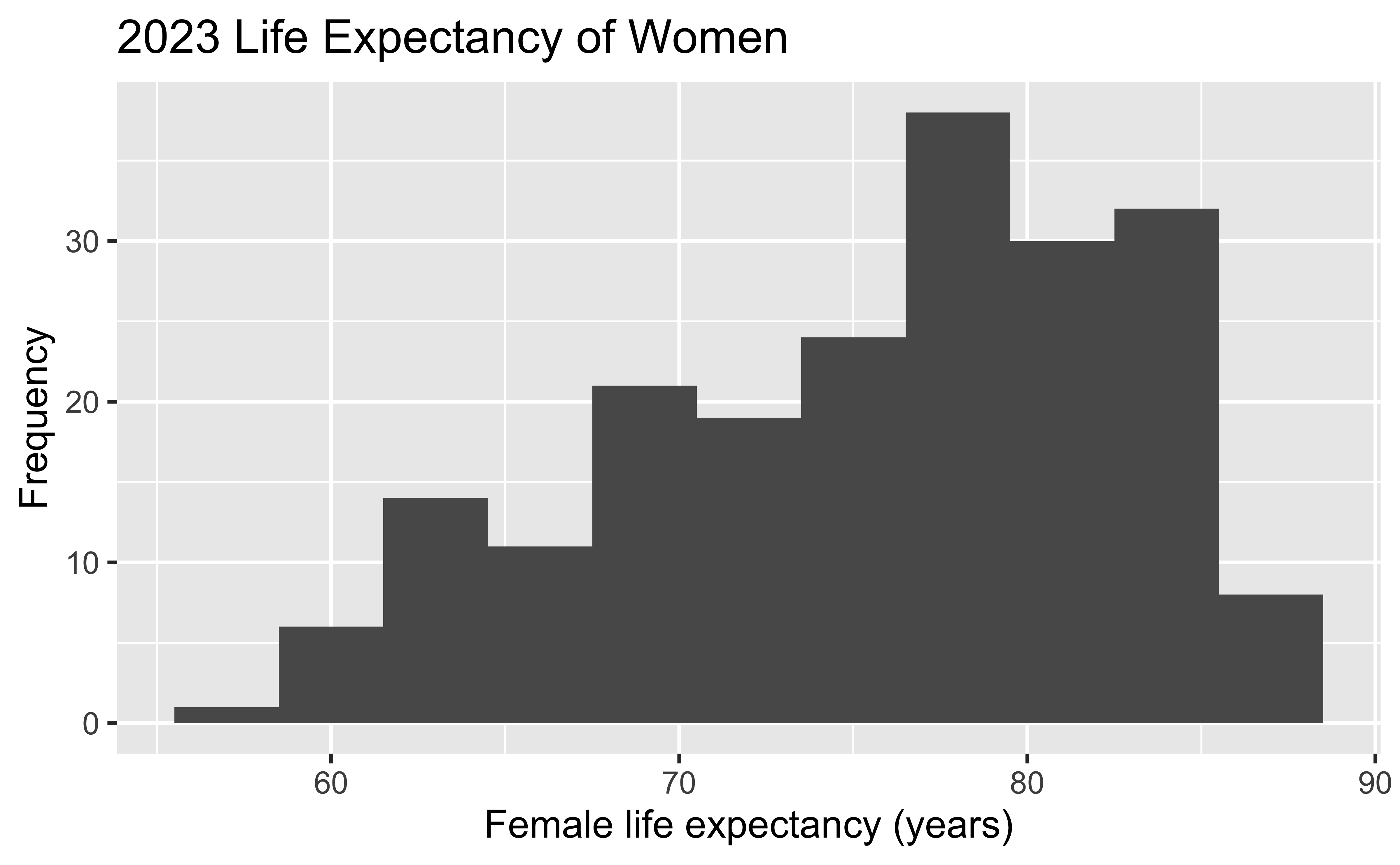
Customizing histograms

lifespan2023 %>%
  filter(sex == "Female") %>%
  ggplot(
    aes(x = lifeexp)
  ) +
  geom_histogram(binwidth = 3) +
  labs(
    x = "Female life expectancy (years)",
    y = "Frequency",
    title = "2023 Life Expectancy of Women"
  )

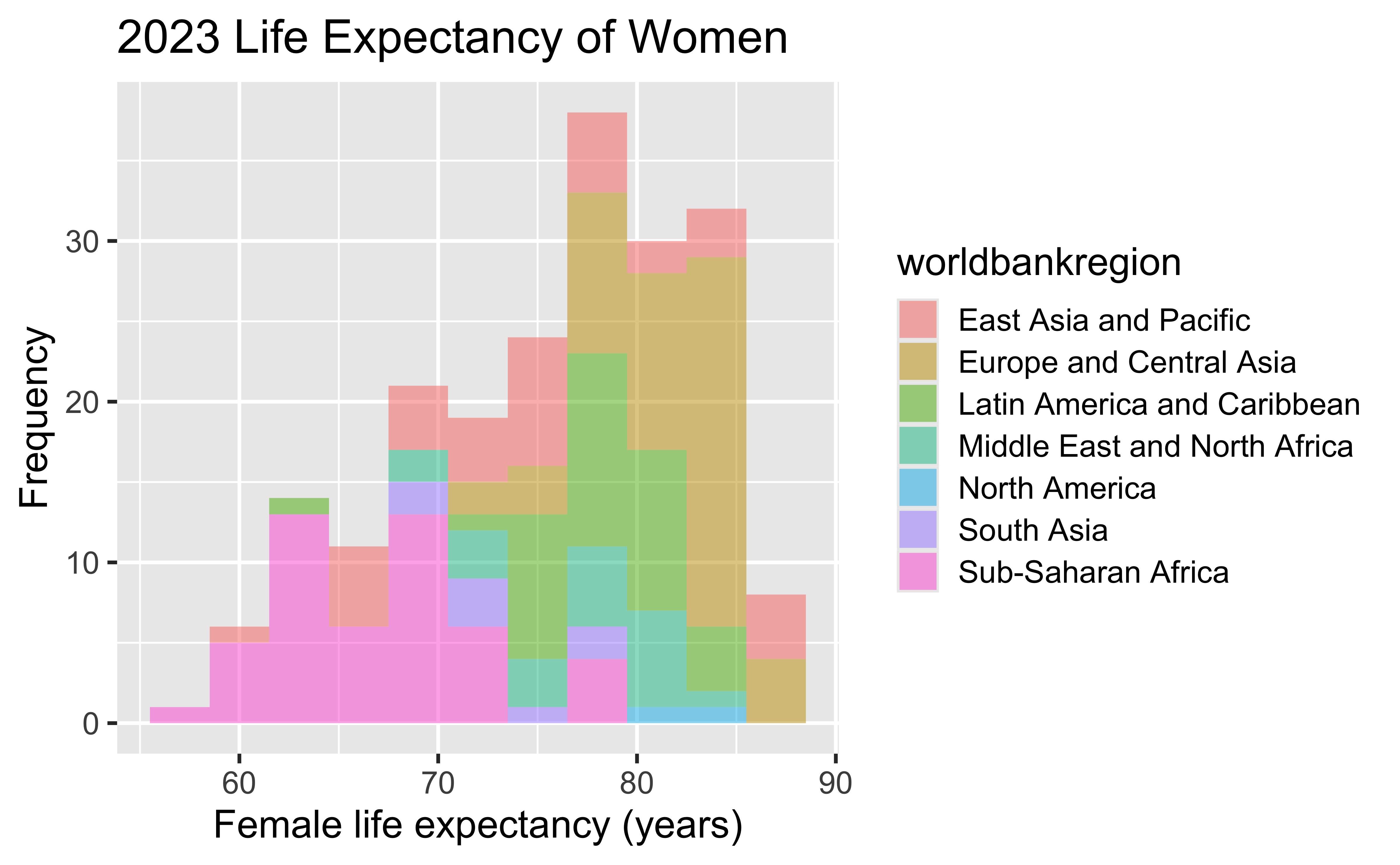
Fill with a categorical variable

lifespan2023 %>%
  filter(sex == "Female") %>%
  ggplot(
    aes(
      x = lifeexp,
      fill = worldbankregion
    )
  ) +
  geom_histogram(
    binwidth = 3,
    alpha = 0.5
  ) +
  labs(
    x = "Female life expectancy (years)",
    y = "Frequency",
    title = "2023 Life Expectancy of Women"
  )

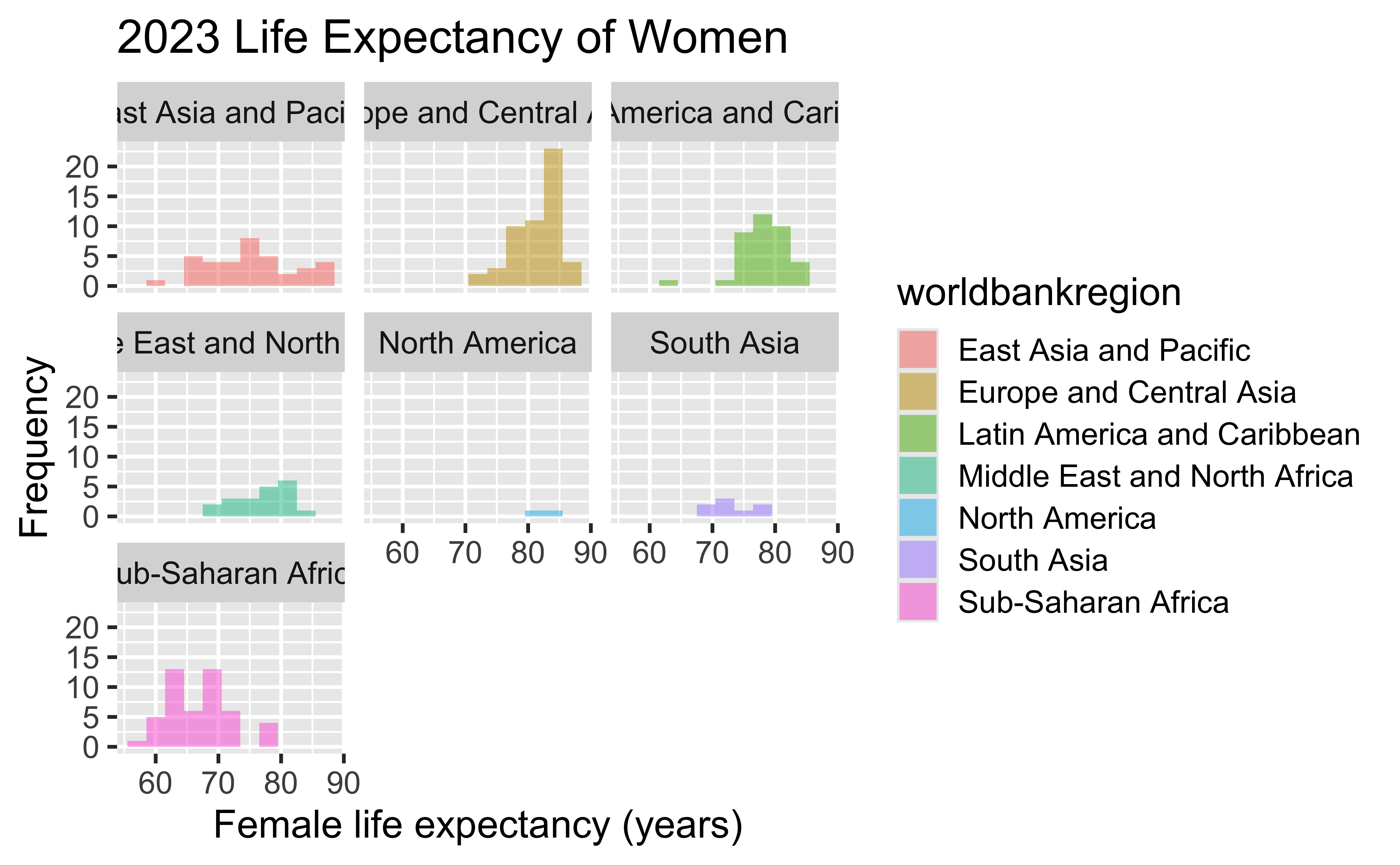
Facet with a categorical variable

lifespan2023 %>%
  filter(sex == "Female") %>%
  ggplot(
    aes(
      x = lifeexp,
      fill = worldbankregion
    )
  ) +
  geom_histogram(
    binwidth = 3,
    alpha = 0.5
  ) +
  labs(
    x = "Female life expectancy (years)",
    y = "Frequency",
    title = "2023 Life Expectancy of Women"
  ) +
  facet_wrap(~worldbankregion, nrow = 3)

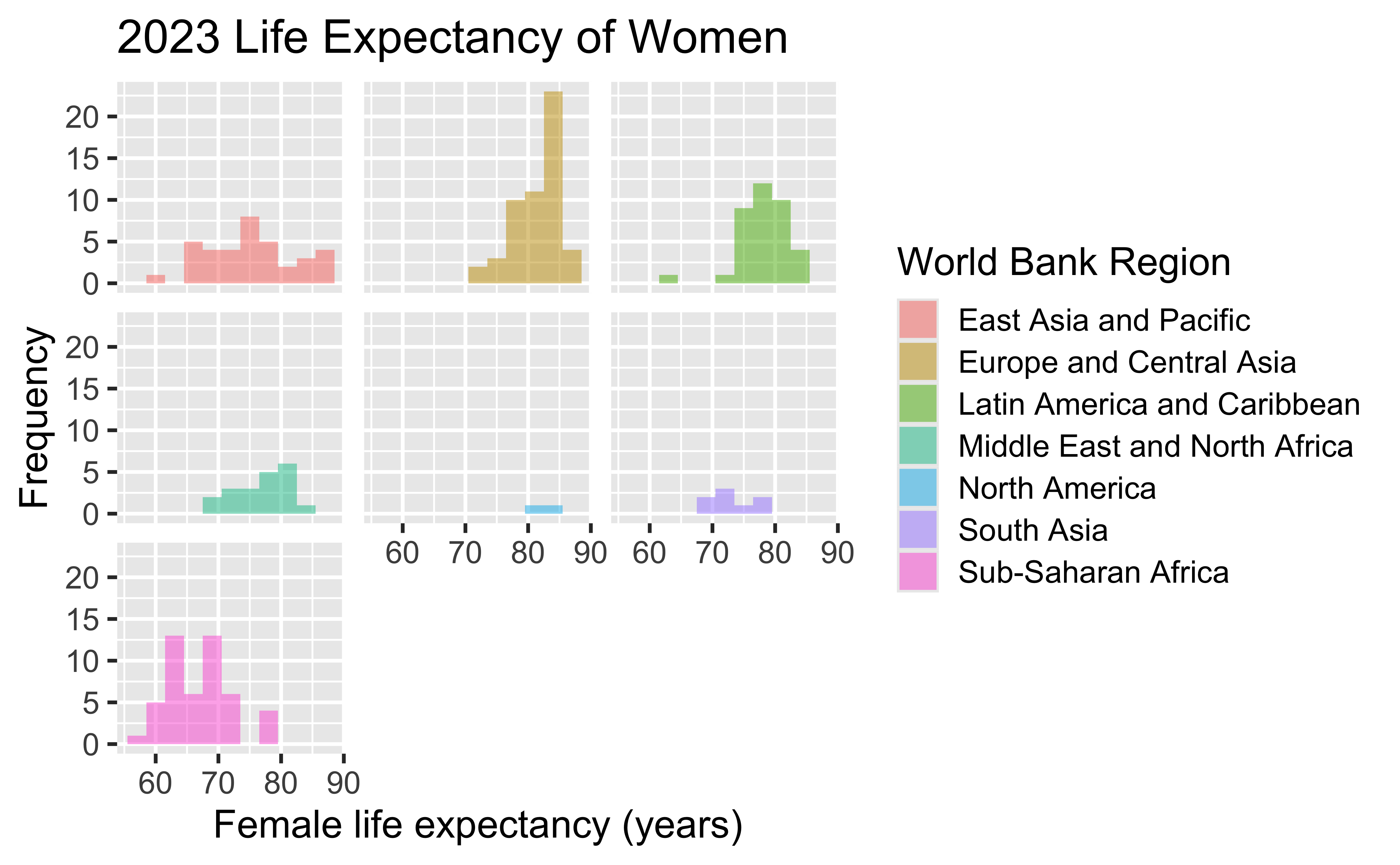
Facet with a categorical variable (fixing labels)

lifespan2023 %>%
  filter(sex == "Female") %>%
  ggplot(
    aes(
      x = lifeexp,
      fill = worldbankregion
    )
  ) +
  geom_histogram(
    binwidth = 3,
    alpha = 0.5
  ) +
  labs(
    x = "Female life expectancy (years)",
    y = "Frequency",
    fill = "World Bank Region",
    title = "2023 Life Expectancy of Women"
  ) +
  facet_wrap(~worldbankregion, nrow = 3) +
  theme(
    strip.background = element_blank(),
    strip.text.x = element_blank()
  )

Which version of all these plots seems most useful, and why?

Density plot

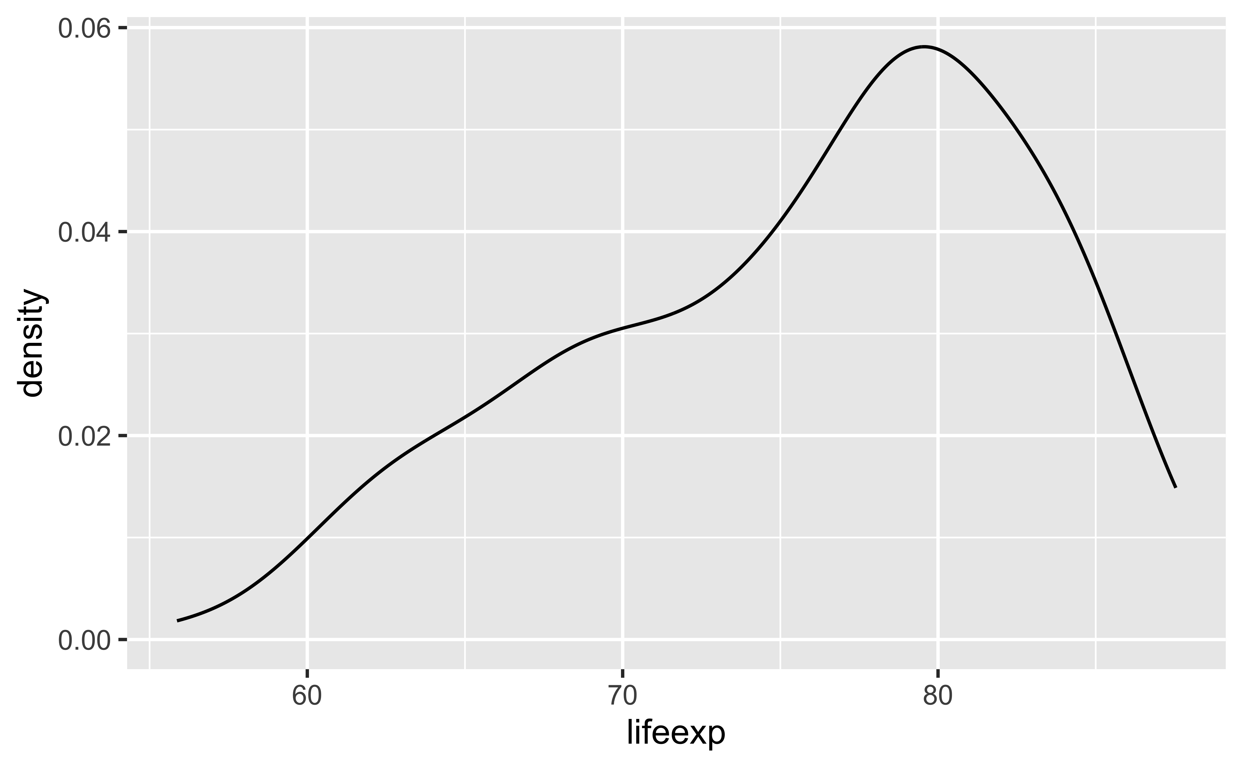
Density plot

lifespan2023 %>%
  filter(sex == "Female") %>%
  ggplot(
    aes(x = lifeexp)
  ) +
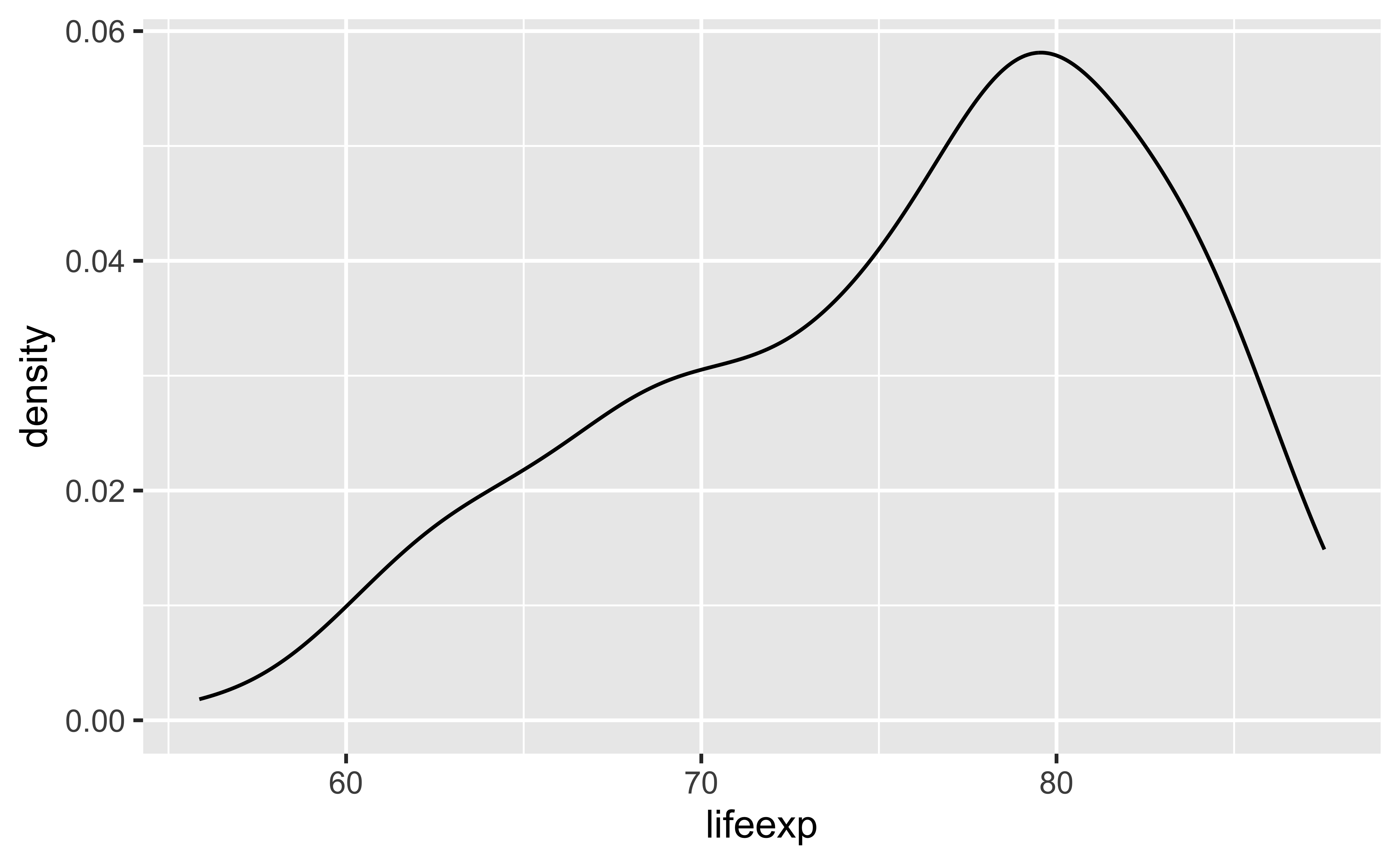
  geom_density()

A density function is a function whose value at any given point can be interpreted as providing a relative likelihood of values. That is, higher values of the density function indicate values of the random variable that are more likely to be observed.

Density plots: adjust = 0.5

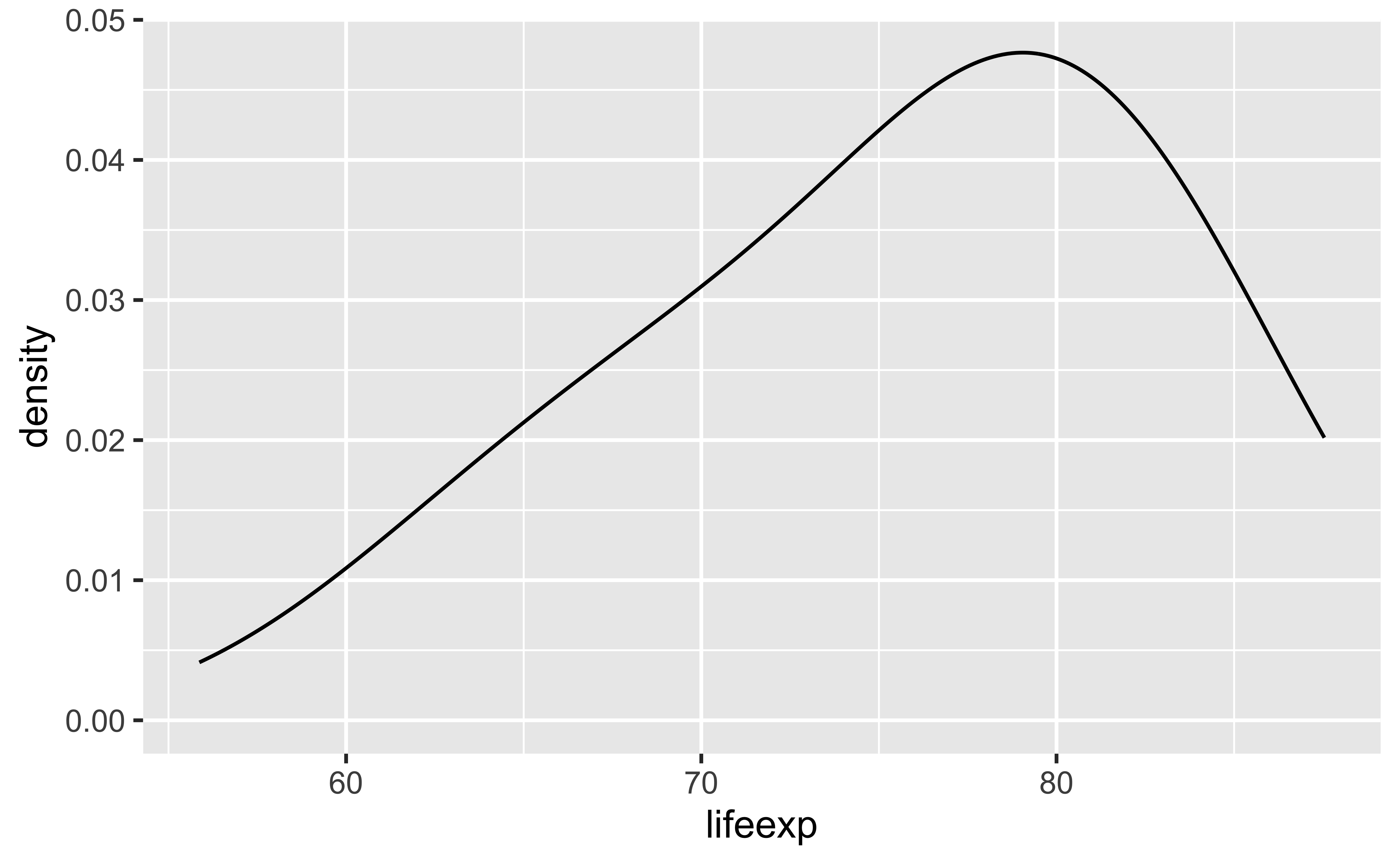
The bandwidth is a parameter that specifies the degree of smoothing. A small bandwidth shows many bumps (like a histogram with a small bin width), while a large bandwidth smooths over many bumps. It is specified using the adjust argument.

lifespan2023 %>%
  filter(sex == "Female") %>%
  ggplot(
    aes(x = lifeexp)
  ) +
  geom_density(adjust = 0.5)


Density plots: adjust = 1

lifespan2023 %>%
  filter(sex == "Female") %>%
  ggplot(
    aes(x = lifeexp)
  ) +
  geom_density(adjust = 1)

Density plots: adjust = 2

lifespan2023 %>%
  filter(sex == "Female") %>%
  ggplot(
    aes(x = lifeexp)
  ) +
  geom_density(adjust = 2)

Customizing density plots

lifespan2023 %>%
  filter(sex == "Female") %>%
  ggplot(
    aes(x = lifeexp)
  ) +
  geom_density(adjust = 1) +
  labs(
    x = "Female life expectancy (years)",
    y = "Density",
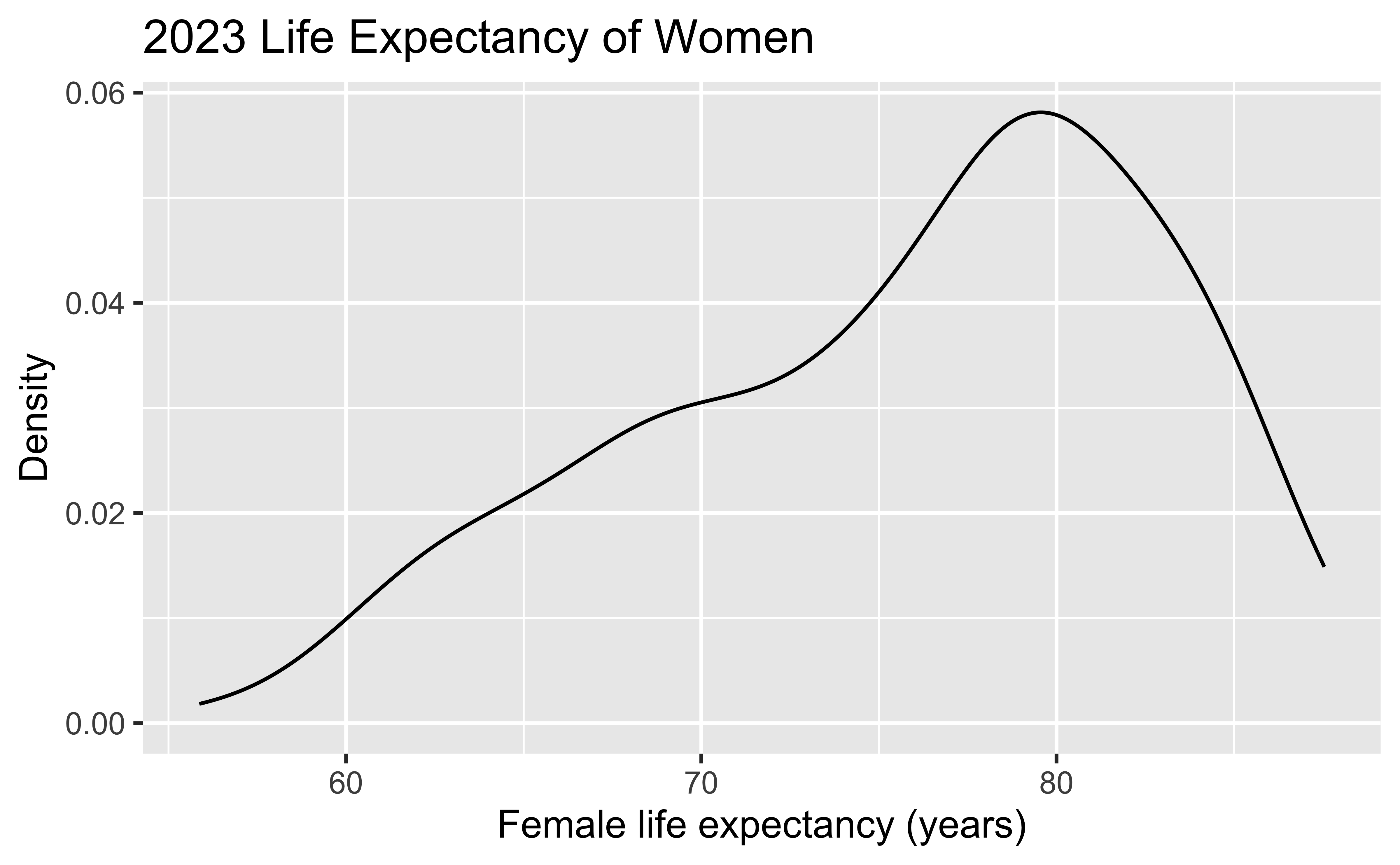
    title = "2023 Life Expectancy of Women"
  )

Adding a categorical variable

lifespan2023 %>%
  filter(sex == "Female") %>%
  ggplot(
    aes(
      x = lifeexp,
      fill = worldbankregion
    )
  ) +
  geom_density(adjust = 1) +
  labs(
    x = "Female life expectancy (years)",
    y = "Density",
    title = "2023 Life Expectancy of Women",
    fill = "Region"
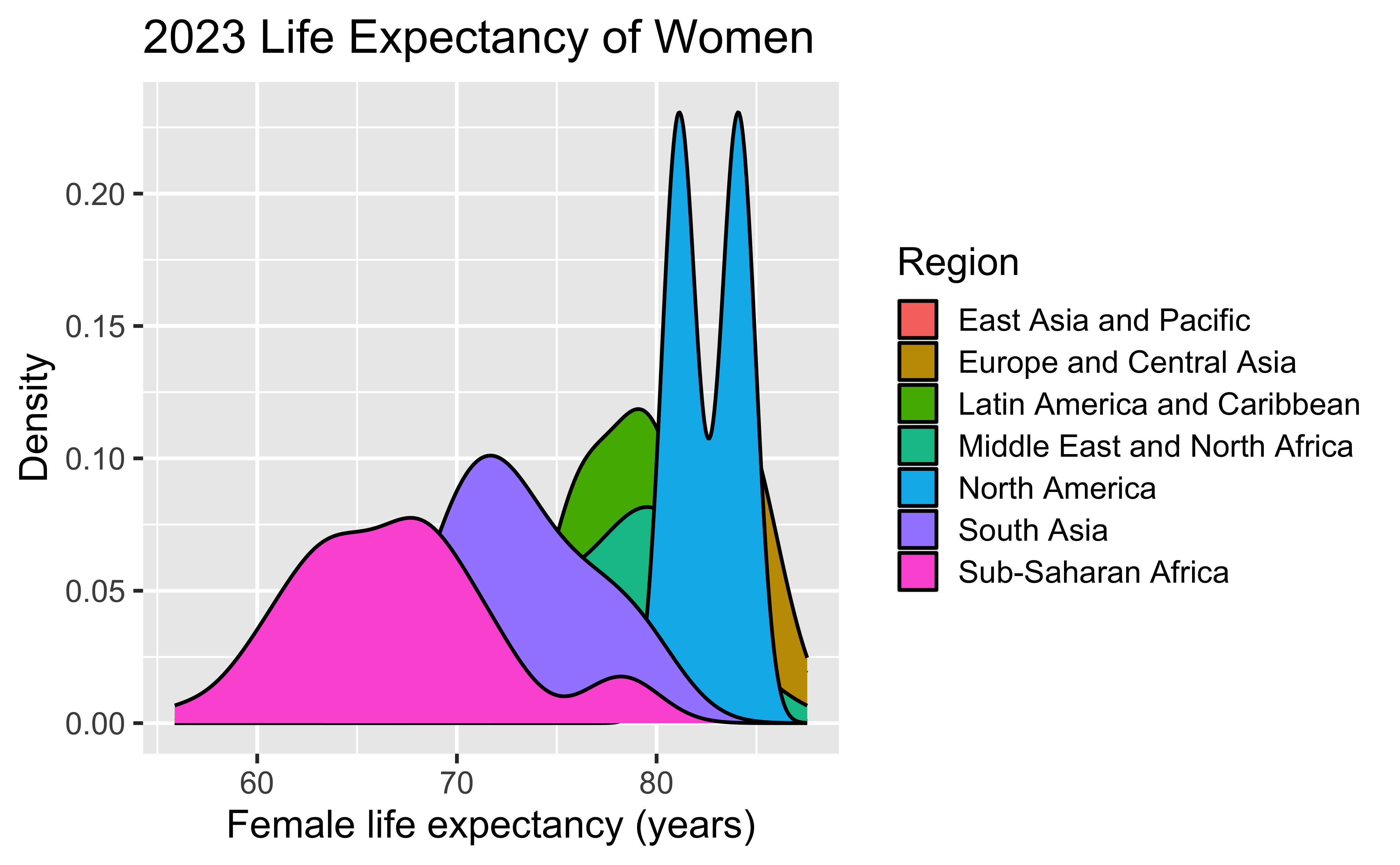
  )

Box plot


Box plot

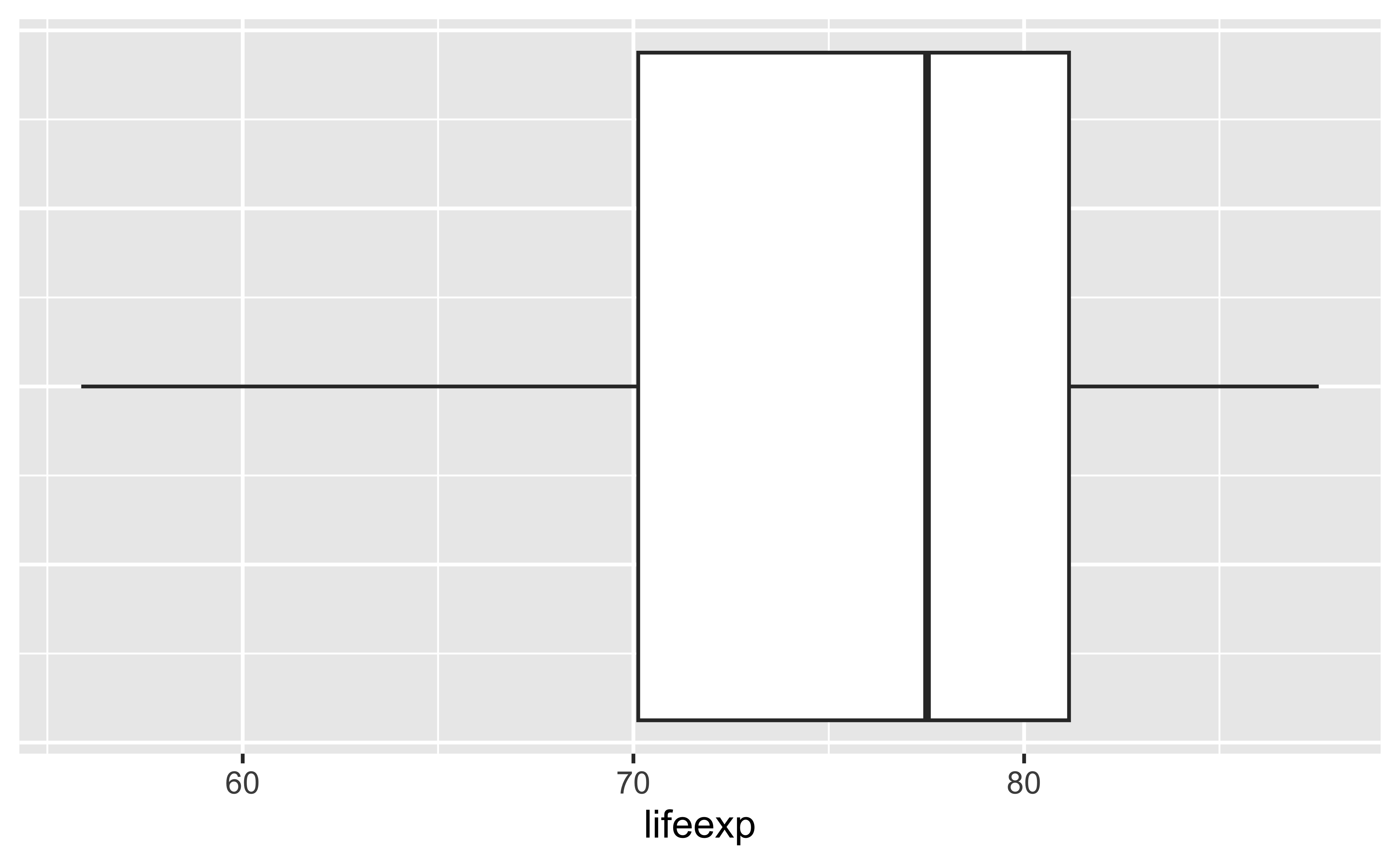
lifespan2023 %>%
  filter(sex == "Female") %>%
  ggplot(
    aes(x = lifeexp)
  ) +
  geom_boxplot() + theme(
  axis.title.y = element_blank(),
  axis.text.y  = element_blank(),
  axis.ticks.y = element_blank()
)

Box plot

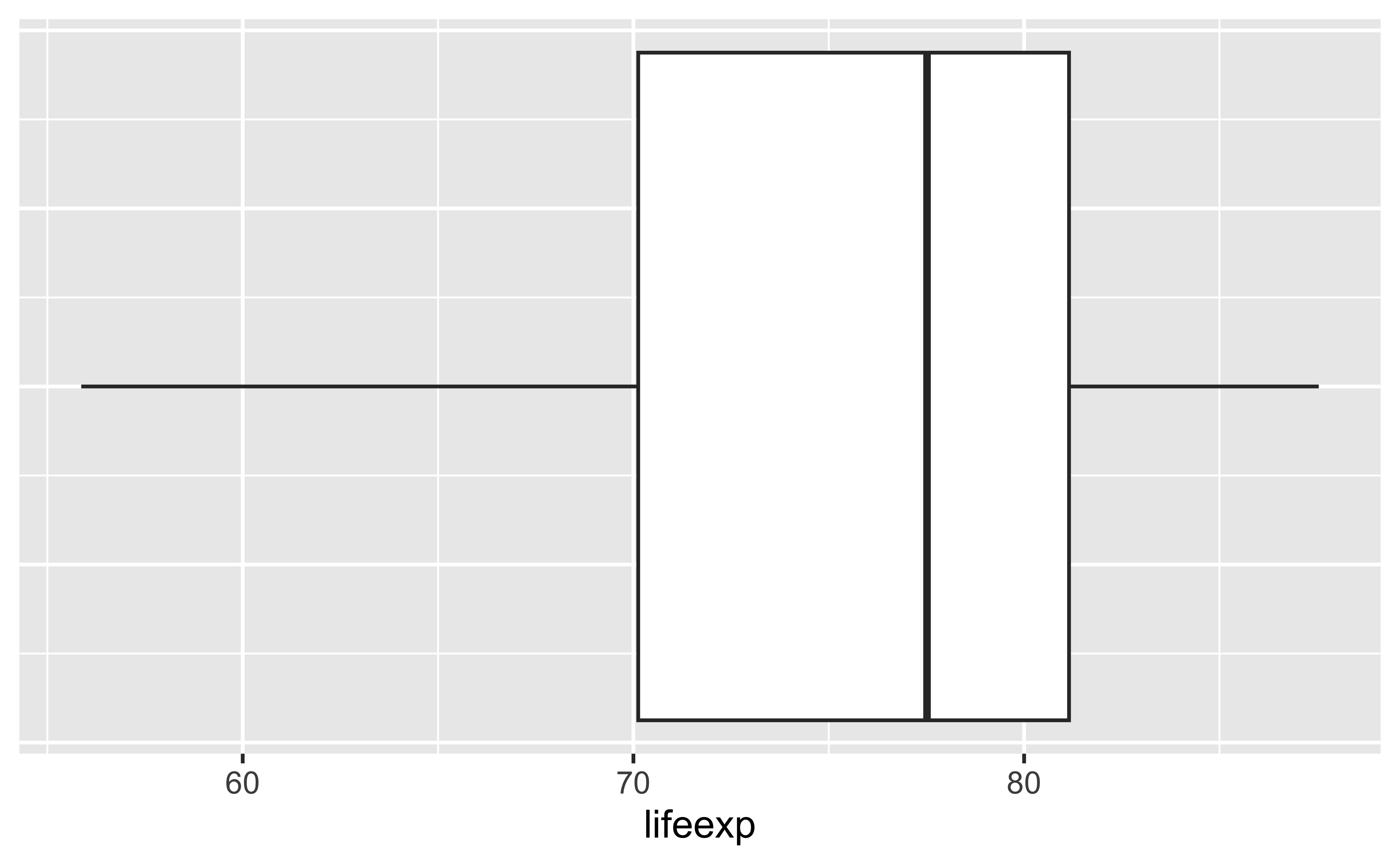
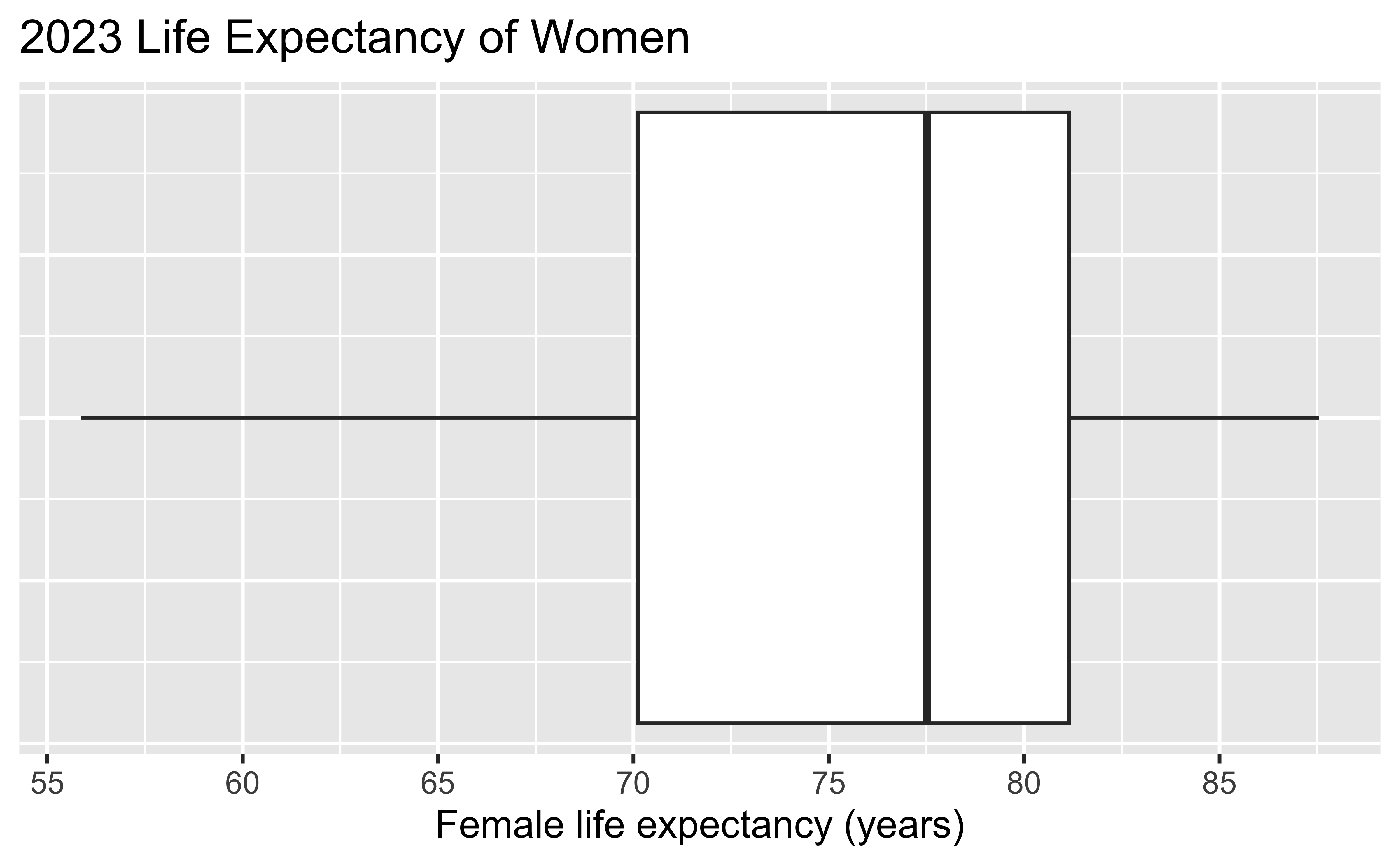
  • Technical specifications vary across software packages
  • Median: line in the middle of the box
  • Hinges (25th and 75th percentiles): edges of the box
  • Upper whisker: extends to the largest data point no more than (1.5 IQR) above the upper hinge (75th percentile); similarly for the lower whisker
  • Outliers: observations beyond the whiskers, sometimes plotted

Comparing box plots and density plots

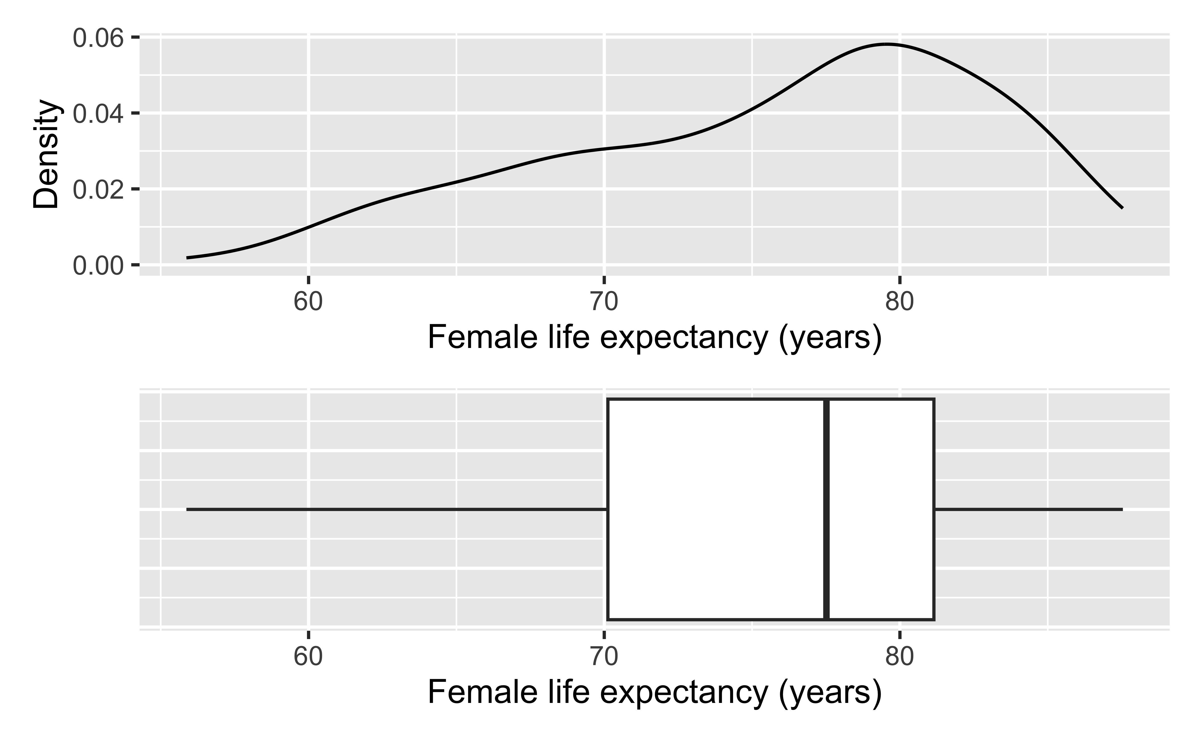
  • What features of the distribution do both plots show well?
  • What additional information does the density plot provide?
  • What additional information does the box plot provide?
  • Is the distribution symmetric or skewed?

Box plot

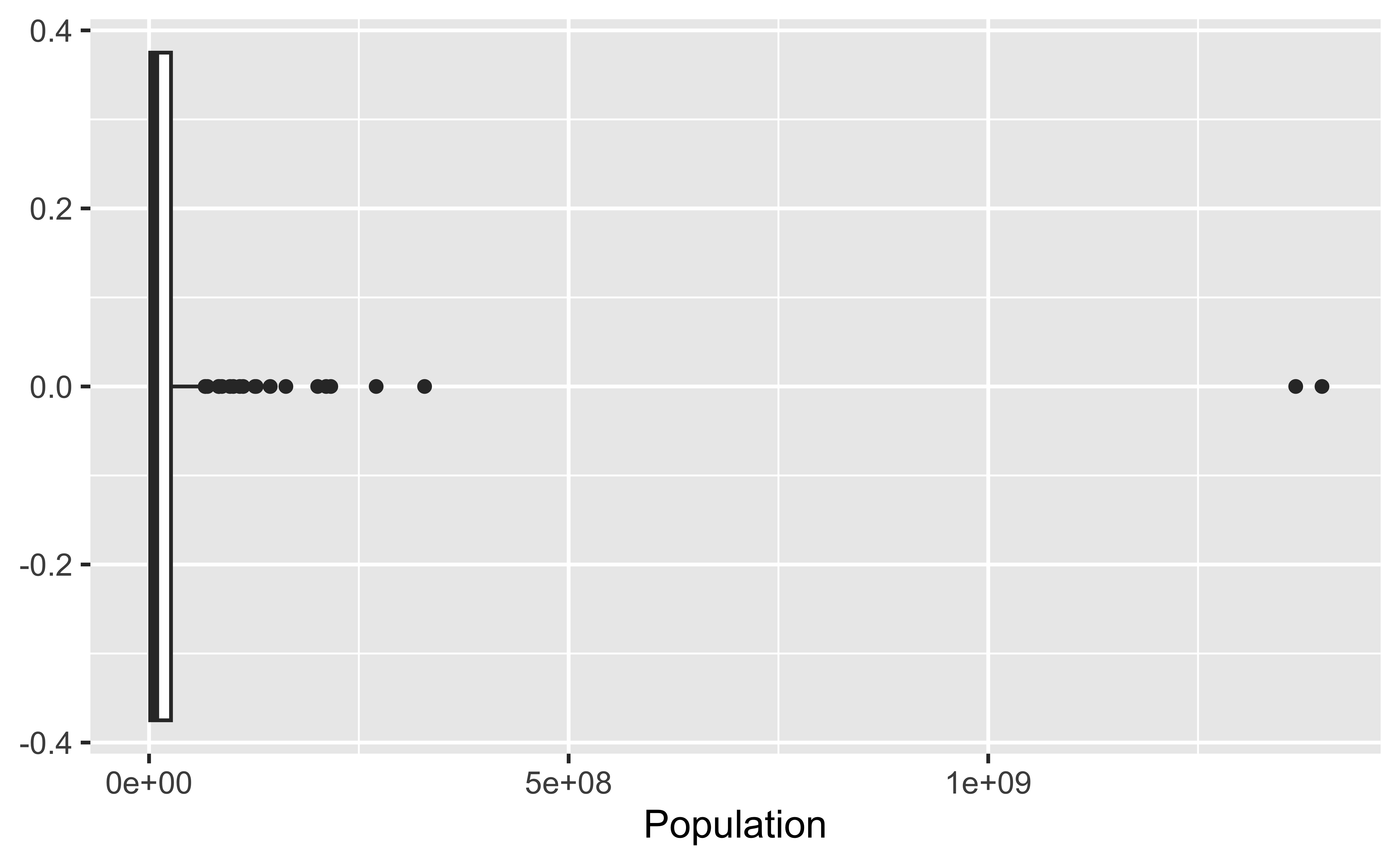
The distribution of population is highly skewed.

  • Most countries have relatively small populations.
  • A few countries have extremely large populations.
  • These large populations appear as outliers.
  • The long right tail indicates a right-skewed distribution.

Box plot

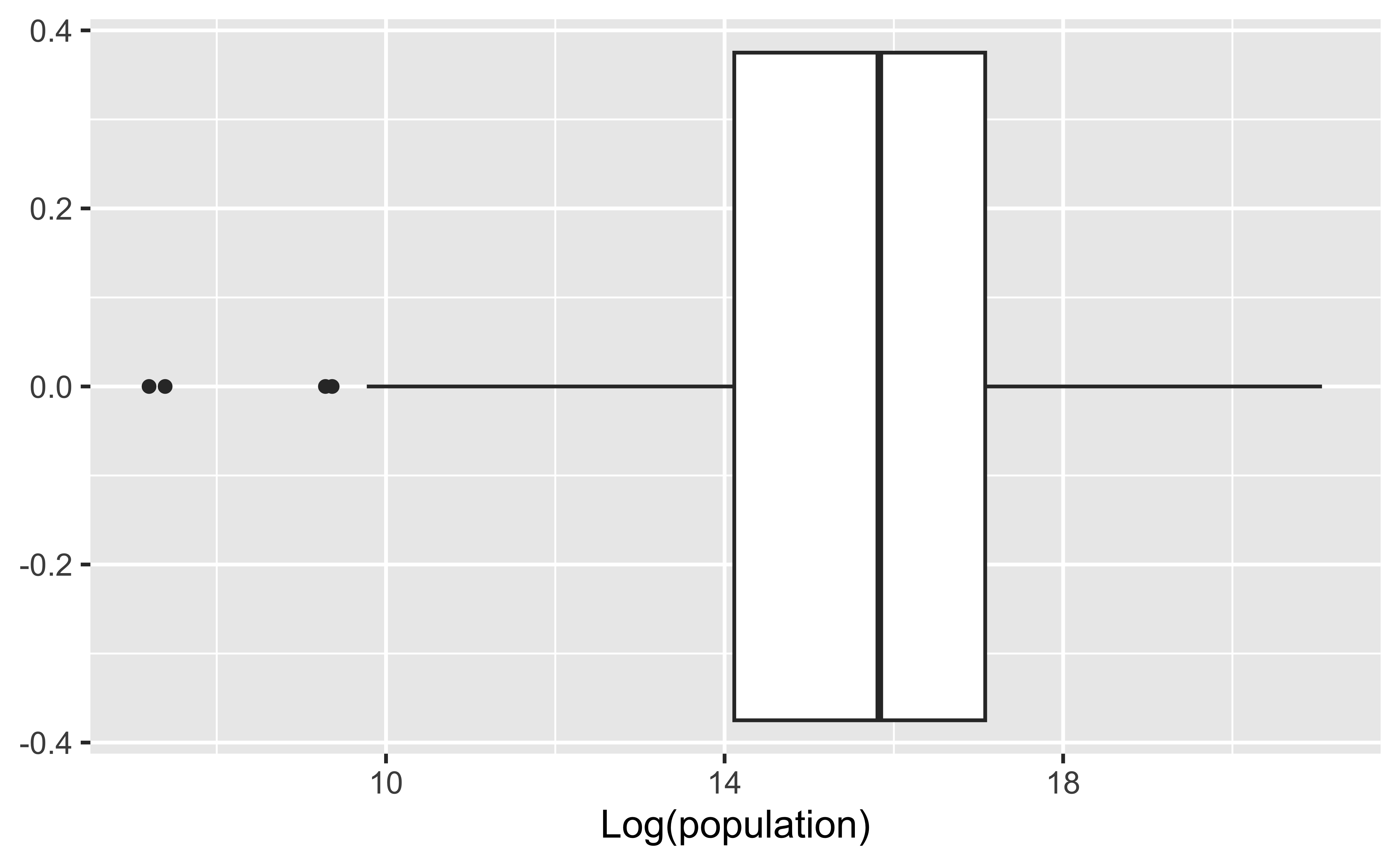
Here we plot the natural logarithm of the population because the original population values are highly skewed (primarily due to China and India). On the log scale, the largest countries are no longer extreme outliers, and the smallest populations become the outliers.

  • The log (ln) transformation reduces the effect of extremely large populations.
  • The distribution is much more symmetric than on the original scale.
  • Countries with the smallest populations now appear as outliers.
  • Log transformations are often useful for variables that span several orders of magnitude.

Customizing box plots

lifespan2023 %>%
  filter(sex == "Female") %>%
  ggplot(aes(x = lifeexp)) +
  geom_boxplot() +
  scale_x_continuous(breaks = scales::breaks_width(5)) +
  labs(
    x = "Female life expectancy (years)",
    y = NULL,
    title = "2023 Life Expectancy of Women"
  ) +
  theme(
    axis.ticks.y = element_blank(),
    axis.text.y = element_blank()
  )

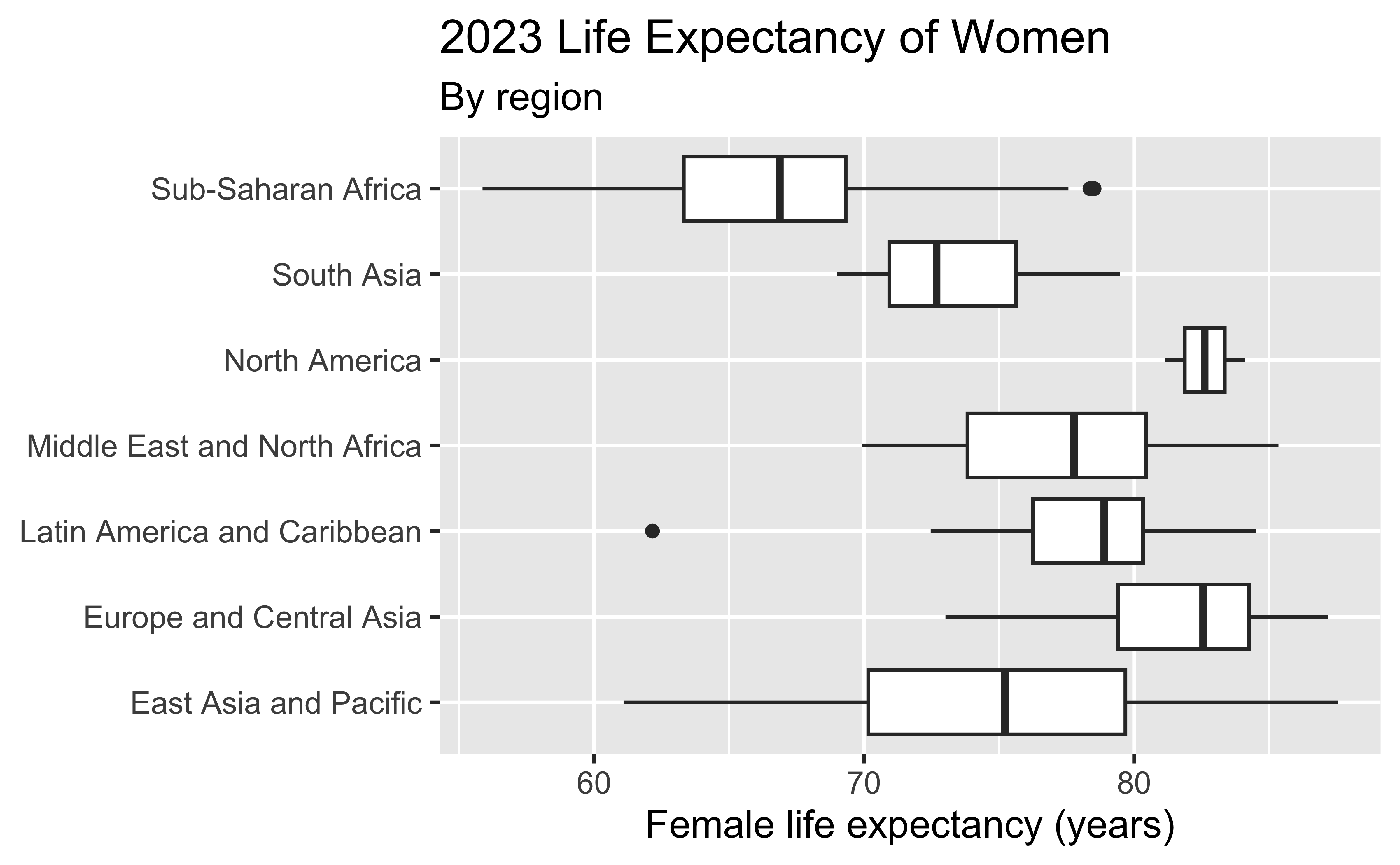
Adding a categorical variable

lifespan2023 %>%
  filter(sex == "Female") %>%
  ggplot(
    aes(
      x = lifeexp,
      y = worldbankregion
    )
  ) +
  geom_boxplot() +
  labs(
    x = "Female life expectancy (years)",
    y = NULL,
    title = "2023 Life Expectancy of Women",
    subtitle = "By region"
  )

Homework (Practice)

IMS Chapter 5

  • Problem 2
  • Problem 4
  • Problem 6
  • Problem 9
  • Problem 10
  • Problem 11
  • Problem 13
  • Problem 15
  • Problem 17
  • Problem 18