Visualizing categorical data

Introduction to Global Health Data Science

Author
Affiliation

Amy Herring

Duke University
STA/GLHLTH 198 Fall 2026

Published

August 26, 2026

Recap

Variables

  • Numerical variables can be classified as continuous or discrete based on whether or not the variable can take on an infinite number of values.
  • If the variable is categorical, we can determine if it is ordinal based on whether or not the levels have a natural ordering.

Data

We consider data from the Global Adult Tobacco Survey (GATS), which is designed to provide nationally-representative data on non-institutionalized people 15 years and older. This survey is a global standard for systematically monitoring adult tobacco use and is produced by the Centers for Disease Control (CDC) in collaboration with the World Health Organization (WHO), RTI International, and Johns Hopkins University.

China has the largest smoking population in the world and accounts for roughly 40% of tobacco consumption worldwide. We will focus on GATS data from China in 2018 (the most recent survey year), but note data from other countries are available from the WHO’s Microdata Repository.

Data

glimpse(gats)
Rows: 19,376
Columns: 18
$ CASEID         <dbl> 601010, 601012, 601013, 601014, 601015, …
$ RESIDENCE      <fct> Urban, Urban, Urban, Urban, Urban, Urban…
$ PROVINCE       <fct> Beijing, Beijing, Beijing, Beijing, Beij…
$ REGION6        <fct> North, North, North, North, North, North…
$ REGION3        <fct> East, East, East, East, East, East, East…
$ AGE            <dbl> 33.95342, 35.92877, 70.52055, 56.95342, …
$ GENDER         <fct> Female, Male, Male, Male, Female, Female…
$ CURRENTSMOKE   <fct> No, No, No, No, Yes, No, No, No, No, Yes…
$ EDUCATION      <fct> High School, Postgraduate, Secondary Sch…
$ OCCUPATION     <fct> Other, Other, Retired, Other, Retired, B…
$ AGESTART       <dbl> NA, NA, NA, NA, 20, NA, NA, NA, NA, 14, …
$ CIGS_DAY       <dbl> NA, NA, NA, NA, 10, NA, NA, NA, NA, 5, N…
$ HEARDOFECIG    <fct> No, Yes, Yes, Yes, Yes, Yes, Yes, No, Ye…
$ ECIGUSE        <fct> NA, Not at All, Not at All, Not at All, …
$ TRYSTOP        <fct> NA, NA, NA, NA, Yes, NA, NA, NA, NA, No,…
$ HOMESMOKERULES <fct> Never Allowed, Never Allowed, Never Allo…
$ SMOKESICK      <fct> Yes, Yes, Yes, Yes, Yes, Yes, Yes, Yes, …
$ SMOKECANCER    <fct> Yes, Yes, Yes, Yes, Yes, Yes, Yes, Yes, …
Selected variables

Variable Description
CURRENTSMOKE Current smoking status (yes, no, or don’t know)
AGE Computed from date of birth
EDUCATION Highest level of education completed
GENDER Interviewer-recorded gender (male, female, or missing/NA)
PROVINCE Province of residence

Other variables are also available in the dataset. Sample survey weights are not included but should be used to obtain nationally representative estimates (our unweighted estimates are fairly close for the quantities we consider today).

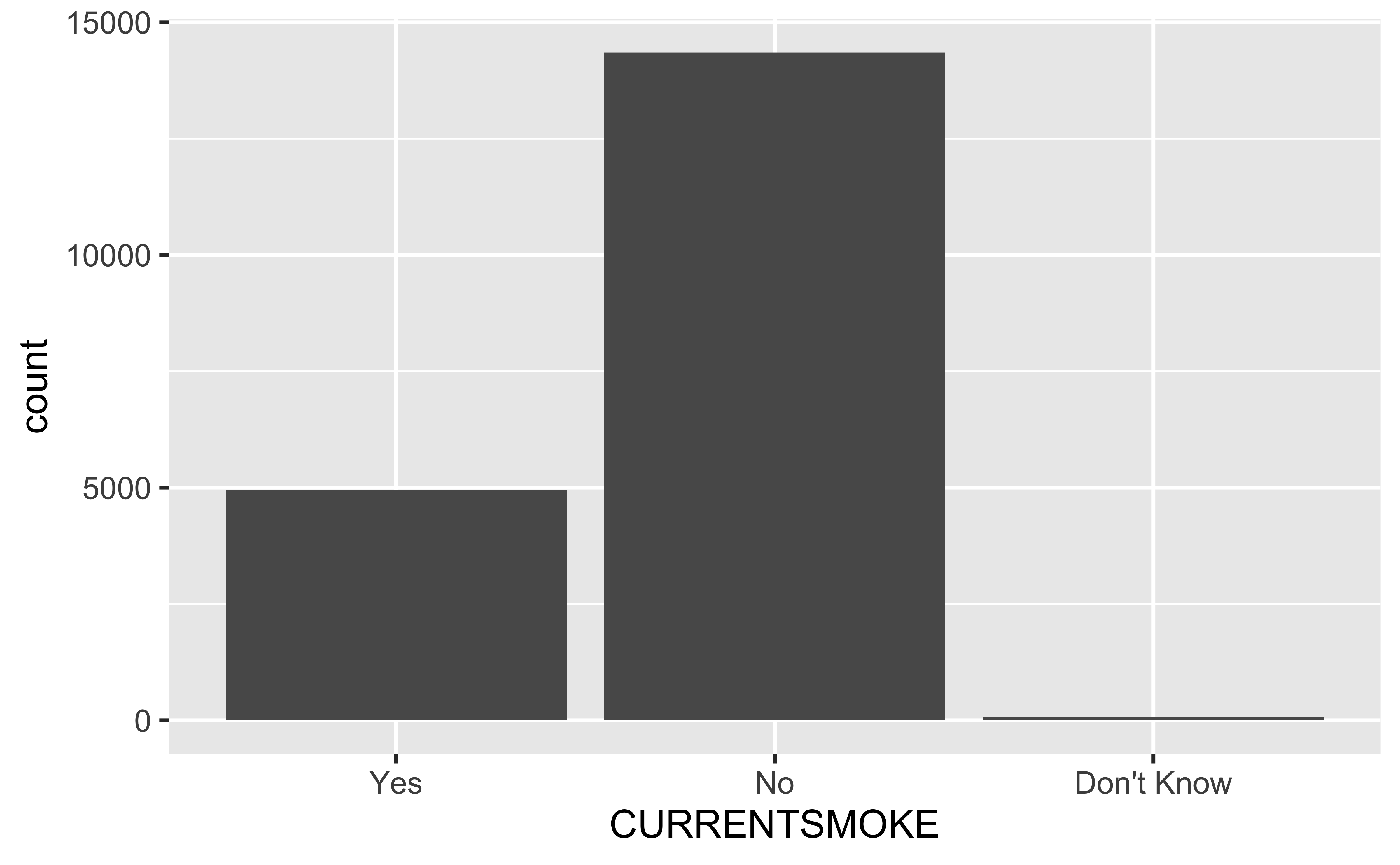
Bar plot

Bar plot

ggplot(gats, aes(x = CURRENTSMOKE)) +
  geom_bar()

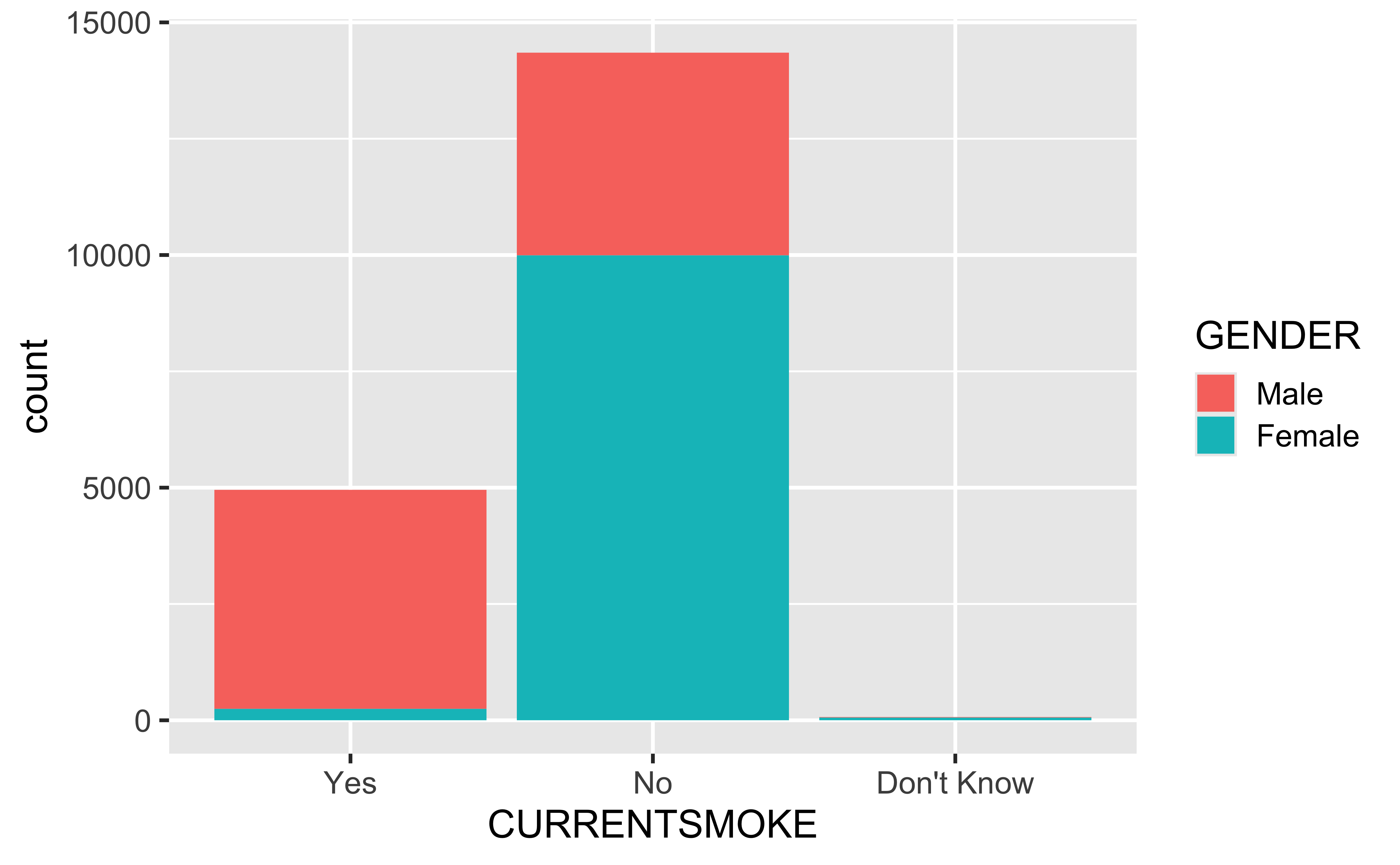
Stacked bar plot

ggplot(
  gats,
  aes(
    x = CURRENTSMOKE,
    fill = GENDER
  )
) +
  geom_bar()

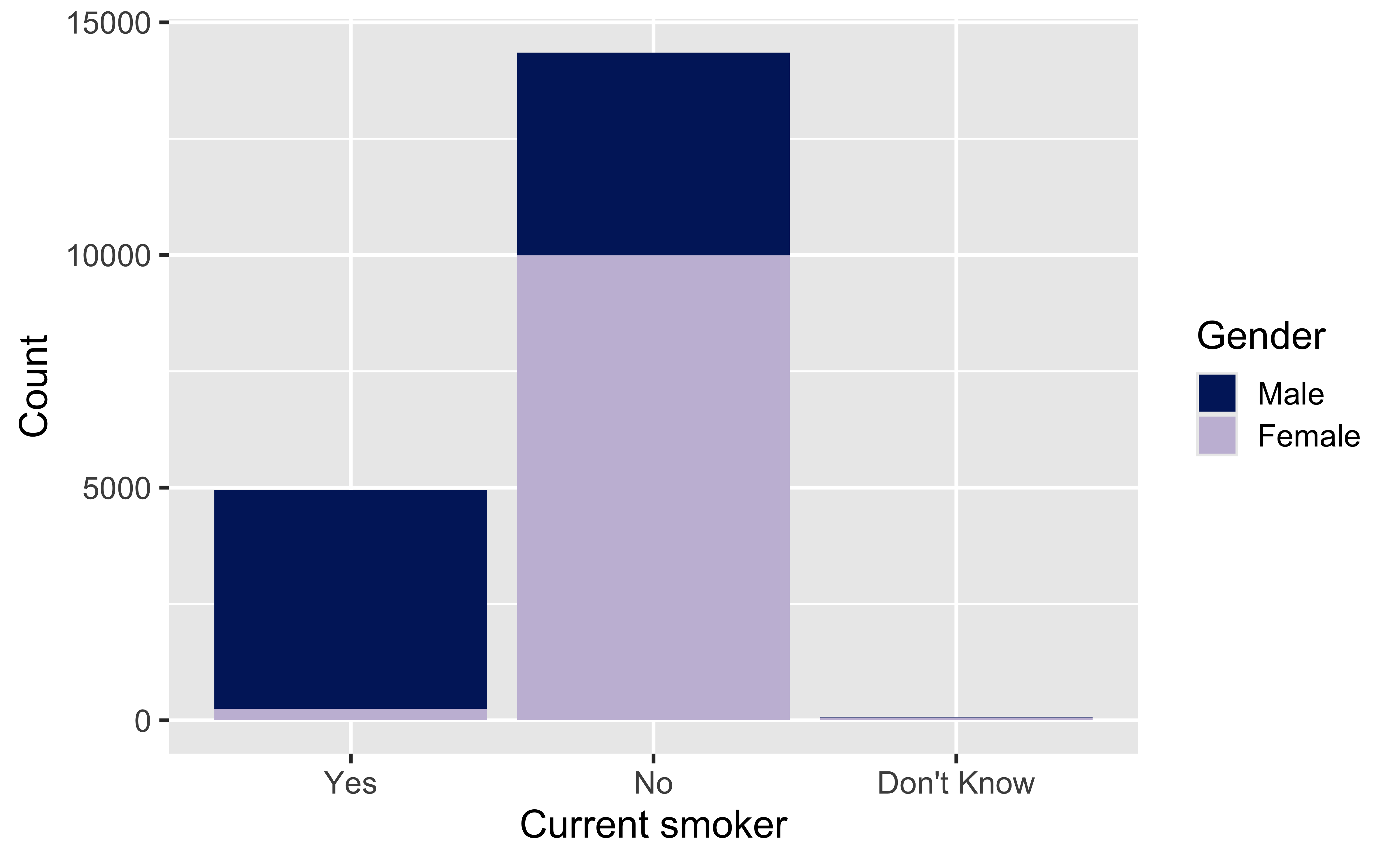
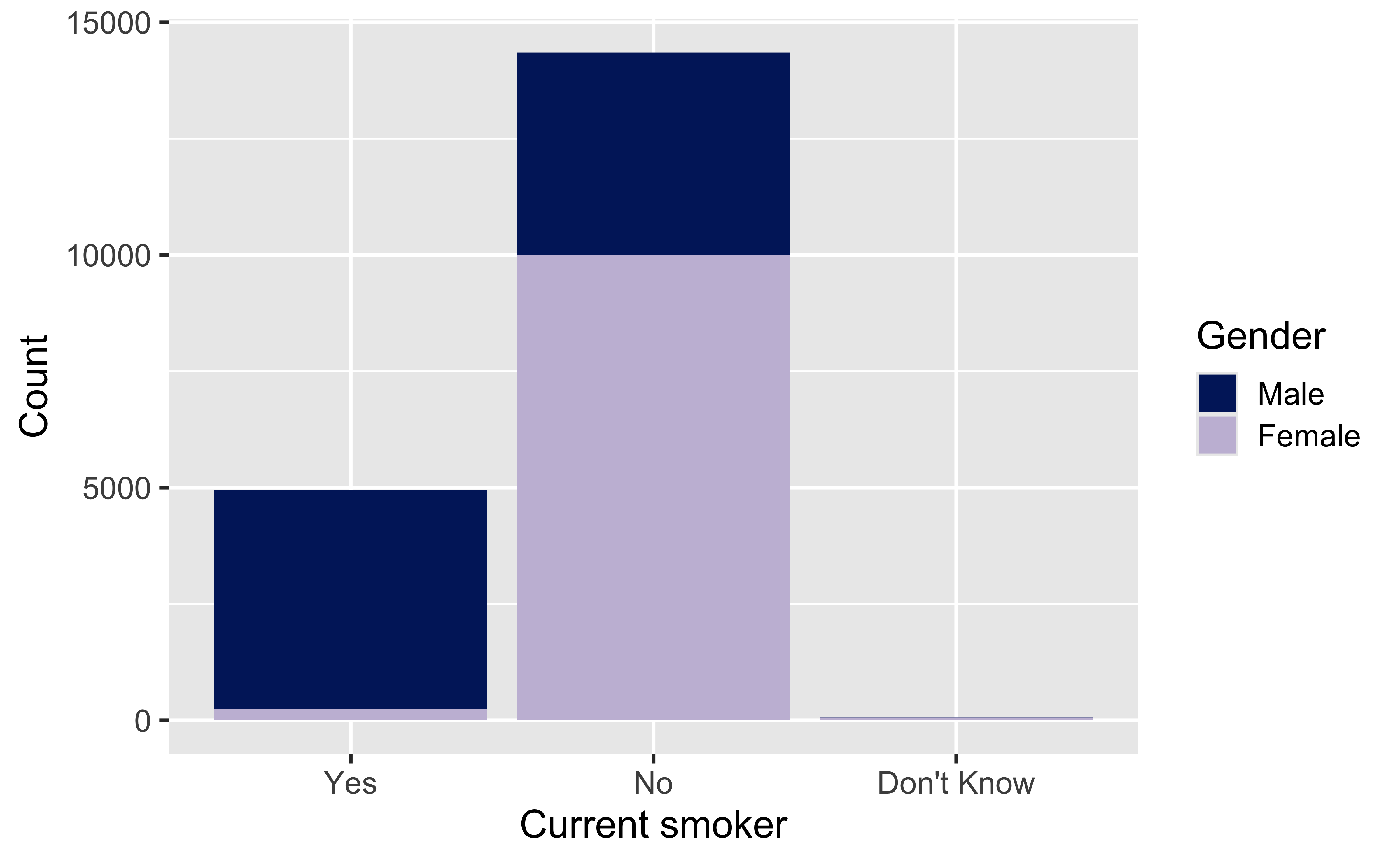
Ok, I dislike those colors

ggplot(
  gats,
  aes(
    x = CURRENTSMOKE,
    fill = GENDER
  )
) +
  geom_bar() +
  scale_fill_manual(
    values = c(
      "Male" = "#012169",
      "Female" = "#C7BDD9"
    )
  ) +
  labs(
    x = "Current smoker",
    y = "Count",
    fill = "Gender"
  )

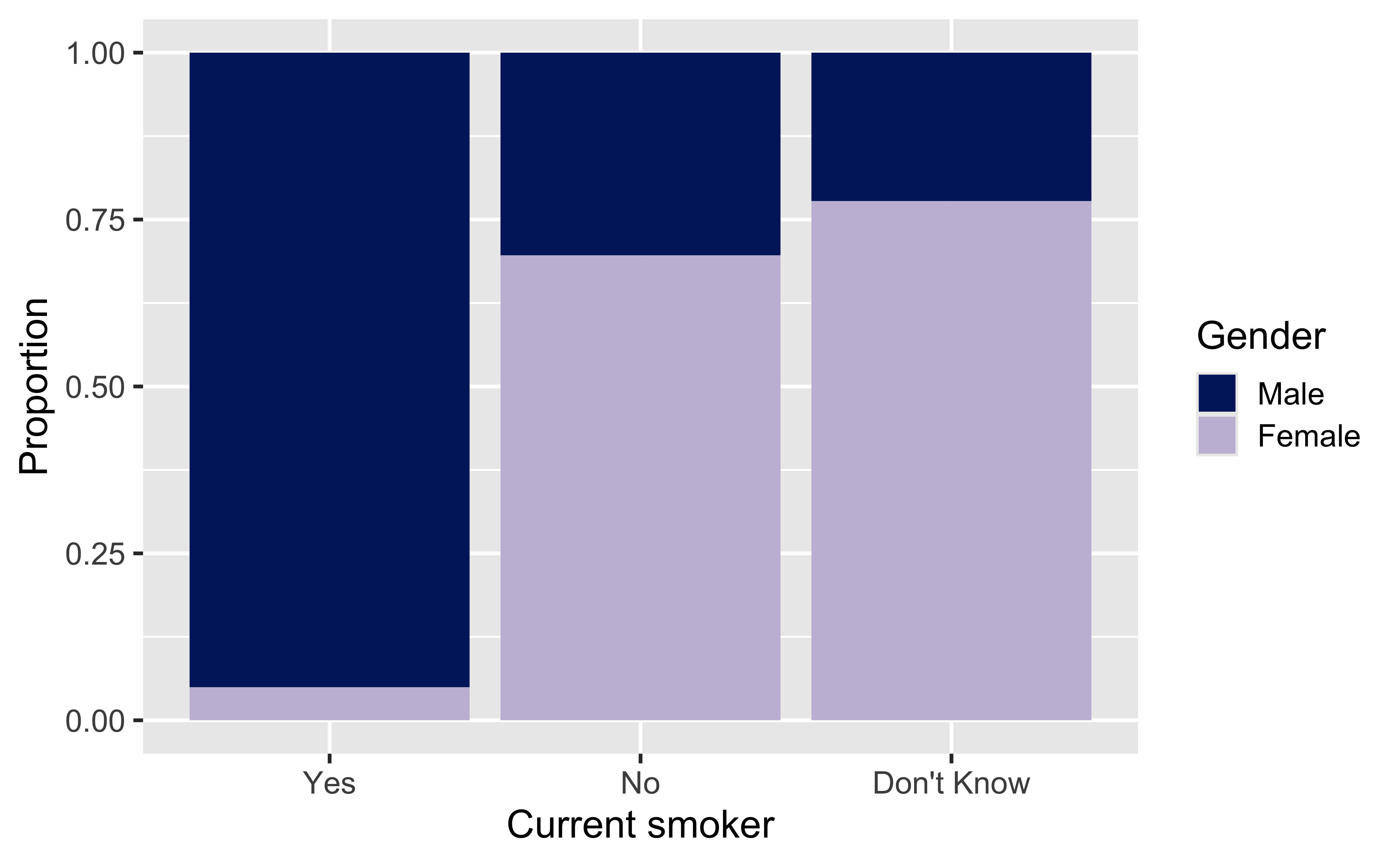
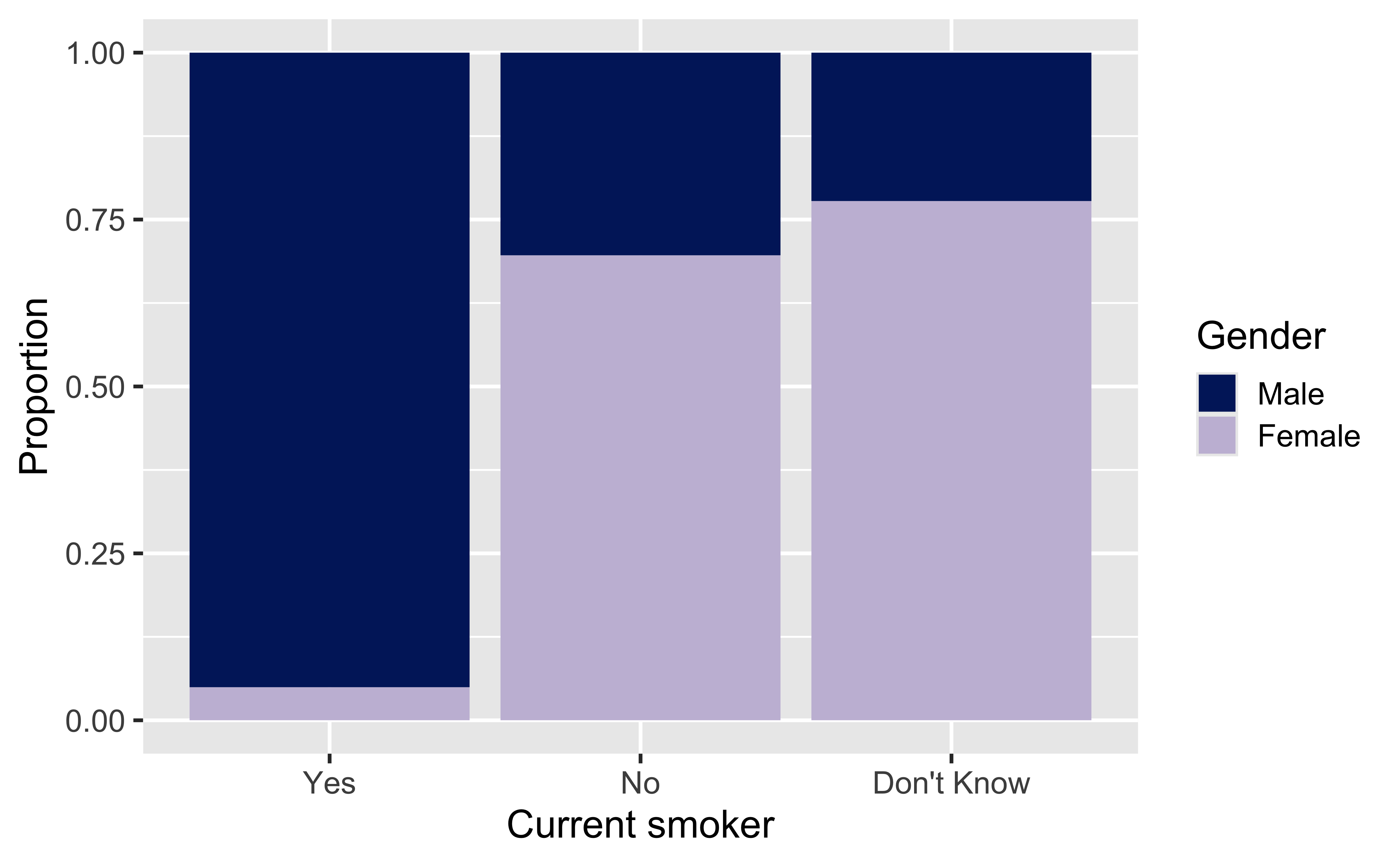
Segmented bar plot

ggplot(
  gats,
  aes(
    x = CURRENTSMOKE,
    fill = GENDER
  )
) +
  geom_bar(position = "fill") +
  scale_fill_manual(
    values = c(
      "Male" = "#012169",
      "Female" = "#C7BDD9"
    )
  ) +
  labs(
    x = "Current smoker",
    y = "Proportion",
    fill = "Gender"
  )

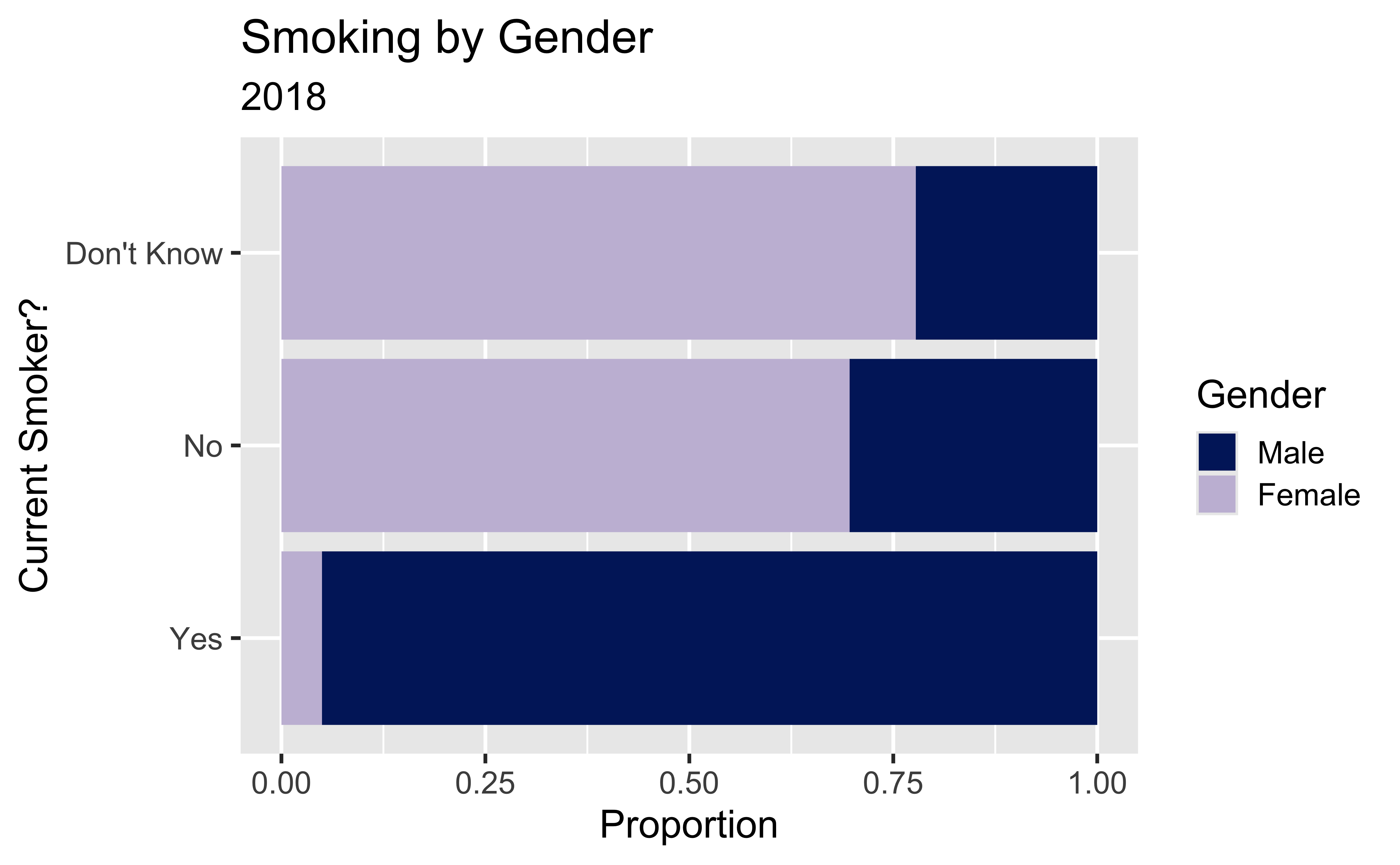
Here, instead of looking at raw counts, we’re looking at the proportion of smokers in each gender category.

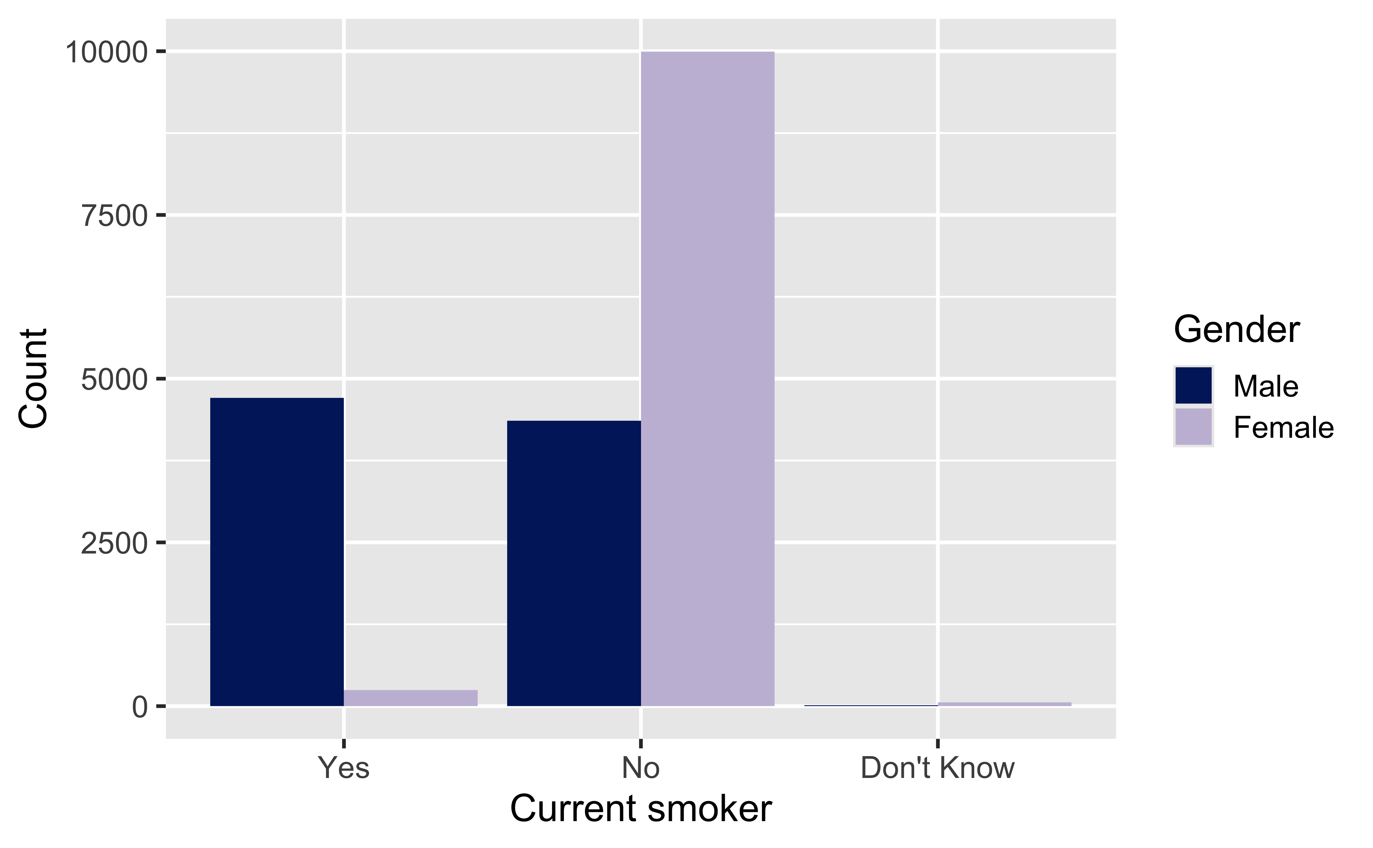
Which plot is more useful?

Customizing bar plots

ggplot(
  gats,
  aes(
    y = CURRENTSMOKE,
    fill = GENDER
  )
) +
  geom_bar(position = "fill") +
  scale_fill_manual(
    values = c(
      "Male" = "#012169",
      "Female" = "#C7BDD9"
    )
  ) +
  labs(
    x = "Proportion",
    y = "Current Smoker?",
    fill = "Gender",
    title = "Smoking by Gender",
    subtitle = "2018"
  )

Side-by-side bar plot

ggplot(
  gats,
  aes(
    x = CURRENTSMOKE,
    fill = GENDER
  )
) +
  geom_bar(position = position_dodge()) +
  scale_fill_manual(
    values = c(
      "Male" = "#012169",
      "Female" = "#C7BDD9"
    )
  ) +
  labs(
    x = "Current smoker",
    y = "Count",
    fill = "Gender"
  )


Relationships between numerical and categorical variables

Already talked about…

  • Coloring and faceting histograms and density plots
  • Side-by-side box plots

Violin plots

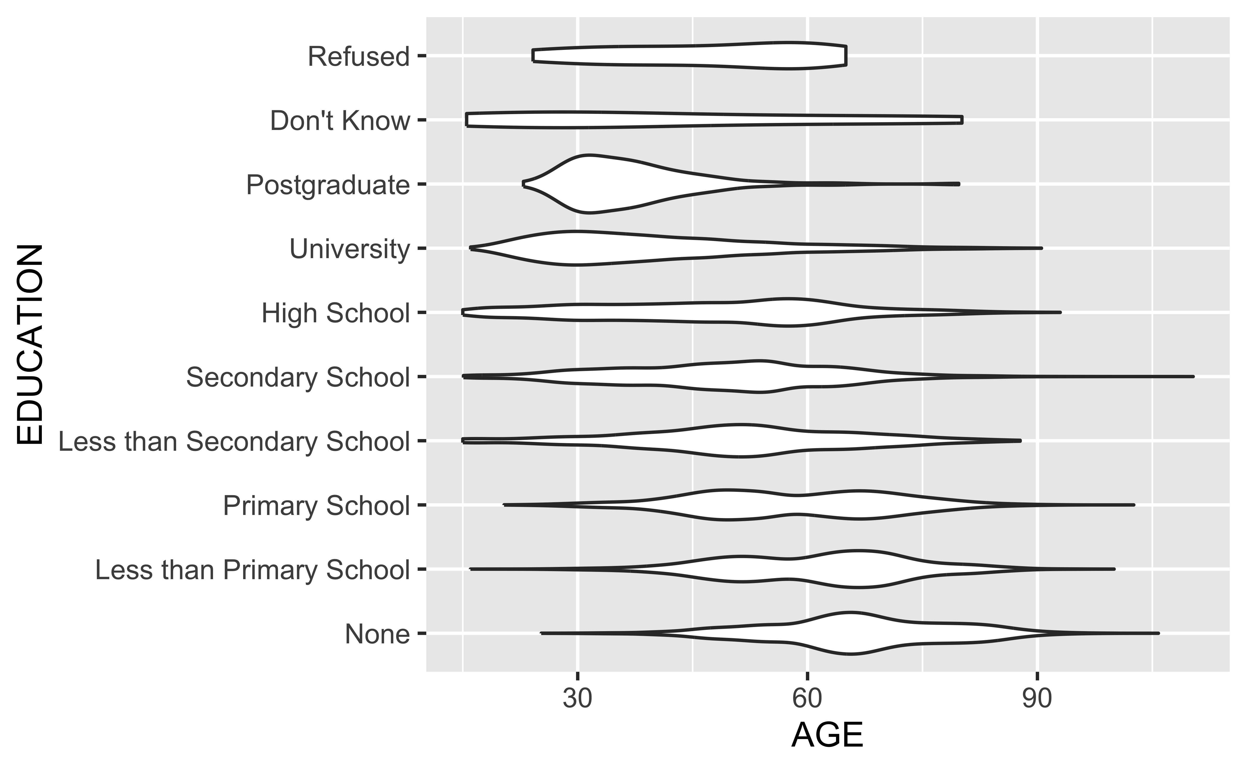
Violin plots are like boxplots, but instead of showing the quartiles (25th, 50th, and 75th %iles), they show rotated density plots on each side.

Violin plots

ggplot(
  gats,
  aes(
    x = AGE,
    y = EDUCATION
  )
) +
  geom_violin()

Ridge plots

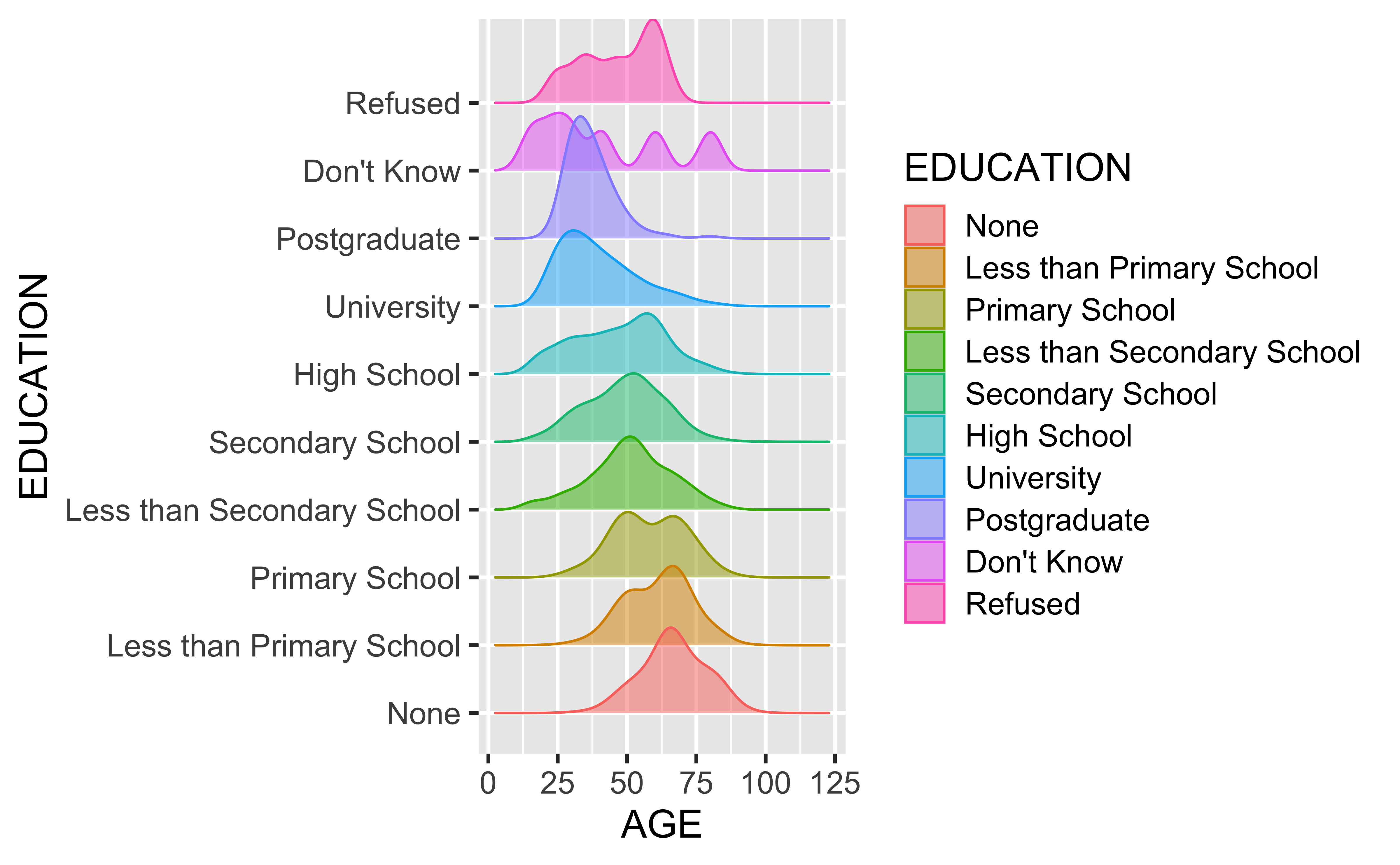
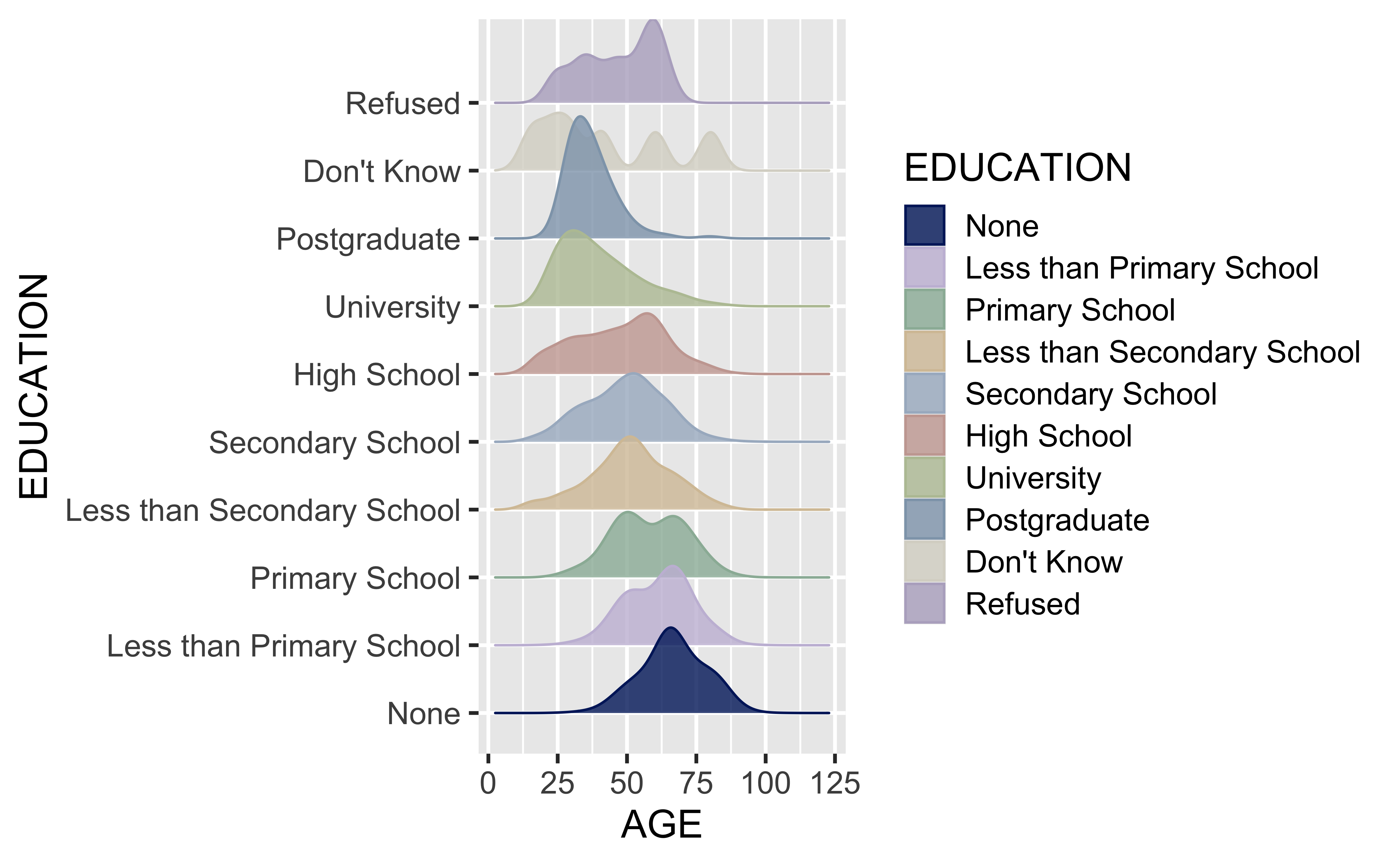
Ridge plots also show density estimates across categorical groups

Ridge plots

library(ggridges)

ggplot(
  gats,
  aes(
    x = AGE,
    y = EDUCATION,
    fill = EDUCATION,
    color = EDUCATION
  )
) +
  geom_density_ridges(alpha = 0.5)

Muted color palette

library(ggridges)

duke_palette <- c(
  "#012169",  # Duke blue
  "#C7BDD9",  # soft lavender
  "#9BB7A5",  # muted sage
  "#D6C3A5",  # warm sand
  "#A8B7C9",  # dusty blue
  "#C9A7A1",  # dusty rose
  "#B9C3A3",  # olive sage
  "#8FA4B8",  # slate blue
  "#D9D6CC",  # warm gray
  "#B7AFC8"   # gray lavender

)

ggplot(
  gats,
  aes(
    x = AGE,
    y = EDUCATION,
    fill = EDUCATION,
    color = EDUCATION
  )
) +
  geom_density_ridges(alpha = 0.8) +
  scale_fill_manual(values = duke_palette) +
  scale_color_manual(values = duke_palette)

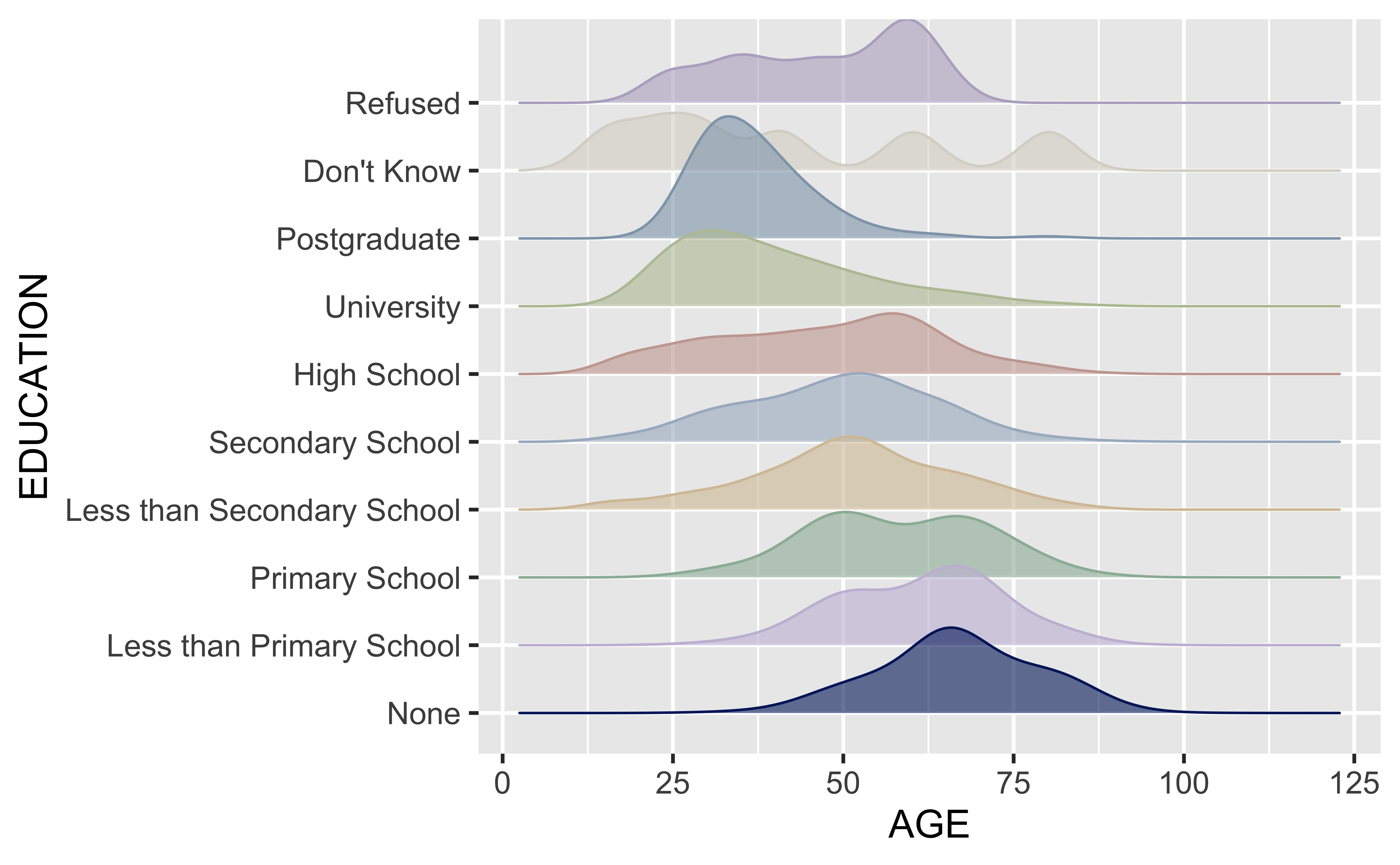
Don’t need the legend

library(ggridges)

duke_palette <- c(
  "#012169", "#C7BDD9", "#9BB7A5",
  "#D6C3A5", "#A8B7C9", "#C9A7A1",
  "#B9C3A3", "#8FA4B8", "#D9D6CC",
  "#B7AFC8"
)

ggplot(
  gats,
  aes(
    x = AGE,
    y = EDUCATION,
    fill = EDUCATION,
    color = EDUCATION
  )
) +
  geom_density_ridges(alpha = 0.6) +
  scale_fill_manual(values = duke_palette) +
  scale_color_manual(values = duke_palette) +
  theme(
    legend.position = "none"
  )

Homework (Practice)

IMS Chapter 4

  • Problem 5
  • Problem 7
  • Problem 8