Visualising data with ggplot2
Introduction to Global Health Data Science
ggplot2 \(\in\) tidyverse
- ggplot2 is the tidyverse’s data visualization package.
- The structure of ggplot code can be summarized as:
ggplot(
  data = my_data,
  mapping = aes(
    x = x_var,
    y = y_var
  )
) +
  geom_xxx() +
  other_options
Data: Life expectancy from infancy
IHME data on location (mostly countries), World Bank region, binary sex, and estimated life expectancy and population in 2023 will be used to explore the men’s health gap (later we will add more years).

Dr. Abernathy of The Simpsons (aged 40)
glimpse(lifeexpwide2023)Rows: 204
Columns: 6
$ location <chr> "Afghanistan", "Albania", "Algeria", "A…
$ year <dbl> 2023, 2023, 2023, 2023, 2023, 2023, 202…
$ worldbankregion <chr> "South Asia", "Europe and Central Asia"…
$ pop <dbl> 38041757, 2854191, 43053054, 55312, 771…
$ Female <dbl> 68.98985, 82.05155, 77.60938, 74.38214,…
$ Male <dbl> 68.13812, 77.27016, 74.54654, 67.96911,…Grampa Simpson (Matt Groening)

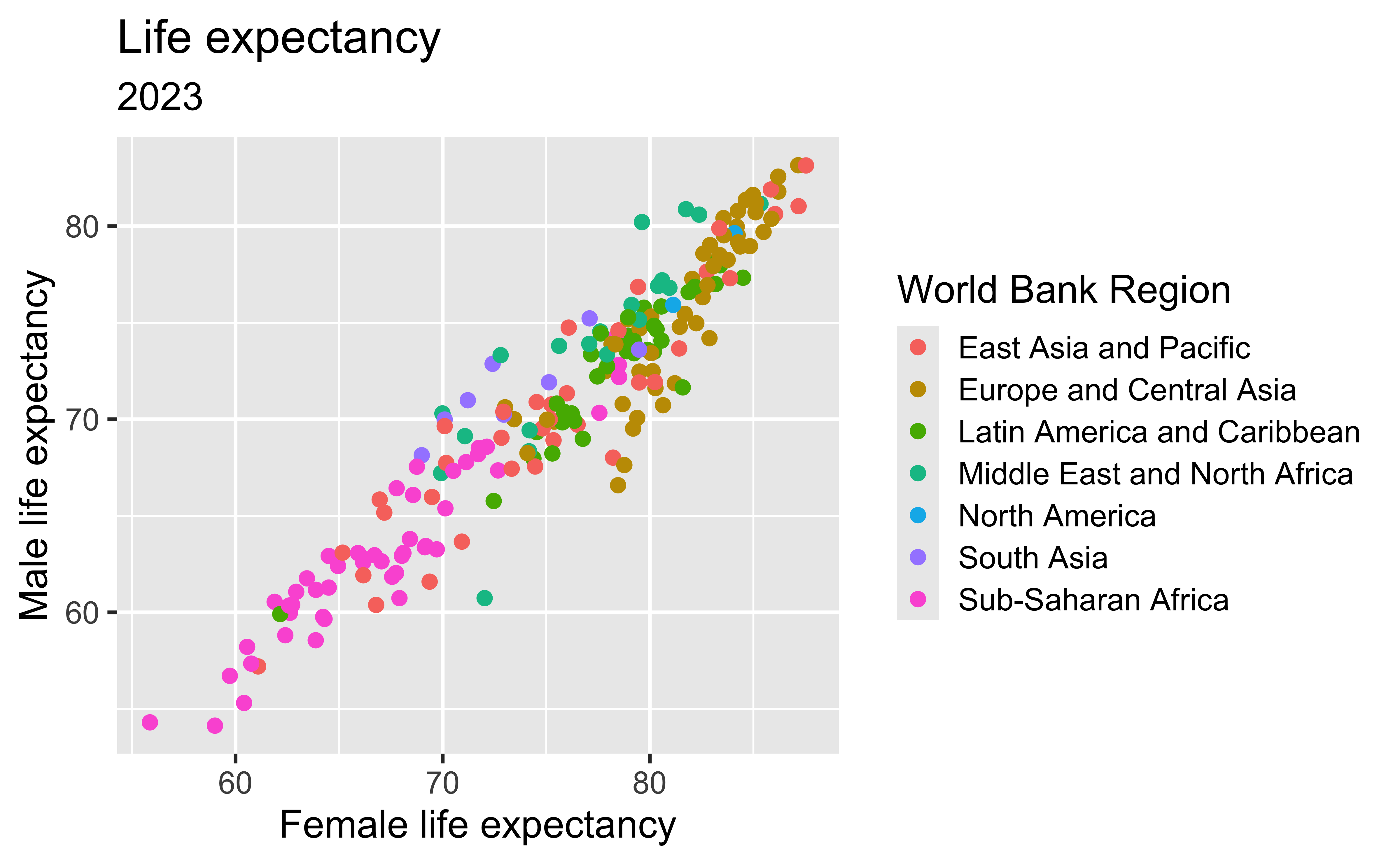
Life expectancy
Discuss
- What does the color represent?
- What overall pattern do you notice?
- What additional information would help explain the scatter?
Building the plot
ggplot(
  data = lifeexpwide2023,
  mapping = aes(
    x = Female,
    y = Male,
    color = worldbankregion
  )
) +
  geom_point() +
  labs(
    title = "Life expectancy",
    subtitle = "2023",
    x = "Female life expectancy",
    y = "Male life expectancy",
    color = "World Bank Region"
  )
Coding out loud
Start with the
lifeexpwide2023data
ggplot(
  data = lifeexpwide2023
)
Coding out loud
Start with the
lifeexpwide2023data,
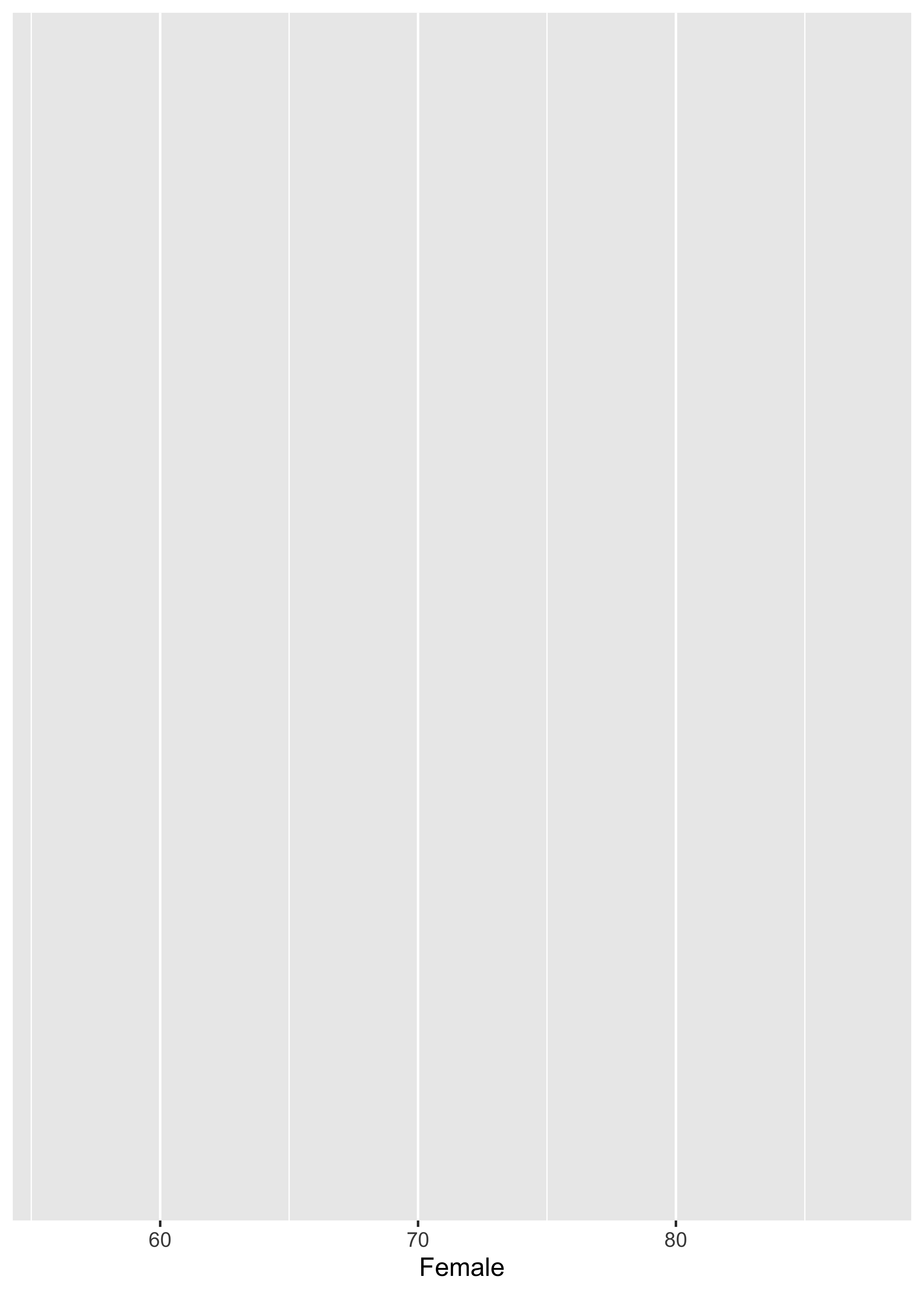
and map female life expectancy to the x-axis
ggplot(
  data = lifeexpwide2023,
  mapping = aes(
    x = Female
  )
)
Coding out loud
Start with the
lifeexpwide2023data,
map female life expectancy to the x-axis,
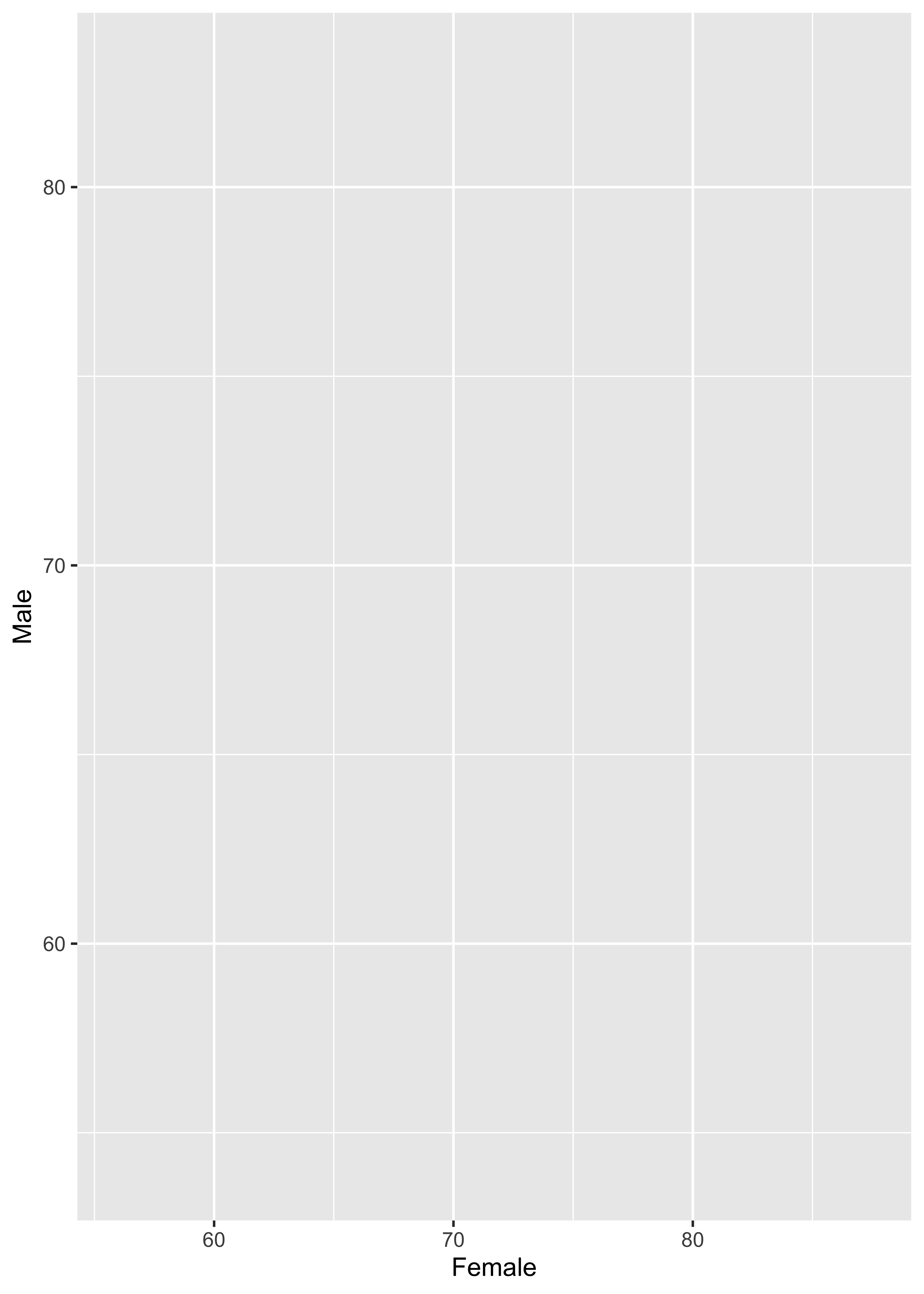
and map male life expectancy to the y-axis
ggplot(
  data = lifeexpwide2023,
  mapping = aes(
    x = Female,
    y = Male
  )
)
Coding out loud
Start with the
lifeexpwide2023data,
map female life expectancy to the x-axis,
map male life expectancy to the y-axis,
and represent each observation with a point
ggplot(
  data = lifeexpwide2023,
  mapping = aes(
    x = Female,
    y = Male
  )
) +
  geom_point()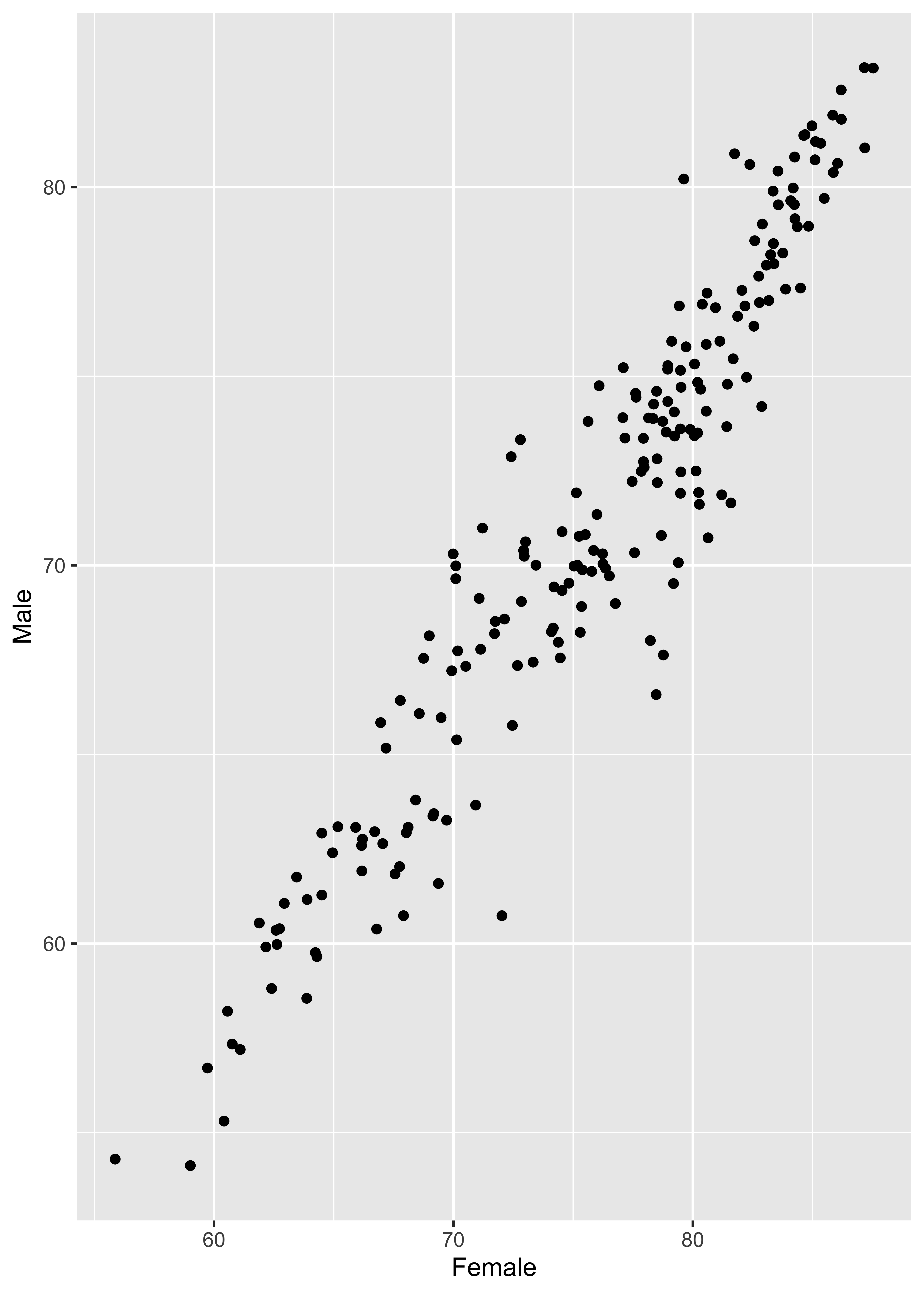
Coding out loud
Start with the
lifeexpwide2023data,
map female life expectancy to the x-axis,
map male life expectancy to the y-axis,
represent each observation with a point,
and map region to the color of each point
ggplot(
  data = lifeexpwide2023,
  mapping = aes(
    x = Female,
    y = Male,
    color = worldbankregion
  )
) +
  geom_point()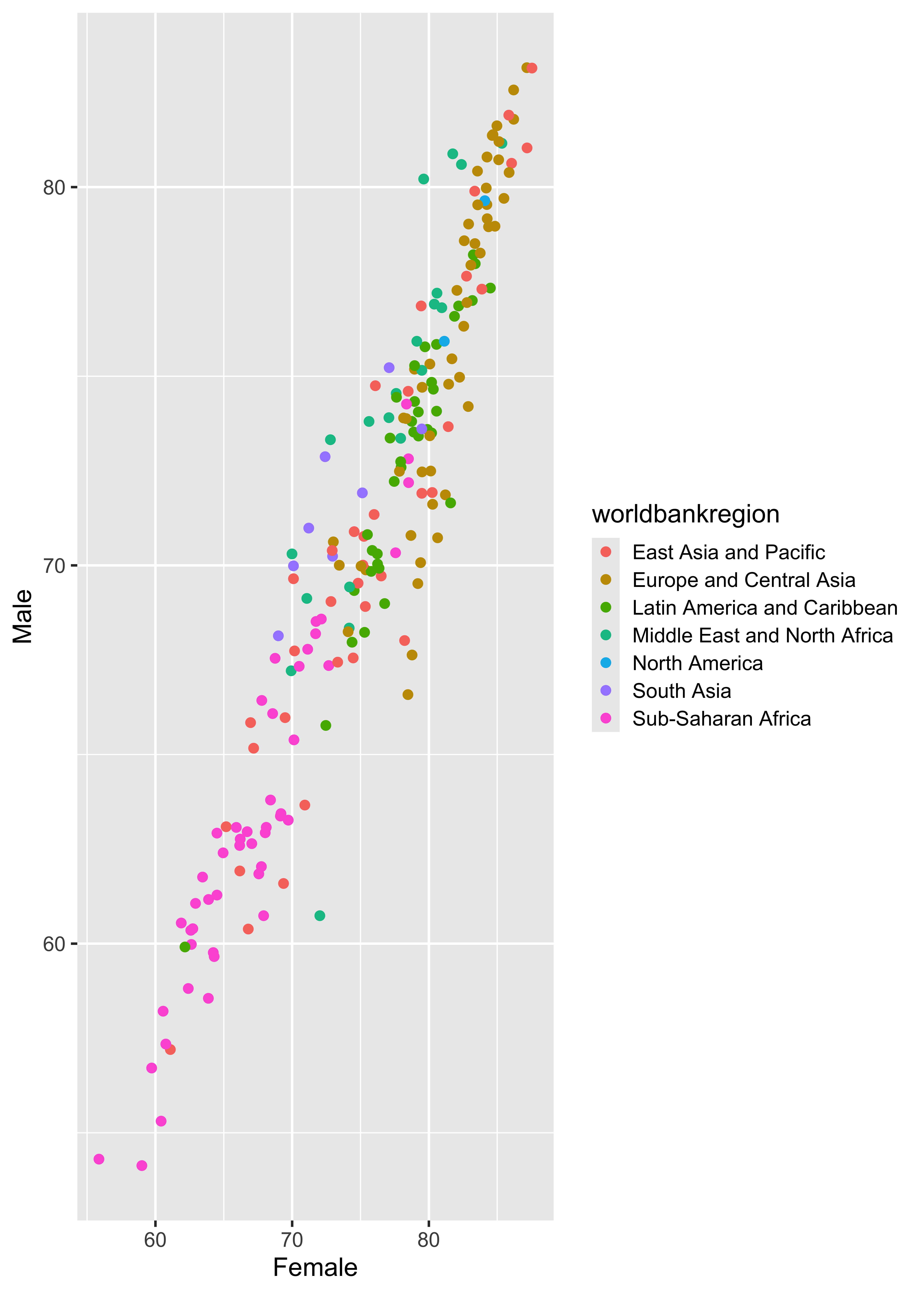
Coding out loud
Start with the
lifeexpwide2023data,
map female life expectancy to the x-axis,
map male life expectancy to the y-axis,
represent each observation with a point,
map region to the color of each point,
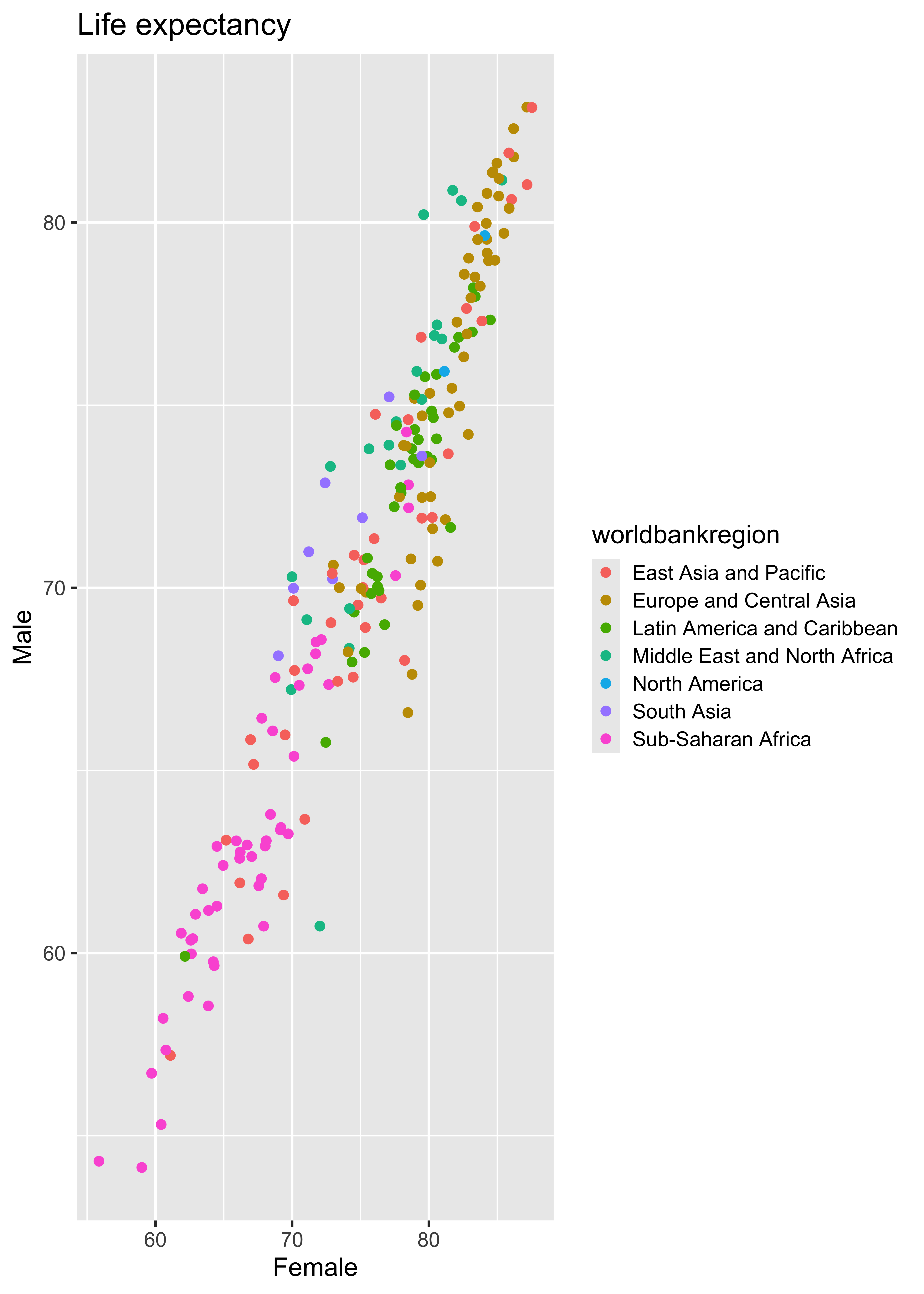
and title the plot “Life expectancy.”
ggplot(
  data = lifeexpwide2023,
  mapping = aes(
    x = Female,
    y = Male,
    color = worldbankregion
  )
) +
  geom_point() +
  labs(
    title = "Life expectancy"
  )
Coding out loud
Start with the
lifeexpwide2023data,
map female life expectancy to the x-axis,
map male life expectancy to the y-axis,
represent each observation with a point,
map region to the color of each point,
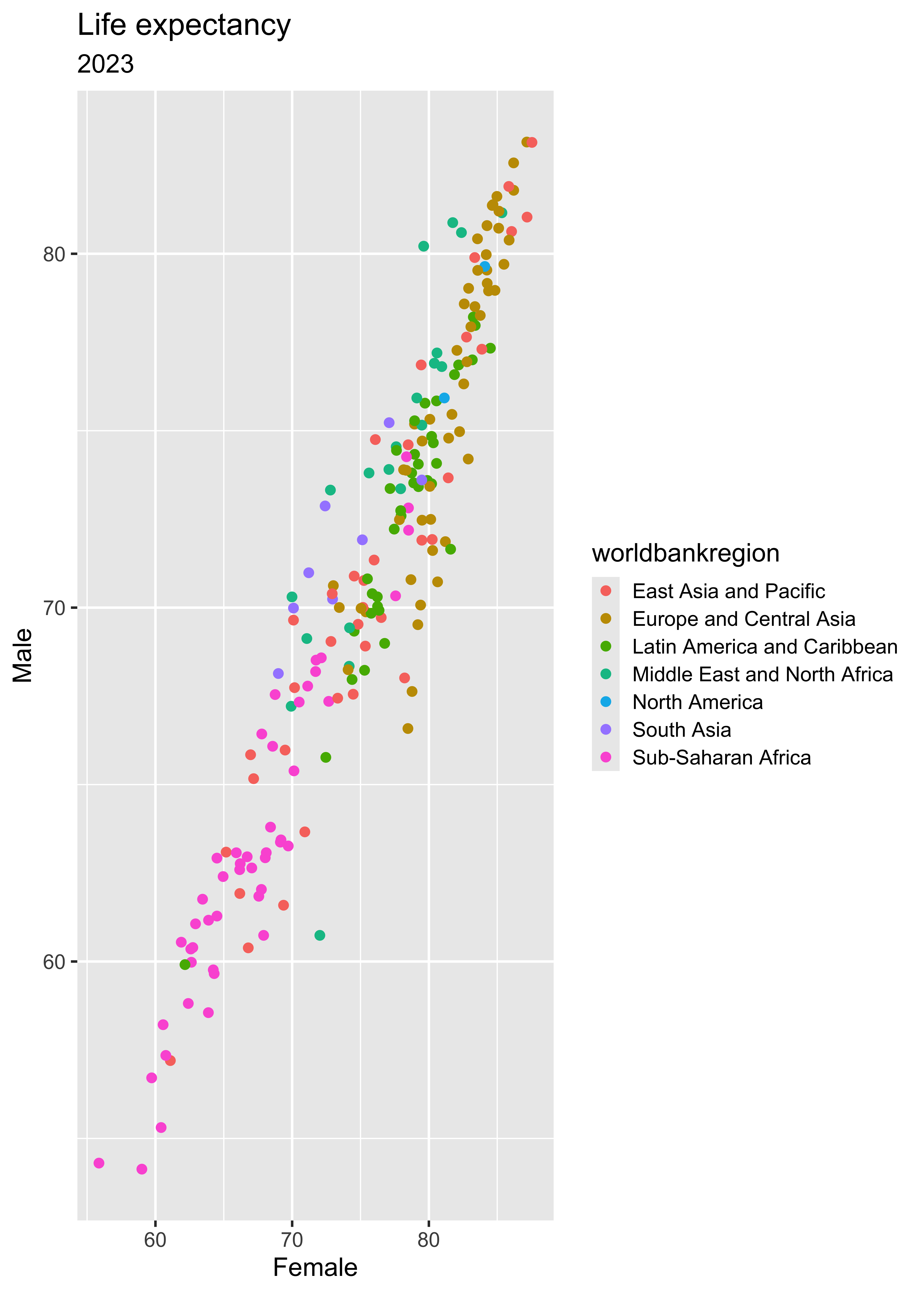
title the plot “Life expectancy,” and add the subtitle “2023.”
ggplot(
  data = lifeexpwide2023,
  mapping = aes(
    x = Female,
    y = Male,
    color = worldbankregion
  )
) +
  geom_point() +
  labs(
    title = "Life expectancy",
    subtitle = "2023"
  )
Coding out loud
Start with the
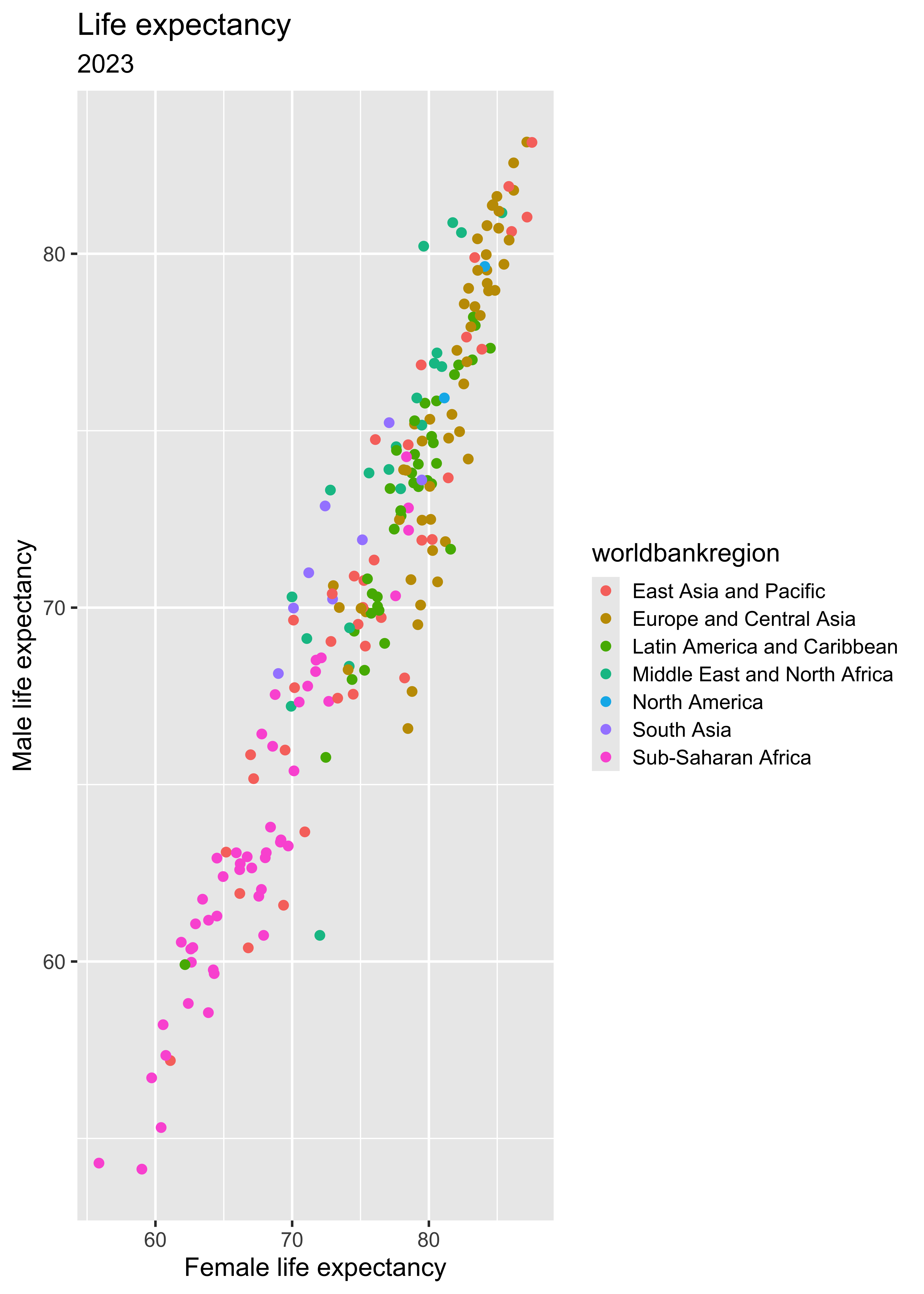
lifeexpwide2023data, map female life expectancy to the x-axis, map male life expectancy to the y-axis, represent each observation with a point, map region to the color of each point, title the plot “Life expectancy,” add the subtitle “2023,” and refine x and y axis labels.
ggplot(
  data = lifeexpwide2023,
  mapping = aes(
    x = Female,
    y = Male,
    color = worldbankregion
  )
) +
  geom_point() +
  labs(
    title = "Life expectancy",
    subtitle = "2023",
     x = "Female life expectancy",
     y = "Male life expectancy"
  )
Coding out loud
Start with the
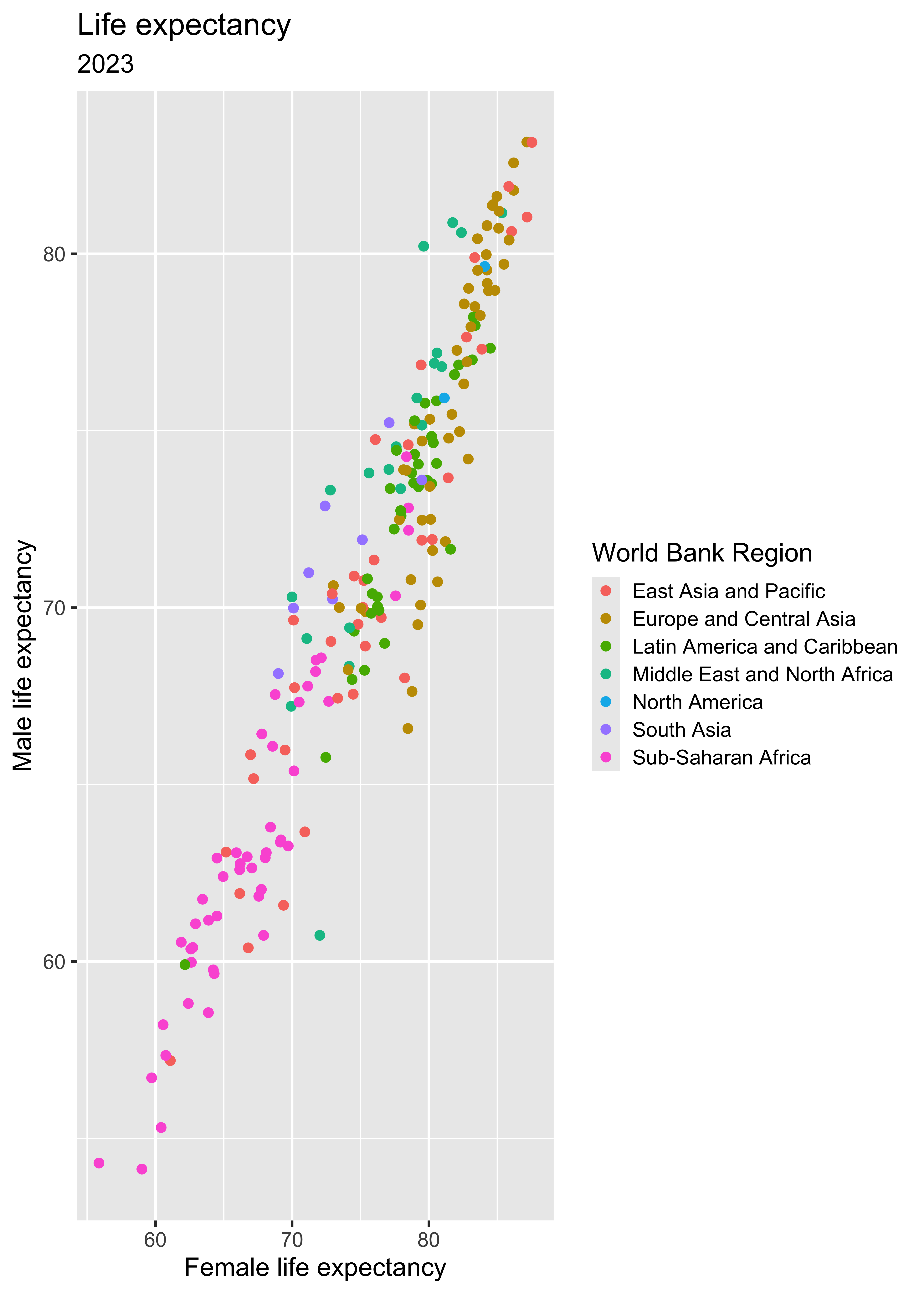
lifeexpwide2023data, map female life expectancy to the x-axis, map male life expectancy to the y-axis, represent each observation with a point, map region to the color of each point, title the plot “Life expectancy,” add the subtitle “2023,” refine the axis labels, and fix the legend label.
ggplot(
  data = lifeexpwide2023,
  mapping = aes(
    x = Female,
    y = Male,
    color = worldbankregion
  )
) +
  geom_point() +
  labs(
    title = "Life expectancy",
    subtitle = "2023",
     x = "Female life expectancy",
     y = "Male life expectancy",
     color="World Bank Region"
  )
Coding out loud
Start with the
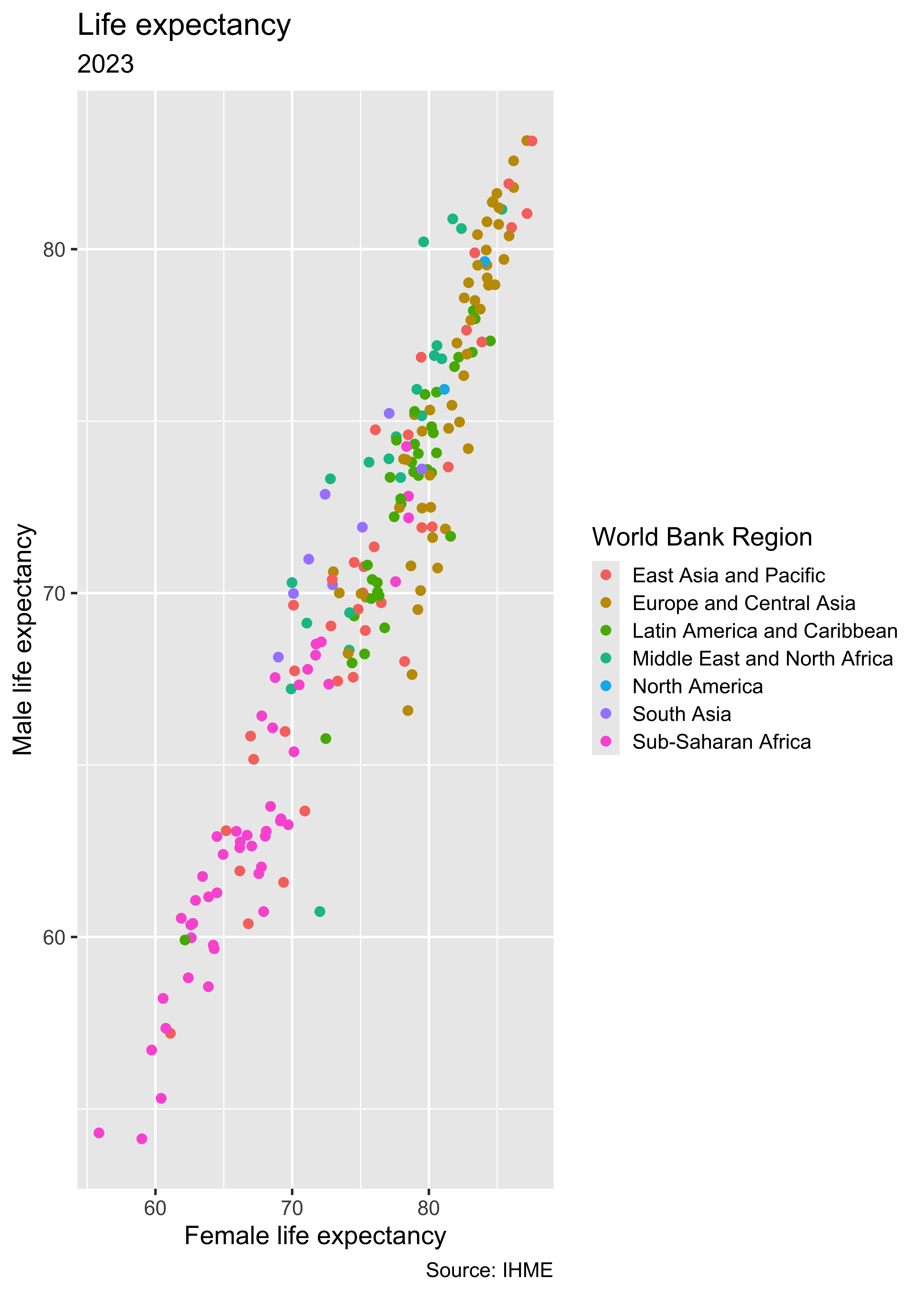
lifeexpwide2023data, map female life expectancy to the x-axis, map male life expectancy to the y-axis, represent each observation with a point, map region to the color of each point, title the plot “Life expectancy,” add the subtitle “2023,” refine the axis labels, fix the legend label, and add a caption for data source.
ggplot(
  data = lifeexpwide2023,
  mapping = aes(
    x = Female,
    y = Male,
    color = worldbankregion
  )
) +
  geom_point() +
  labs(
    title = "Life expectancy",
    subtitle = "2023",
     x = "Female life expectancy",
     y = "Male life expectancy",
     color="World Bank Region",
     caption = "Source: IHME"
  )
Argument names
Tip
You can omit the names of the first two arguments when building plots with ggplot().
ggplot(
  data = lifeexpwide2023,
  mapping = aes(
    x = Female,
    y = Male,
    color = worldbankregion
  )
) +
geom_point()ggplot(
lifeexpwide2023,
aes(
x = Female,
y = Male,
color = worldbankregion
)
) +
geom_point()Where is the gap most pronounced?
lifeexpwide2023 %>%
mutate(gap = Female - Male) %>%
select(location, worldbankregion, Female, Male, gap) %>%
arrange(desc(gap)) %>%
print(n = 10)# A tibble: 204 × 5
location worldbankregion Female Male gap
<chr> <chr> <dbl> <dbl> <dbl>
1 Ukraine Europe and Cen… 78.5 66.6 11.9
2 Palestine Middle East an… 72.0 60.7 11.3
3 Russian Federation Europe and Cen… 78.8 67.6 11.1
4 Mongolia East Asia and … 78.2 68.0 10.2
5 United States Virgin Islan… Latin America … 81.6 71.7 9.94
6 Latvia Europe and Cen… 80.6 70.7 9.91
7 Belarus Europe and Cen… 79.2 69.5 9.67
8 Lithuania Europe and Cen… 81.2 71.9 9.34
9 Georgia Europe and Cen… 79.4 70.1 9.32
10 Estonia Europe and Cen… 82.9 74.2 8.68
# ℹ 194 more rowsIs women’s life expectancy always greater?
lifeexpwide2023 %>%
filter(Male > Female) %>%
mutate(gap = Male - Female) %>%
select(location, worldbankregion, Female, Male, gap) %>%
arrange(desc(gap))# A tibble: 4 × 5
location worldbankregion Female Male gap
<chr> <chr> <dbl> <dbl> <dbl>
1 United Arab Emirates Middle East and North … 79.6 80.2 0.594
2 Morocco Middle East and North … 72.8 73.3 0.524
3 Bhutan South Asia 72.4 72.9 0.462
4 Libya Middle East and North … 70.0 70.3 0.315Aesthetics
Aesthetics options
Commonly used characteristics of plotting characters that can be mapped to a specific variable in the data are:
colorshapesize-
alpha(transparency)
Color
ggplot(
  lifeexpwide2023,
  aes(
    x = Female,
    y = Male,
    color = worldbankregion
  )
) +
  geom_point()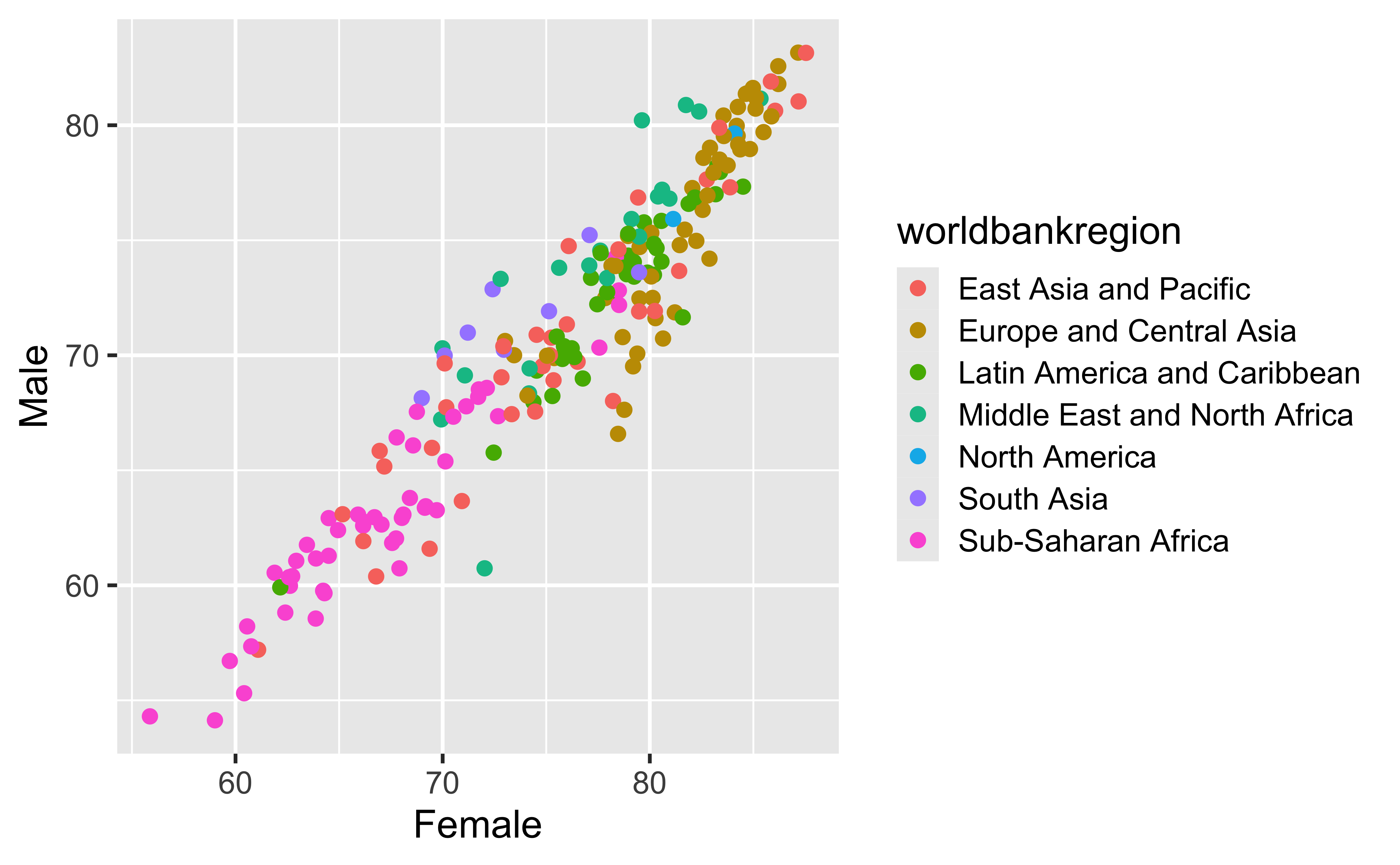
Shape
ggplot(
  lifeexpwide2023,
  aes(
    x = Female,
    y = Male,
    shape = worldbankregion
  )
) +
  geom_point()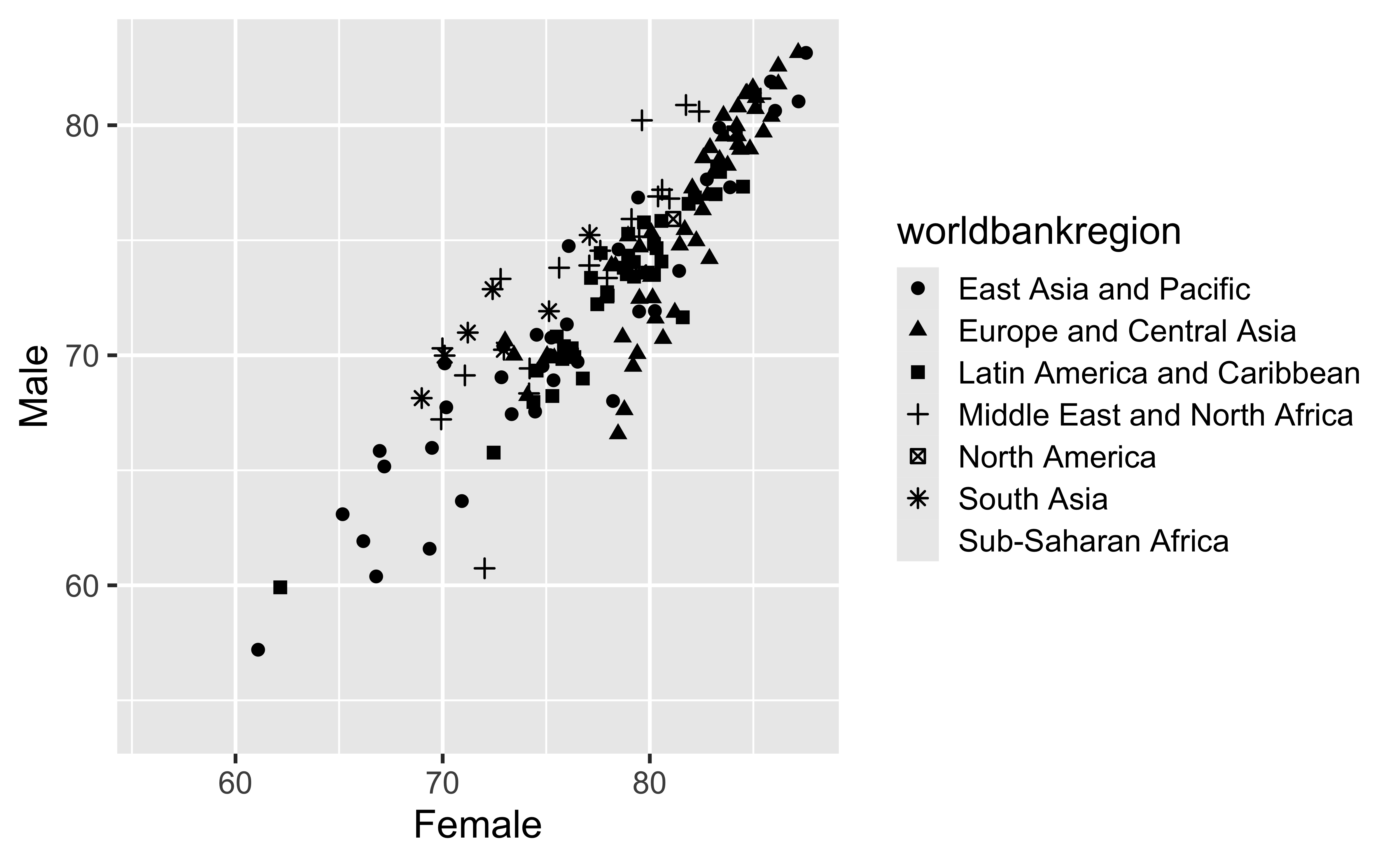
Oops! Only 6 shapes are available, so this isn’t a good option for our more than 6 regions! Let’s fix that.
Shape, take 2
ggplot(
  lifeexpwide2023,
  aes(
    x = Female,
    y = Male,
    shape = worldbankregion
  )
) +
  geom_point() +
  scale_shape_manual(values = c(16,17,15,18,3,4,8,0,1,2))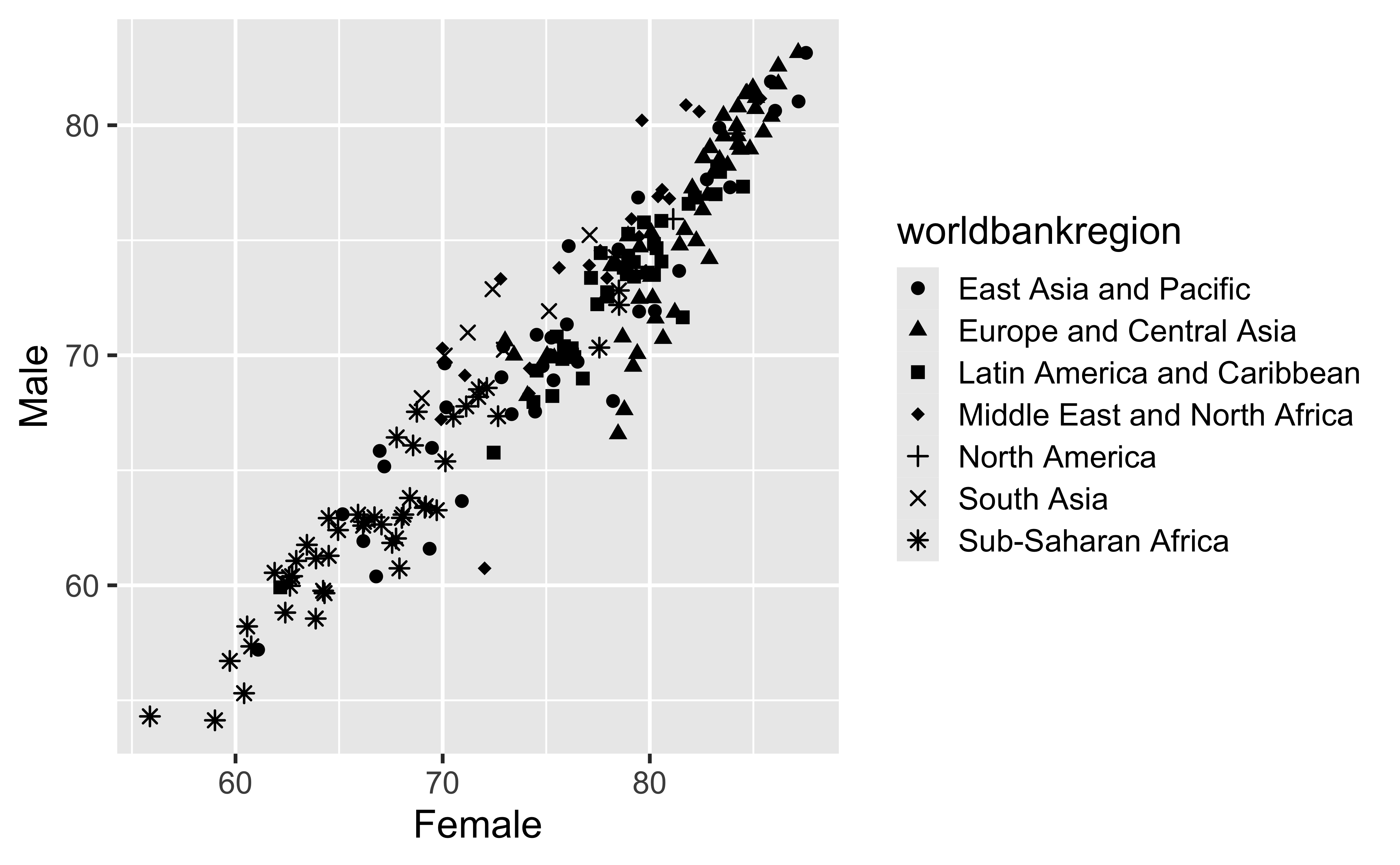
Oops! Only 6 shapes are available, so this isn’t a good option for our more than 6 regions! Let’s fix that.
Shape
Can also map to the same variable as color (helps for color vision deficiency)
ggplot(
  lifeexpwide2023,
  aes(
    x = Female,
    y = Male,
    shape = worldbankregion,
    color=worldbankregion
  )
) + geom_point()
+  scale_shape_manual(values = c(16,17,15,18,3,4,8,0,1,2))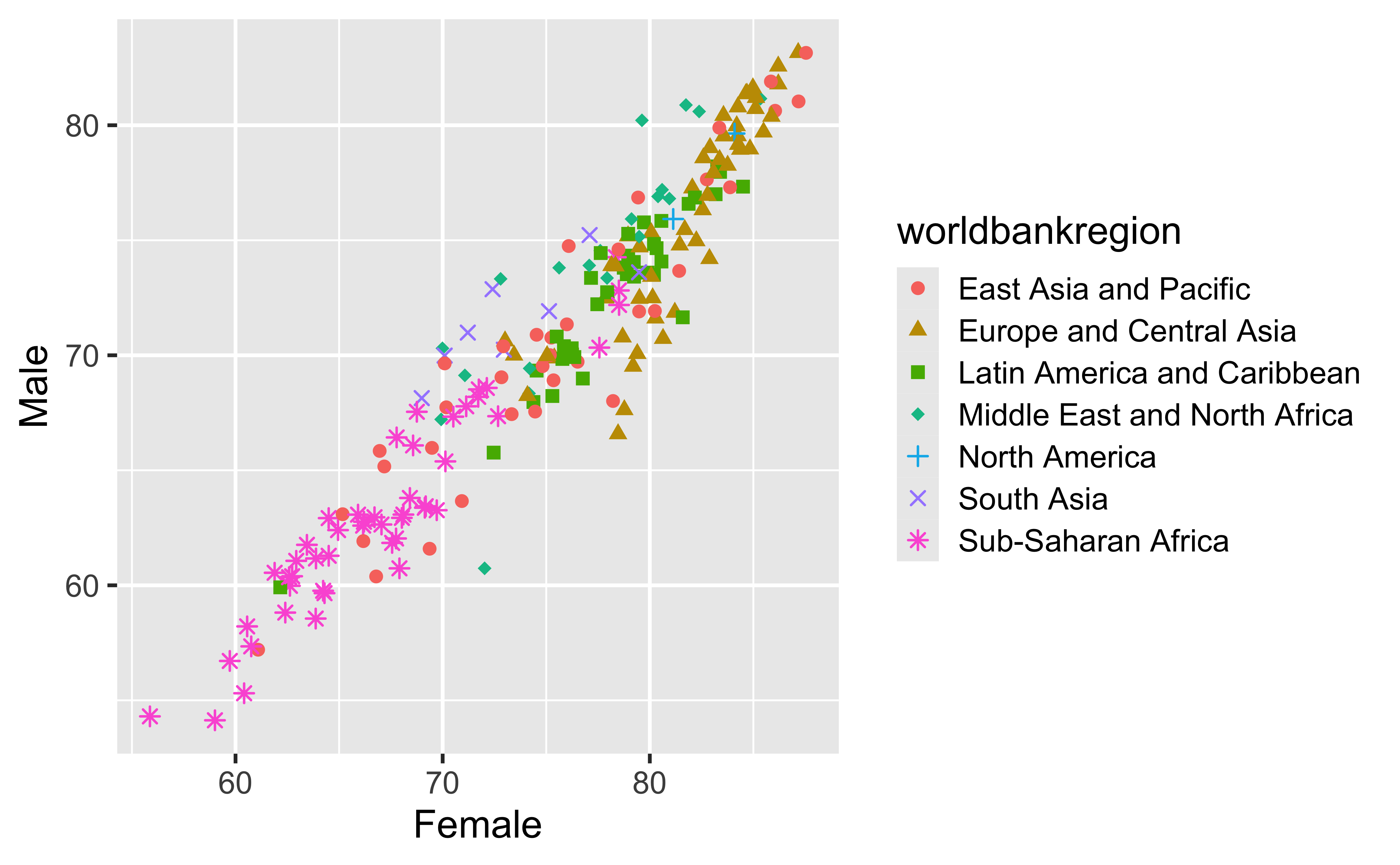
Size
ggplot(
  lifeexpwide2023,
  aes(
    x = Female,
    y = Male,
    color = worldbankregion,
    size = pop
  )
) +
  geom_point()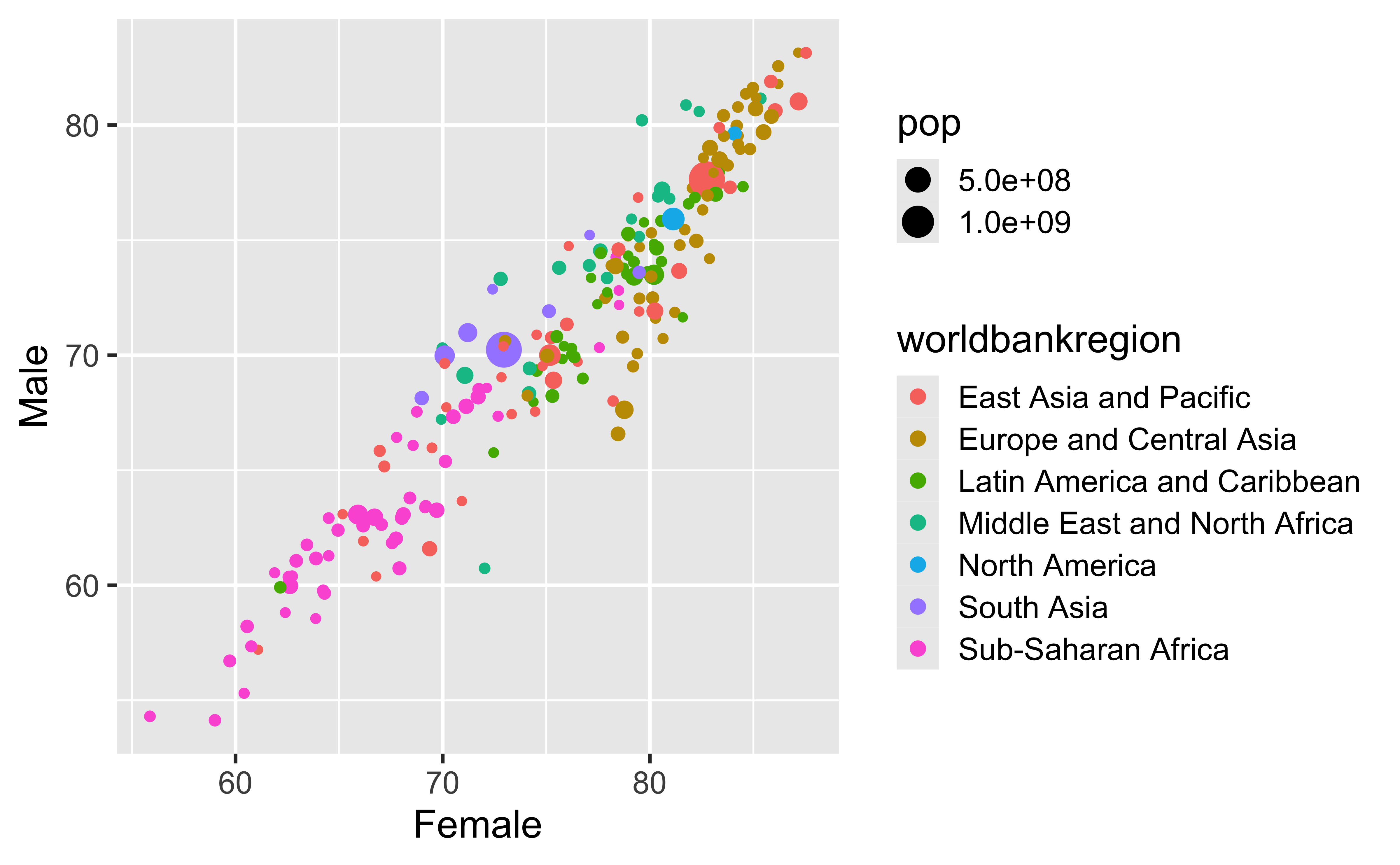
Alpha (Transparency)
ggplot(
  lifeexpwide2023,
  aes(
    x = Female,
    y = Male,
    color = worldbankregion,
    alpha = pop
  )
) +
  geom_point()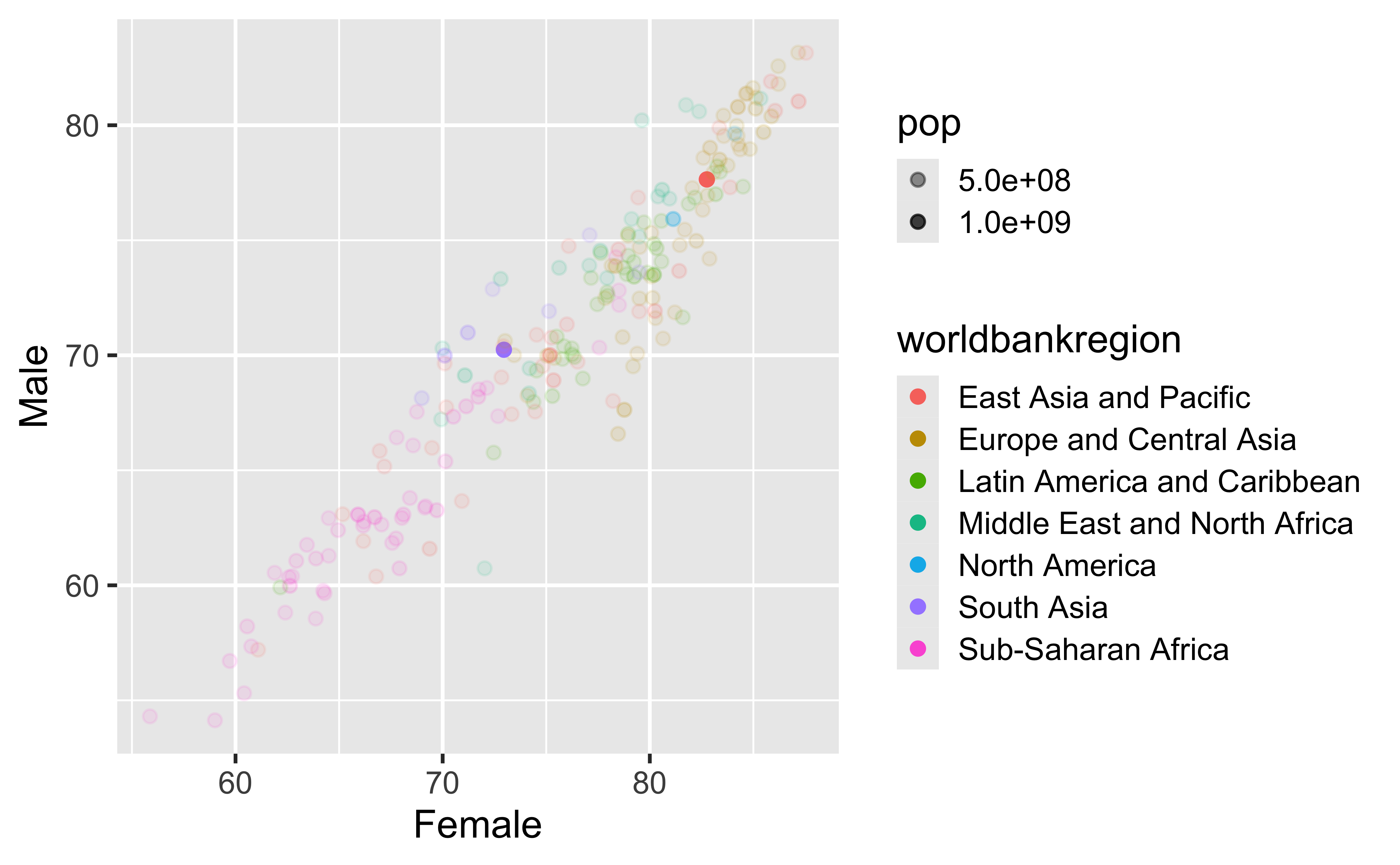
Mapping vs. setting aesthetics
Mapping
ggplot(
  lifeexpwide2023,
  aes(
    x = Female,
    y = Male,
    size = pop
  )
) +
  geom_point()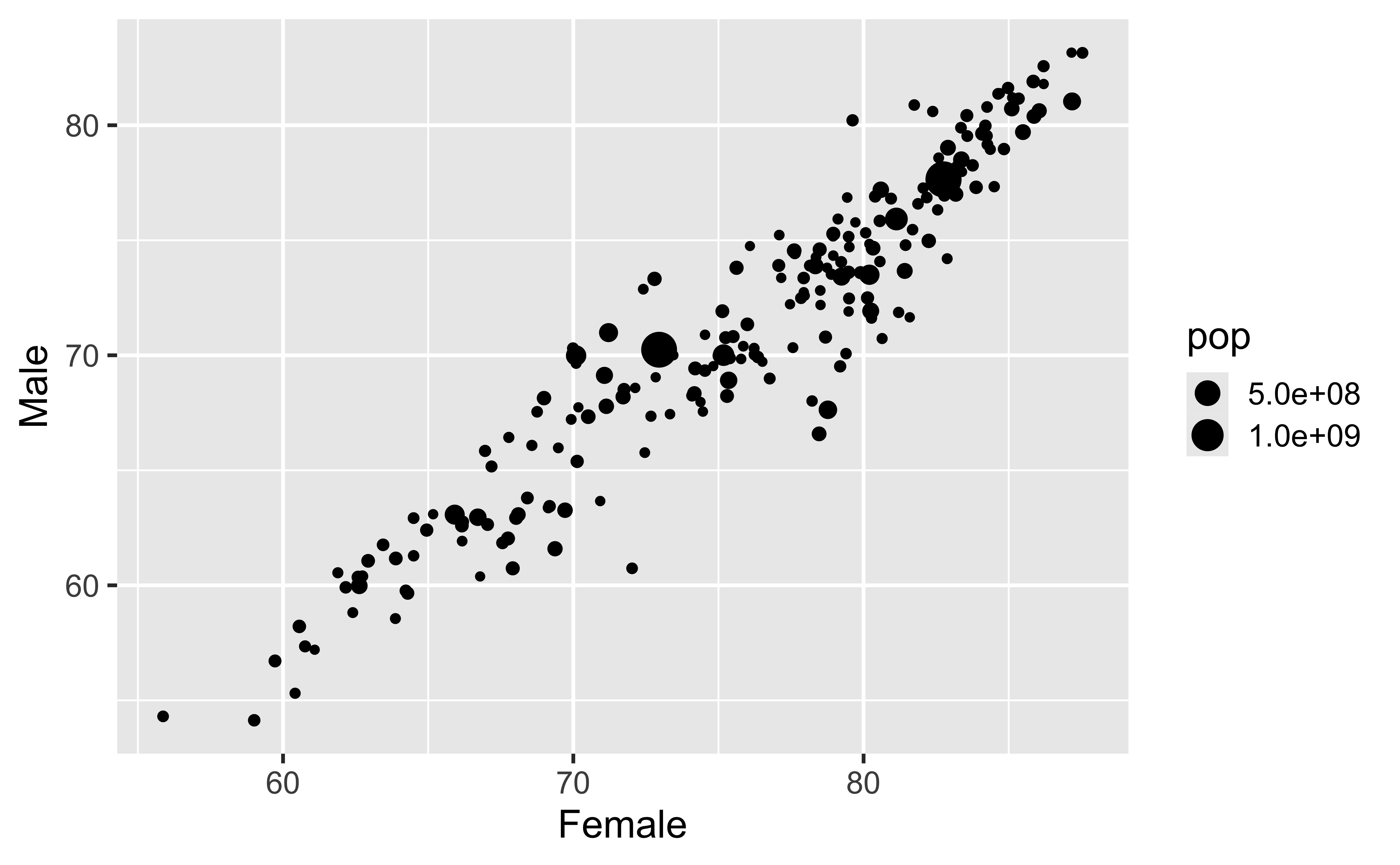
Setting
ggplot(
  lifeexpwide2023,
  aes(
    x = Female,
    y = Male
  )
) +
  geom_point(size = 2)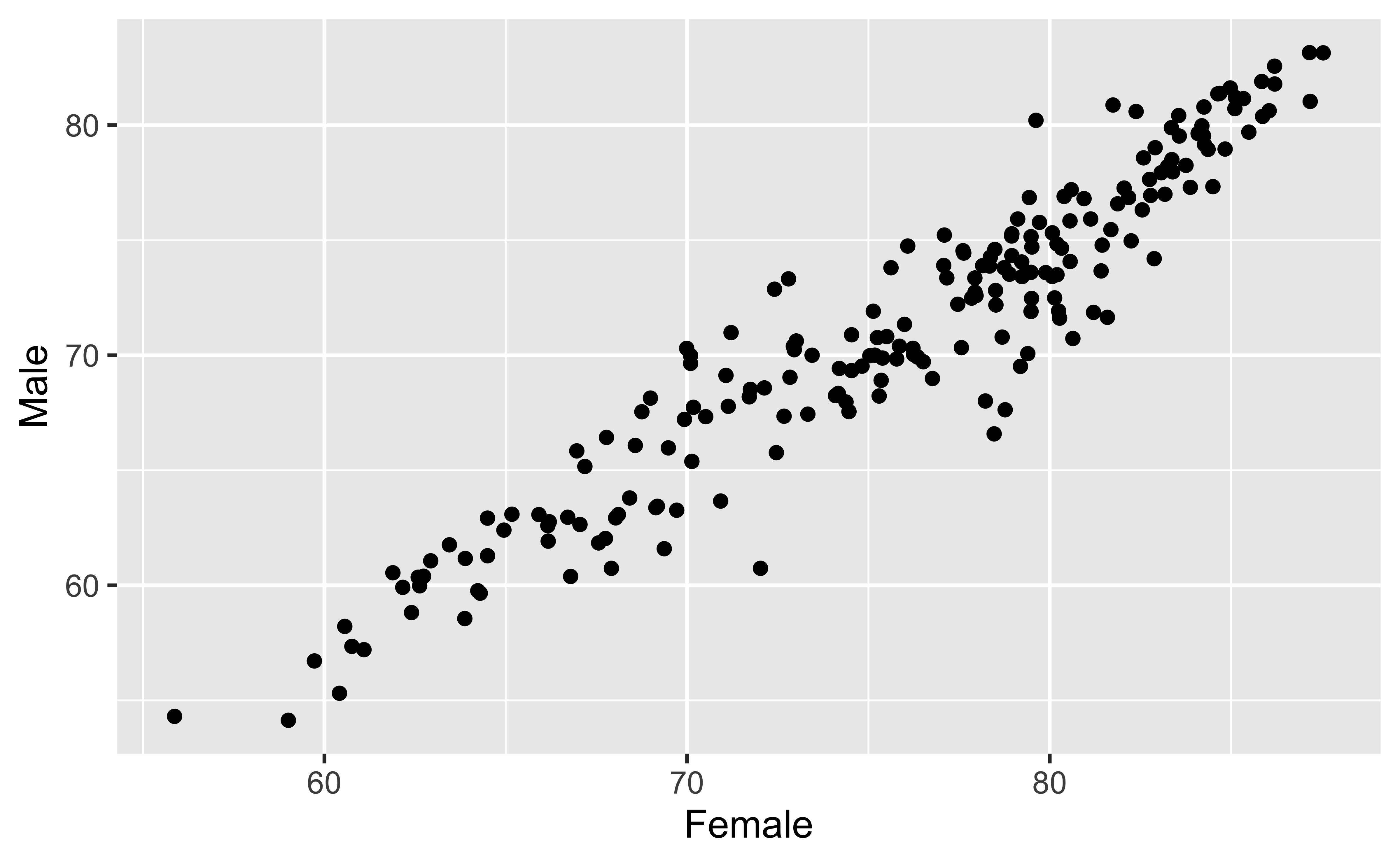
Mapping vs. setting
-
Mapping: Determine the size, alpha, etc. of points based on the values of a variable in the data.
- Goes into
aes().
- Goes into
-
Setting: Determine the size, alpha, etc. of points not based on the values of a variable in the data.
- Goes into
geom_*()(this wasgeom_point()in the previous example, but we’ll learn about other geoms soon!).
- Goes into
Faceting
Faceting
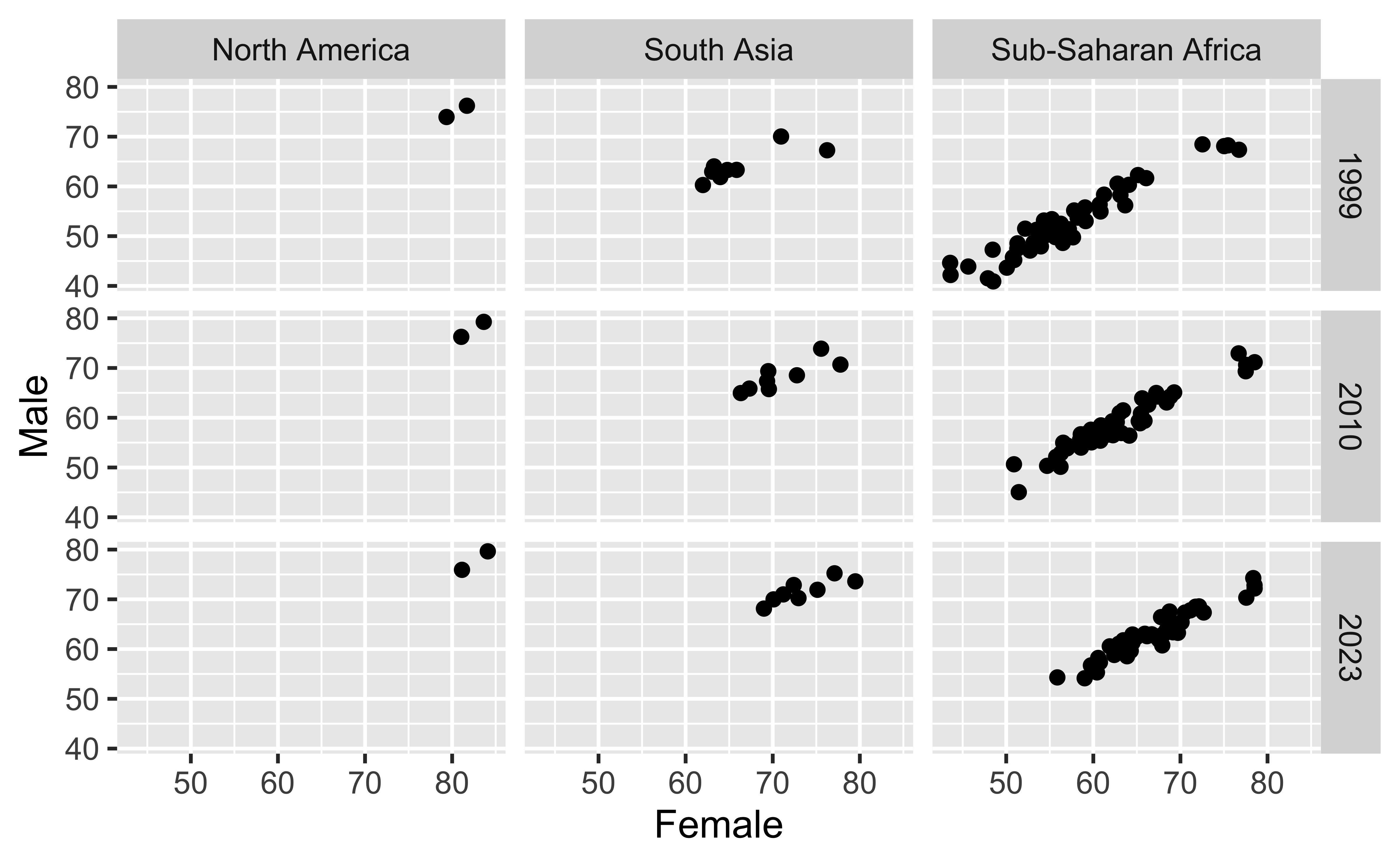
- Smaller plots that display different subsets of the data
- Useful for exploring conditional relationships and large data
Faceting
Various ways to facet
lifeexpwide %>%
  filter(
    year %in% c(1999, 2010, 2023),
    worldbankregion %in% c("North America","South Asia","Sub-Saharan Africa"
    )
  ) %>%
  ggplot(
    aes(x = Female, y = Male)
  ) +
  geom_point() +
  facet_wrap(~worldbankregion)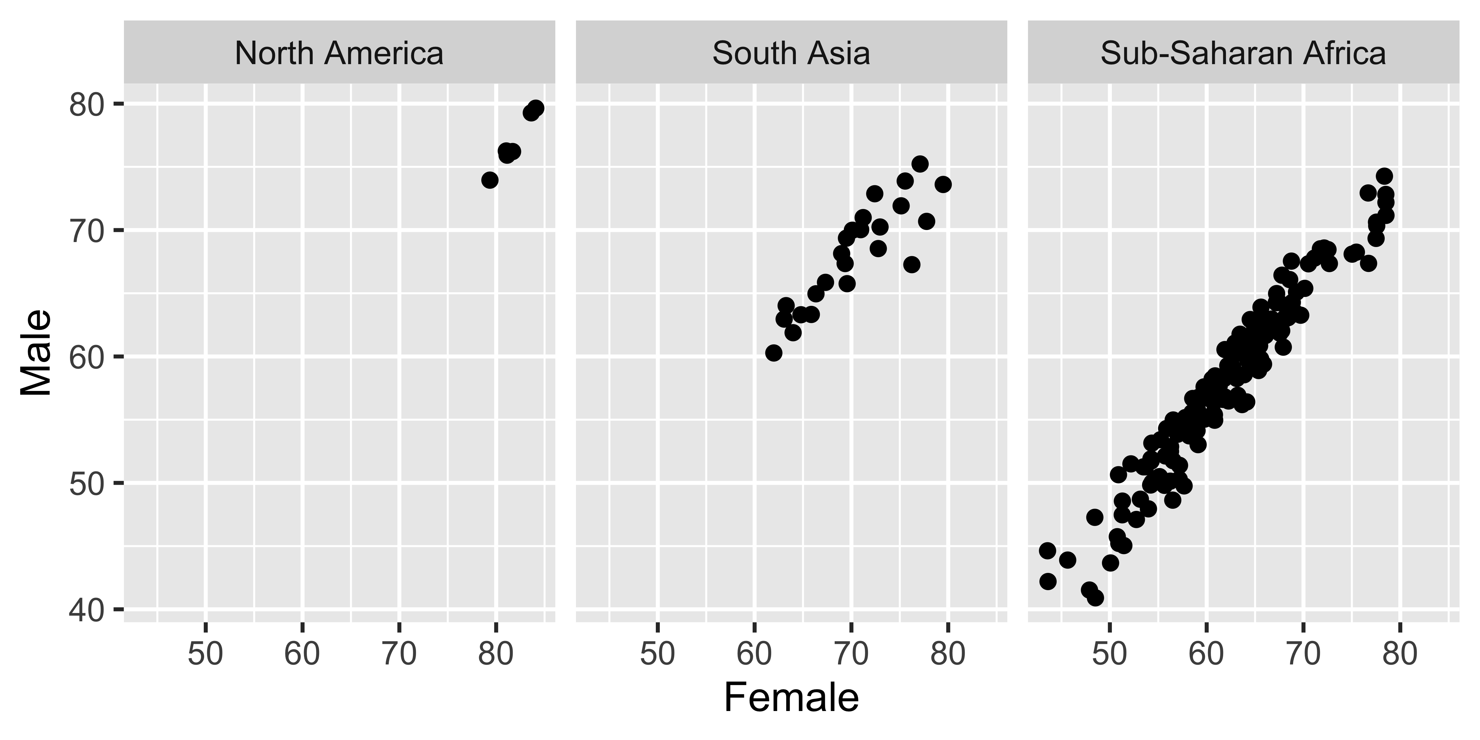
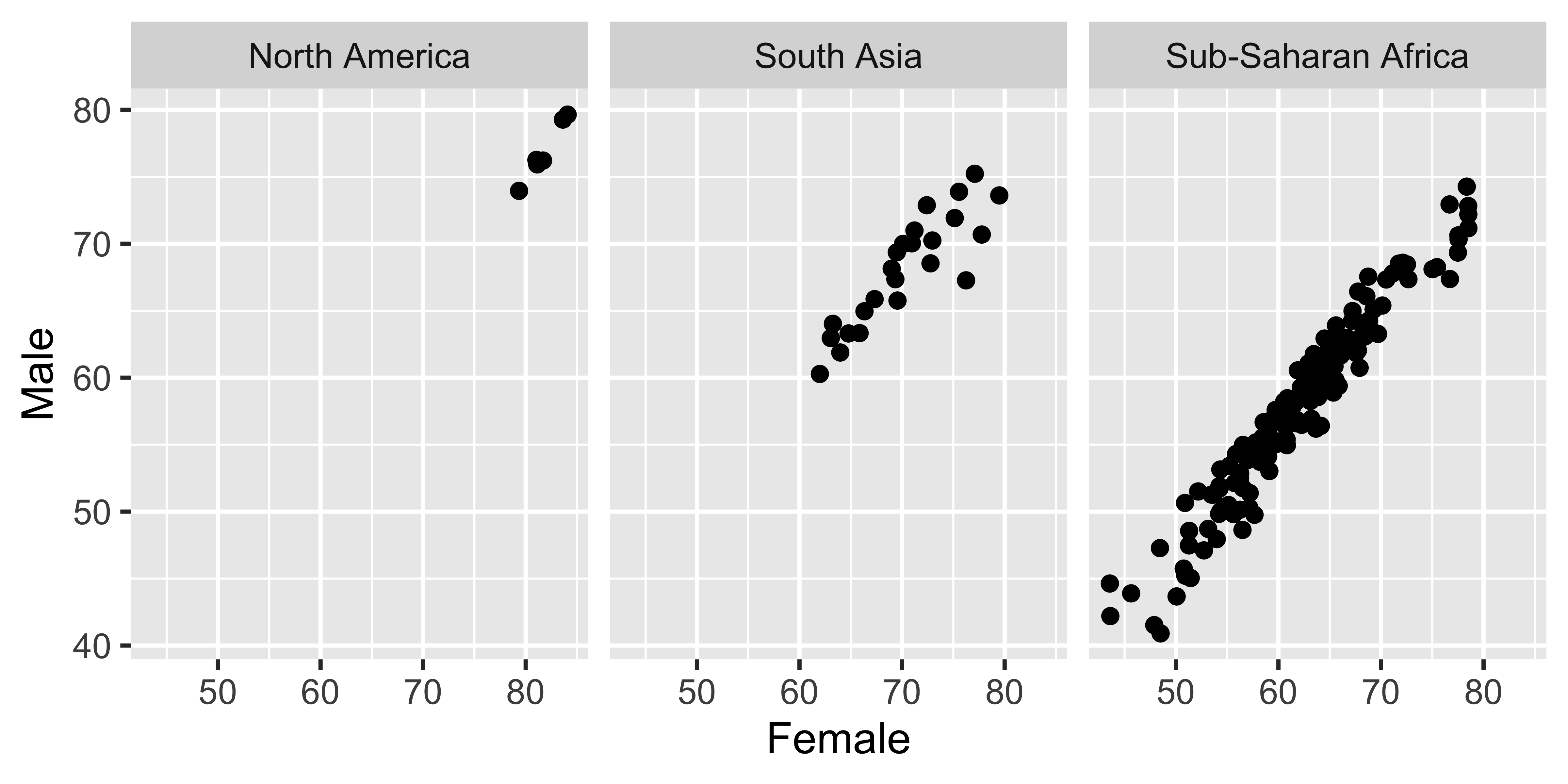
Faceting summary
-
facet_grid()- 2D grid
rows ~ cols- Use
.for no split.
-
facet_wrap()- 1D ribbon wrapped according to the number of rows and columns specified or the available plotting area.
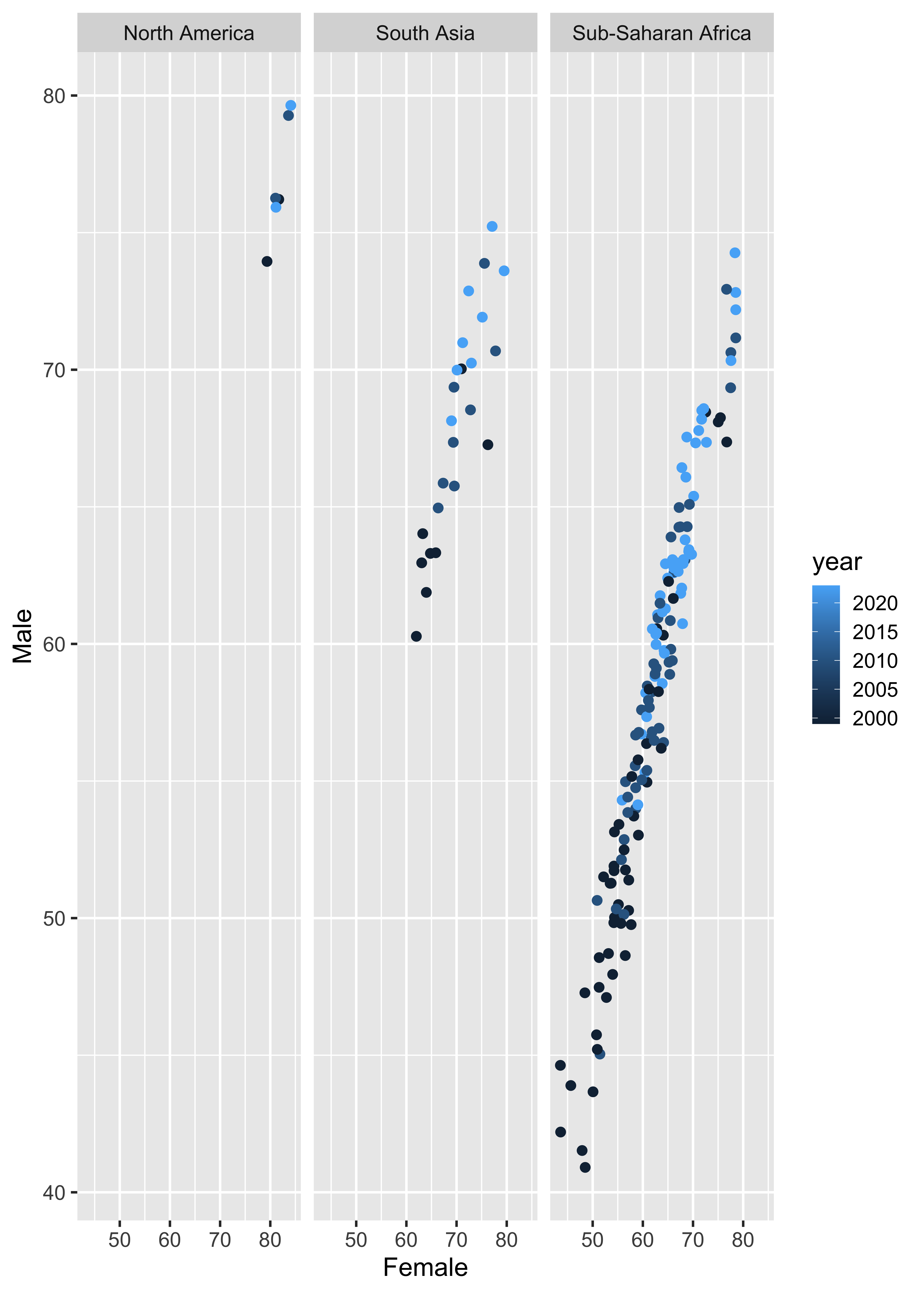
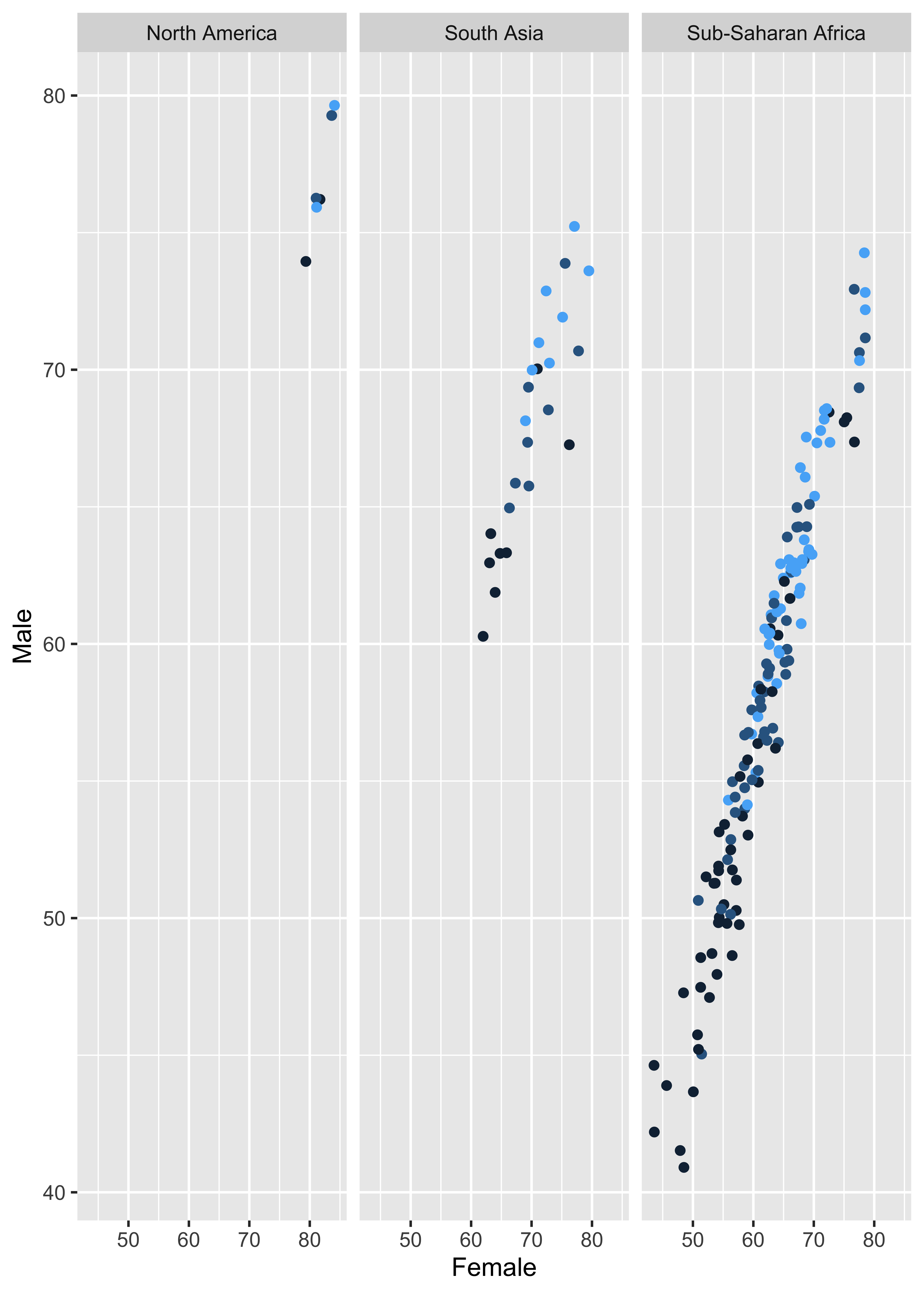
Facet and color
Facet and color, no legend
Homework (Practice)
- Problem 2
- Problem 3
- Problem 7
- Problem 8
- Problem 11
- Problem 12